I'll drink to that
Client: Synthesis
Projects: Logo and menu design
Menu design & prepress: Jacklina Jekova
Crafting & assembly: Todor Georgiev
Year: 2022
This one was exciting!
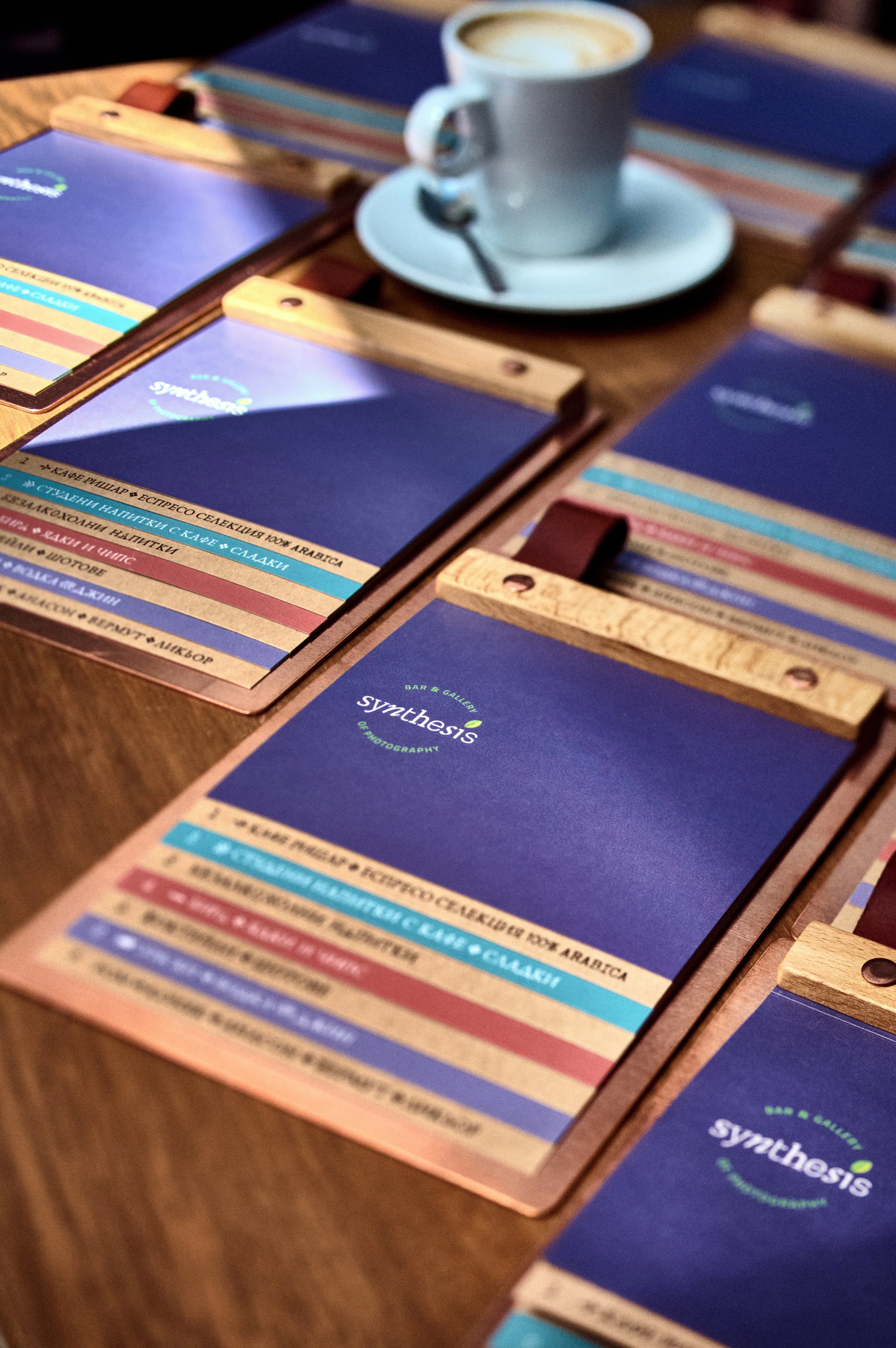
Synthesis combines a bar and the collections of distinct photographers displaying their works in the gallery in the very heart of Sofia, both joined with Photosynthesis – a famous shop for photographic equipment and print house. What started as a logo refresh turned to be a menu redesign in two languages which included its production.
First off was the logotype. It reflects the random (in a good way) feel of the bar's interior, the variety of objects, materials and colours inside, the diverse people that are gathered day all year round, and the cosy and imperfect overall setting.

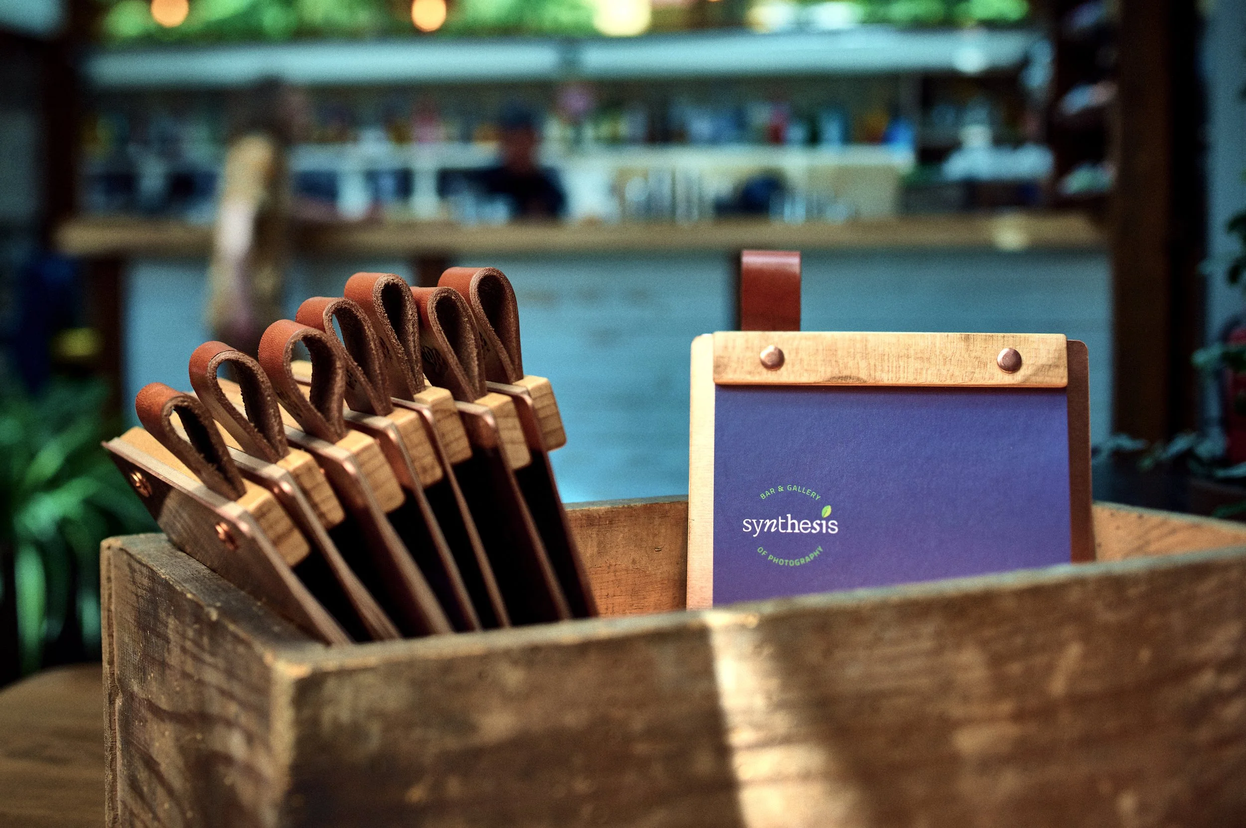
Next up was the menu. After presenting a conceptual idea for the feel, layout and mix of materials, we continued forward with its design. We wanted it to reflect the same feel as the logo so we mixed various typefaces and graphical elements, along with illustrations with and imperfect feel to convey that. After a couple of print tests and proofs, we dialled in what we wanted and the files for both Bulgarian and English were off to the printer.
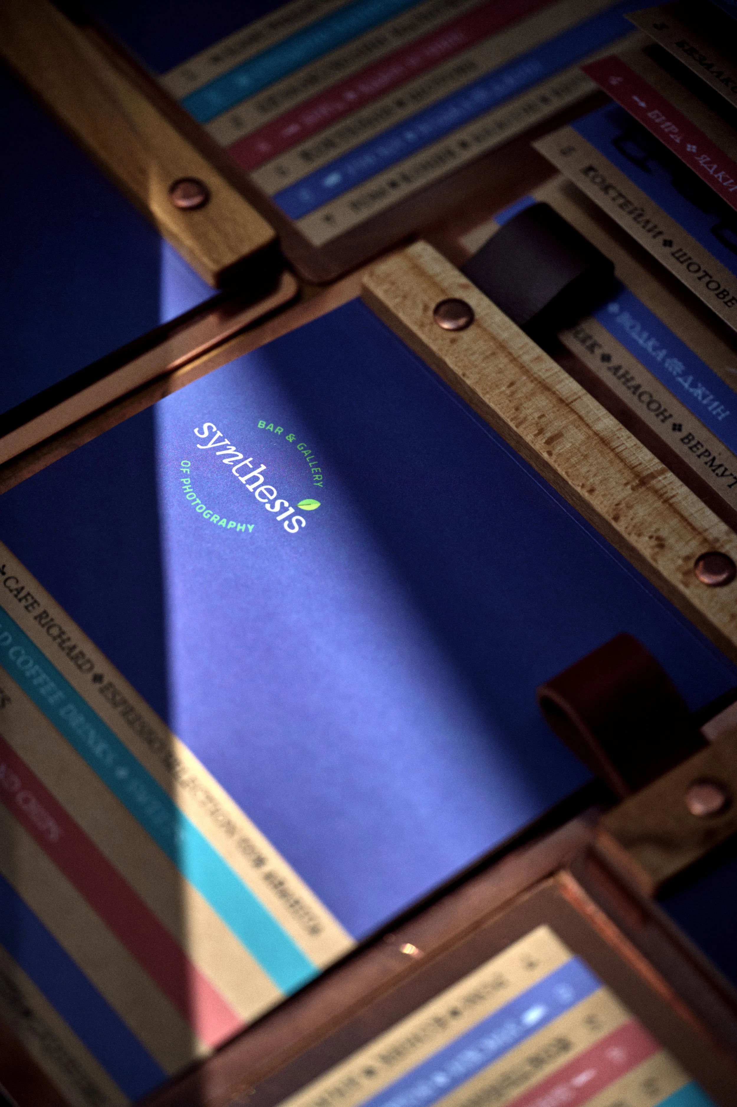

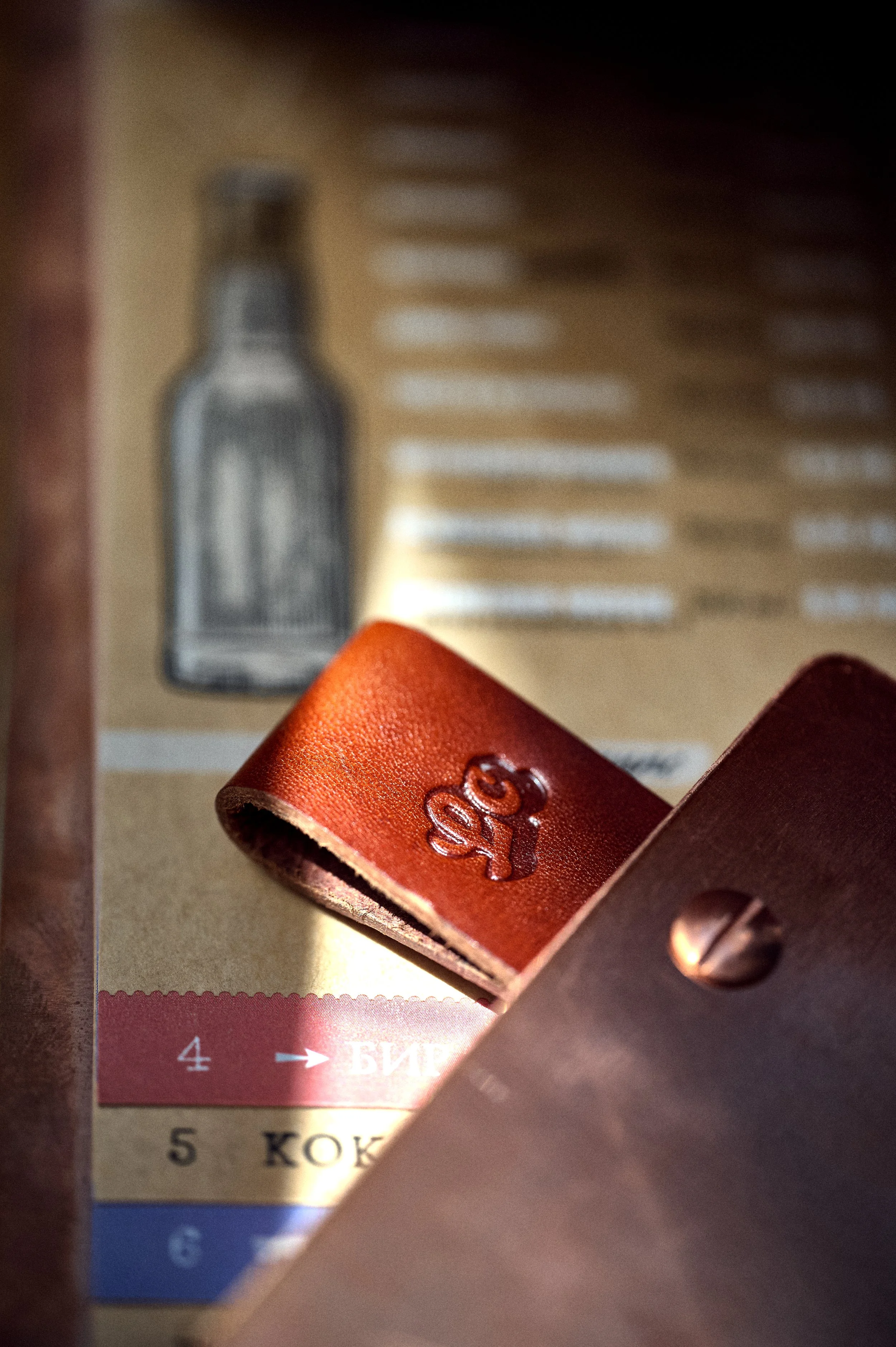
Alongside that, we researched and slowly sourced the best materials available for its production. All this came in an insecure time with prices getting higher by the day and some things were hard to come by. The backs are made from 2 mm thick laser-cut copper plates; hold-down bars are made from beach wood, all cut, milled and finished by hand; all tightened down with copper fasteners manually ground down to size.
To finish them off we chose two tints of bovine leather which we cut into strips to serve as loops and identifiers for the 2 versions of the menu.
All 35 pieces were processed and finished in-house in our workshop.
Both we and the client were super happy with how these turned out. A good challenge and test of our skill set. The lovely shots pictured below were taken by the immaculate Simeon Levi who photographed them on-site.