
Contrasta
Client: Self-initiated
Project: Type design
Work by: Todor Georgiev
Year: 2021
Named after one of the font’s base features – lots of contrast between thick and thin. Comes in 1 Heavy weight.
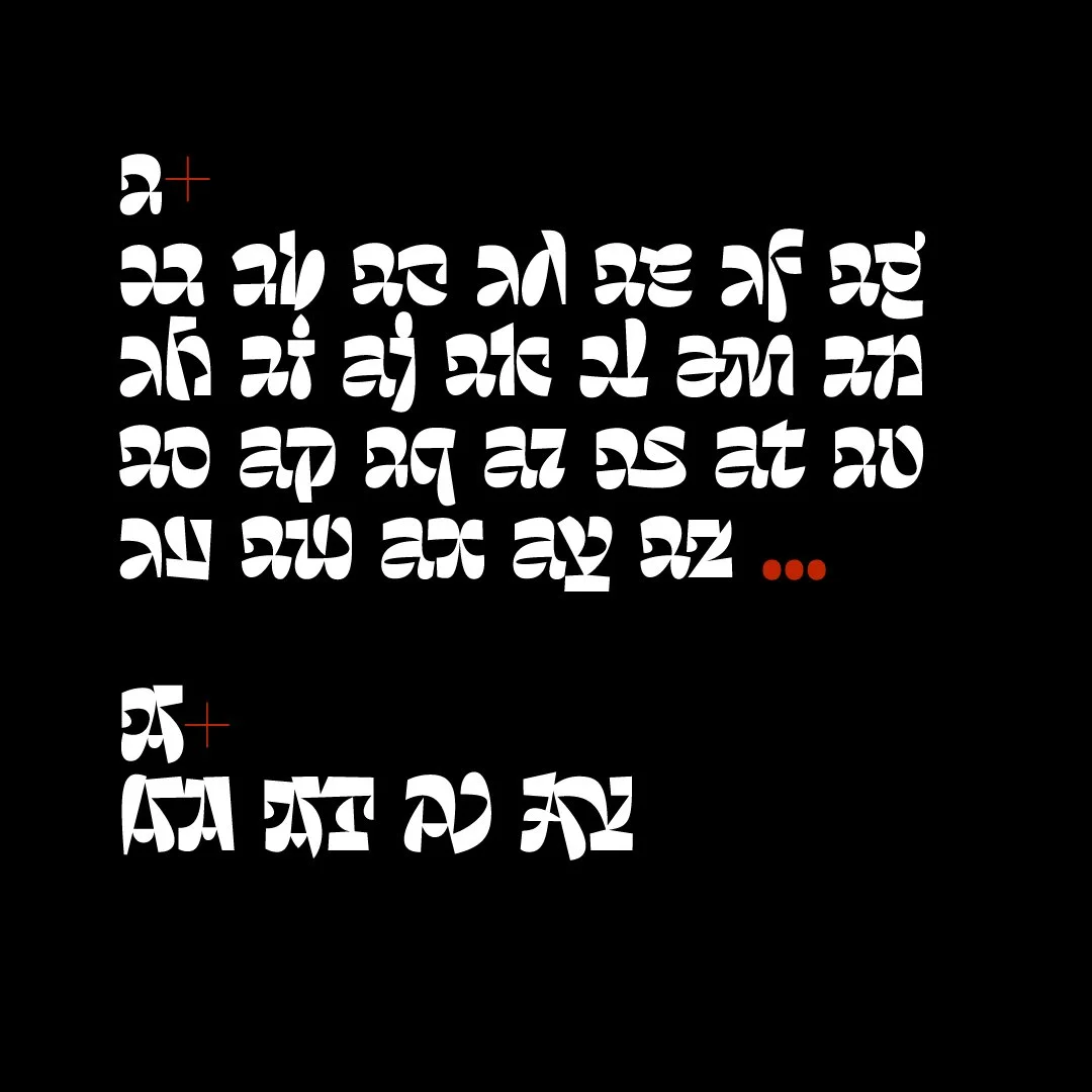
Inspired by Todor Georgiev’s lettering pieces done over the past years and experimentations with letter shapes, combined with the current trends. Contrasta revolves around the idea of not looking like a font at all. The mechanism behind it relies on numerous substitutions happening live as you type as long as the basic [liga] feature is turned on. This results in differing combinations depending on the sequence of the letters. To achieve this Tozzi made 200+ alternates and ligatures, governed by 1400 lines of code which control the Open type features. Baseline, x-height and width may vary from time to time depending on the letter combinations.
Constrasta pairs letters automatically as you type as long as the basic ligature function is turned on.
Some combinations are merged into ligatures while others fit together as two (or more) puzzle pieces. In some cases the sequence is based solely on similar and complimenting shapes.
These automated letter swaps are available to the lowercase only. Uppercase is fitted with a few ligatures.
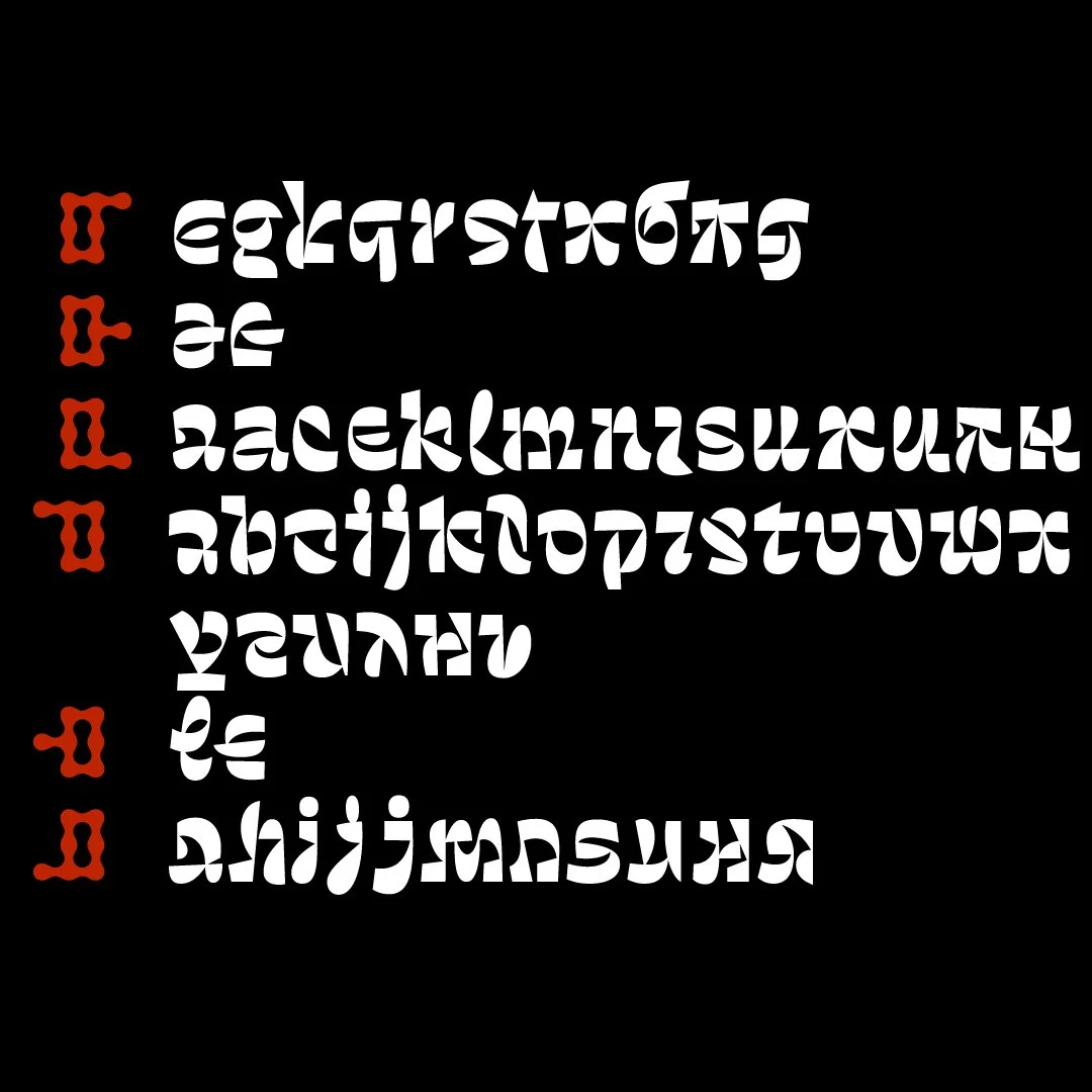
Puzzle fitting is divided into 6 main categories. Whenever aesthetically pleasing and possible, letter pairing is governed by this joinery principle.
Automated letter swaps produce various unexpected glyph shapes and combinations in the process of typing text.
Notice how two 8-letter words bring out 4 different shapes for "i", 3 for "t", 3 for "n", 2 for "a", etc.
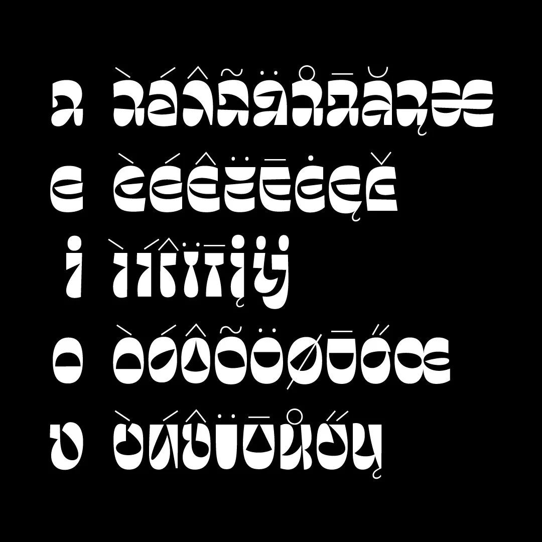
Lowercase letters do not share the same base glyph when it comes to their accented counterparts, digraphs or diphthongs, but rather differ in each individual case.
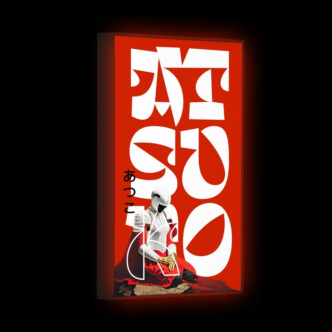
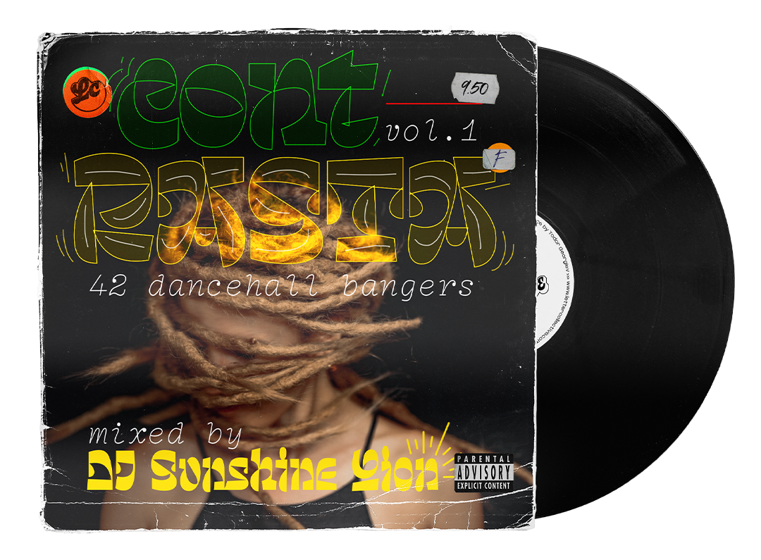
Contrasta features an edgy, brutalist aesthetic with shapes that clash, collide, and coexist. Its forms are a balanced mix between sharp and rounded, highly geometric. Intended to serve as a display face for large sizes and relatively short pieces of text for use in headlines on posters, album covers, festival visuals, apparel, magazine covers and any project which requires a strong and assertive presence, one that stands out and defies conventional norms.
Created with the intent to fill the gap of Bulgarian non-conventional typefaces and motivated by experimentation and exploration.
Glyph count is 674 featuring Latin and Cyrillic script covering 112 languages including English, Afrikaans, Belarusian, Bulgarian, Danish, Estonian, Indonesian, Irish, Icelandic, Spanish, Italian, Latvian, Lithuanian, German, Dutch, Norwegian, Polish, Portuguese, Russian, Slovak, Slovenian, Ukrainian, Hungarian, Finnish, French, Croatian, Czech, Swedish.
Font file is OpenType PostScript (.otf).
Designed & produced by Todor Georgiev in the period 2020–2024. Any feedback is welcome.
Get ready to ditch the conventional.
Get Contrasta.