Vitamin Sea
Client: Sea tapes
Project: Custom lettering
Work by: Todor Georgiev
Year: 2018
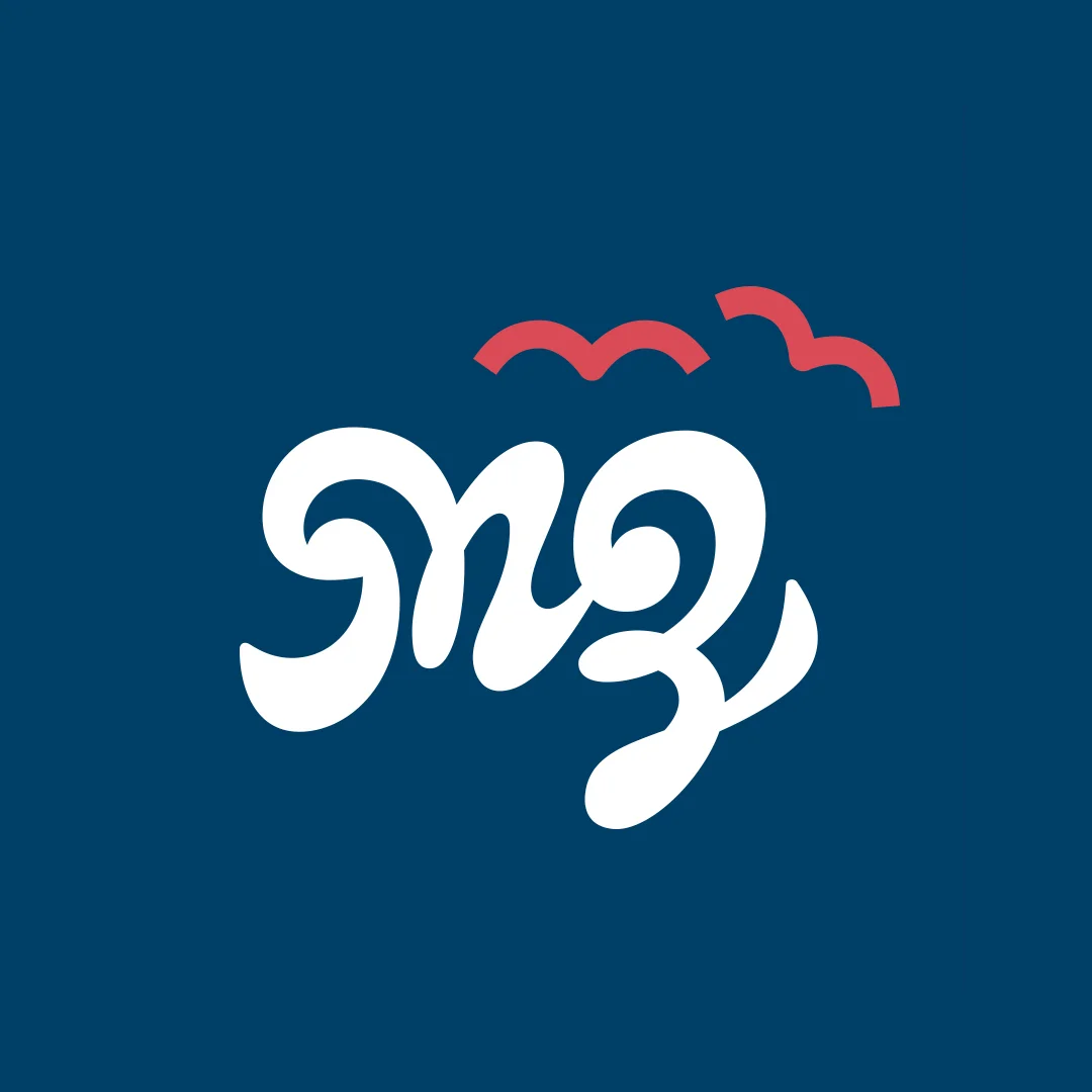
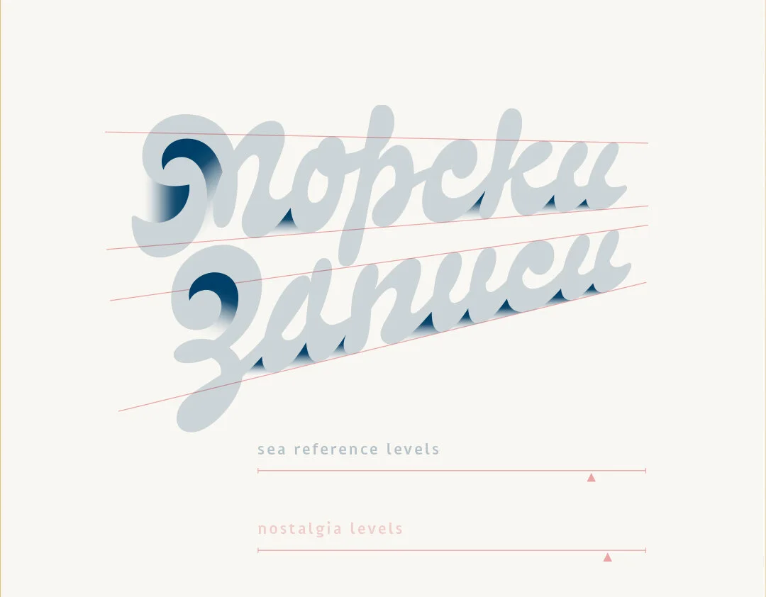
Sea tapes is а page about literature, sea, waves, boats and stories. The main idea of Sea tapes (Морски записи) is to get people to read a little bit more. What you see here is the mark for Sea tapes we consented on with the client. While sketching we had a clean and simple design in mind. However, this does not mean the final result is devoid of meaning and depth. We incorporated the key symbolic references associated with the brand: two flying seagulls and a setting sun; view from a ship cabin’s window; sea waves; detail of a fast handwritten note; the letters М & З. All this packed into a memorable and recognisable logo.


The character of the letters is informal and based on handwriting. We used fluid forms and the appropriate ligatures to emulate a quick note. For the same reason we did not keep an absolutely uniform x-height and we interweaved slight variation in slant angles as well as in the base line. These details bring the digital drawing closer to human writing and differentiate lettering from font.

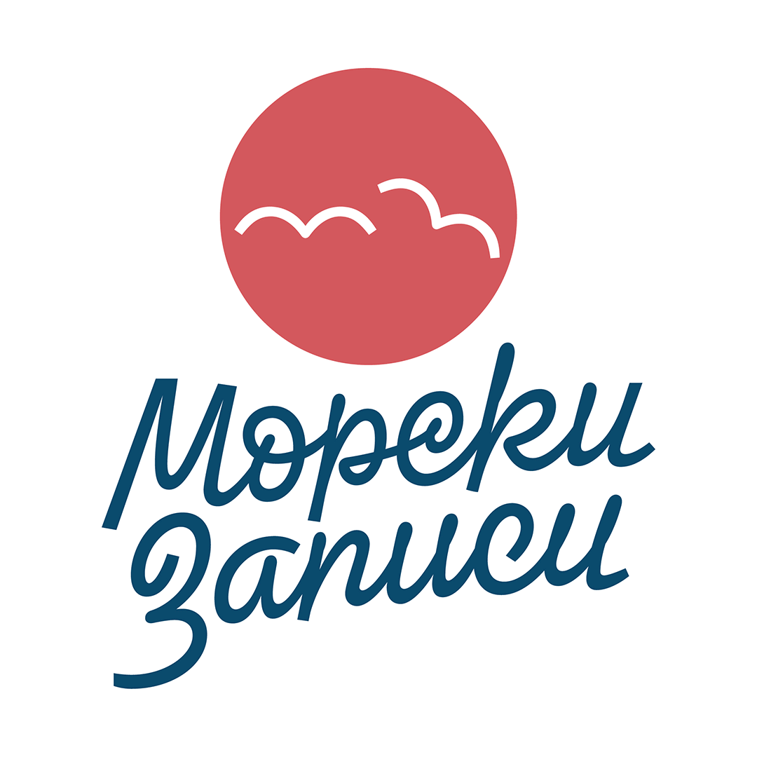
The idea of our first proposal was to come up with as much ligatures as we can. This serves two purposes: (A) to achieve a handwritten feel and (B) to get shapes reminiscent of stylised sea water surface at the base line. This is more clearly visible in the second word. Additionally, we incorporated the shape of a breaking wave into the two initials of the brand name. The overall look of the lettering is intended to give you that nostalgic time-off feel associated with the sea.