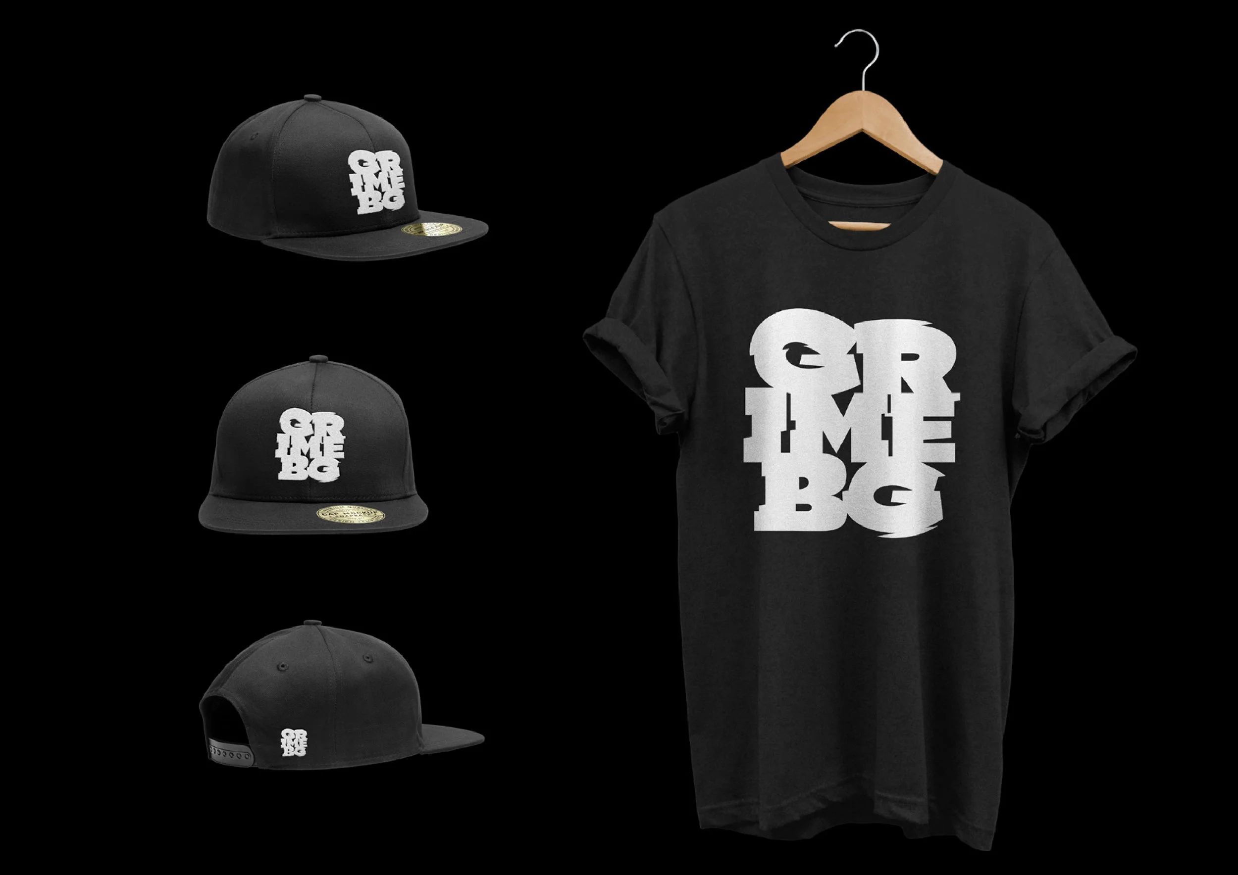
Grimy
GRM BG is a group of young people who have set out to introduce our general public with the UK musical trends in underground rap.
Summary Block
GRM BG is a group of young people who have set out to introduce our general public with the UK musical trends in underground rap.


А boutique little shop that makes the most amazing brownies. The lovely owner approached us with the task of designing a custom logotype for the brand.
What makes Brownini exceptional is that each ingredient is carefully selected and every product is made with special attitude and love. Exactly what we did for their new logotype.


Pharma Bulgaria is a cosmetic company targeted at middle-aged ladies. We chose to design a delicate handwritten letter, used as a monogram for the brand.


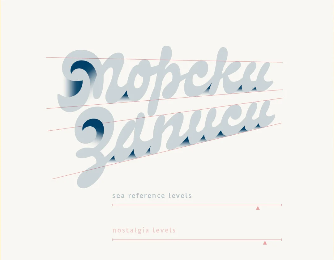
Client: Sea tapes
Project: Custom lettering
Work by: Todor Georgiev
Year: 2018
Sea tapes is а page about literature, sea, waves, boats and stories. The main idea of Sea tapes (Морски записи) is to get people to read a little bit more. What you see here is the mark for Sea tapes we consented on with the client. While sketching we had a clean and simple design in mind. However, this does not mean the final result is devoid of meaning and depth. We incorporated the key symbolic references associated with the brand: two flying seagulls and a setting sun; view from a ship cabin’s window; sea waves; detail of a fast handwritten note; the letters М & З. All this packed into a memorable and recognisable logo.


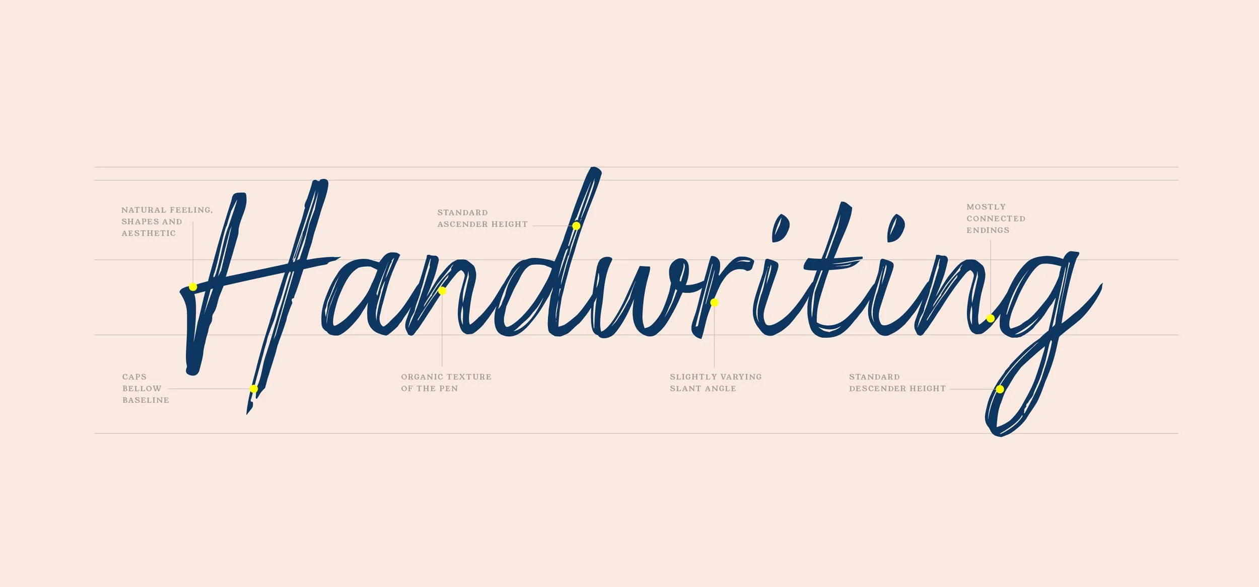
The character of the letters is informal and based on handwriting. We used fluid forms and the appropriate ligatures to emulate a quick note. For the same reason we did not keep an absolutely uniform x-height and we interweaved slight variation in slant angles as well as in the base line. These details bring the digital drawing closer to human writing and differentiate lettering from font.

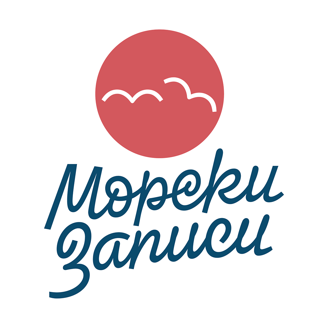
The idea of our first proposal was to come up with as much ligatures as we can. This serves two purposes: (A) to achieve a handwritten feel and (B) to get shapes reminiscent of stylised sea water surface at the base line. This is more clearly visible in the second word. Additionally, we incorporated the shape of a breaking wave into the two initials of the brand name. The overall look of the lettering is intended to give you that nostalgic time-off feel associated with the sea.

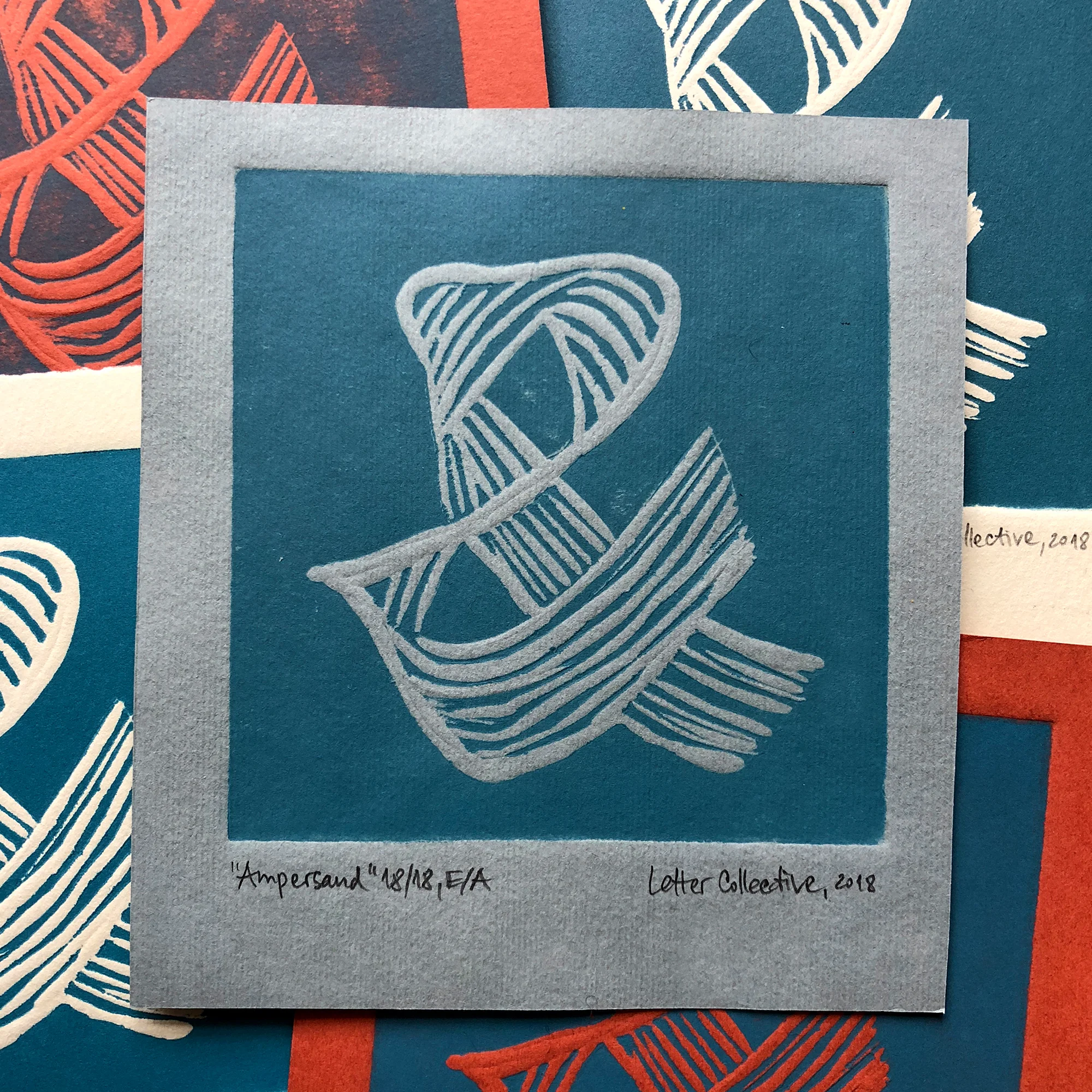
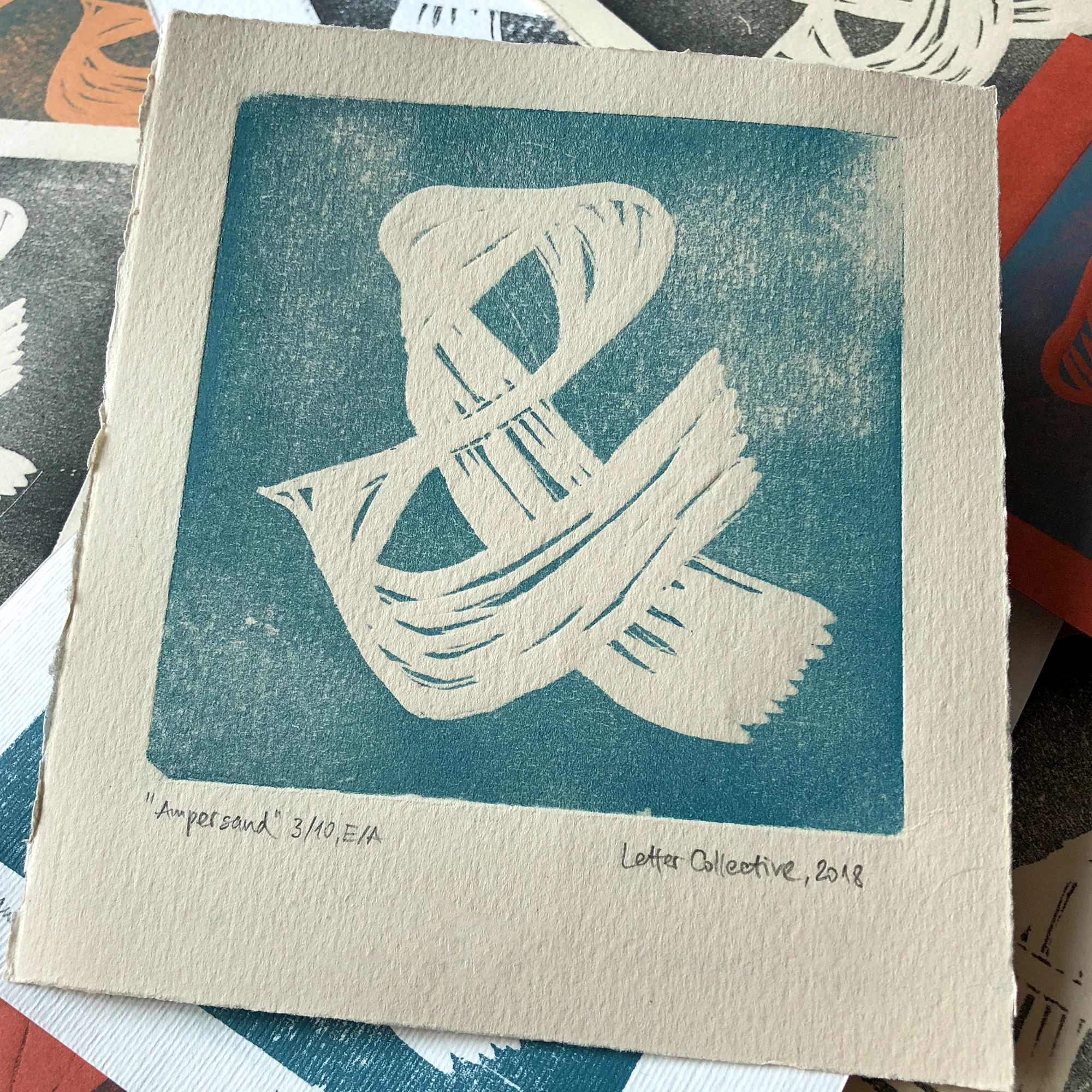
Our first edition handmade linocuts. Custom mixed ink on quality 10x10 cm hand-cut artist’s paper. Bespoke design based on flat brush experimental calligraphy. Order a print through our shop or just drop us a message to order the ones you like.


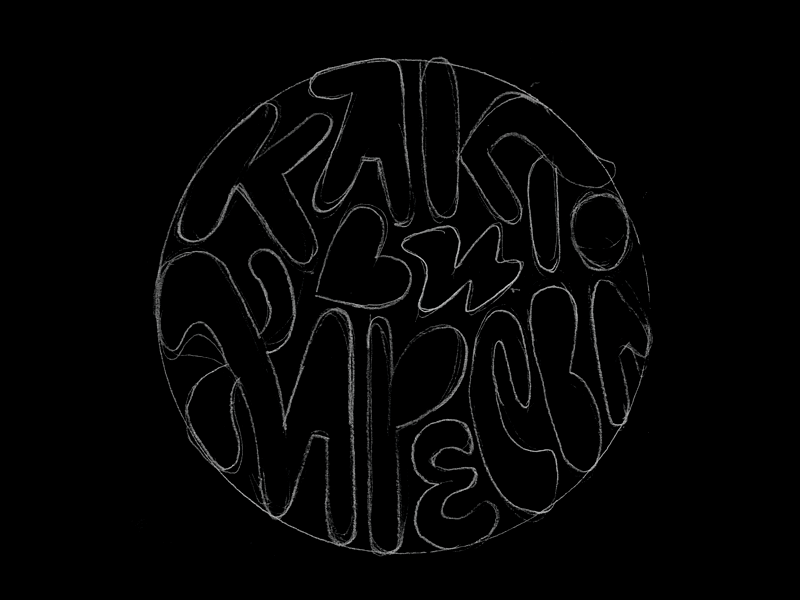
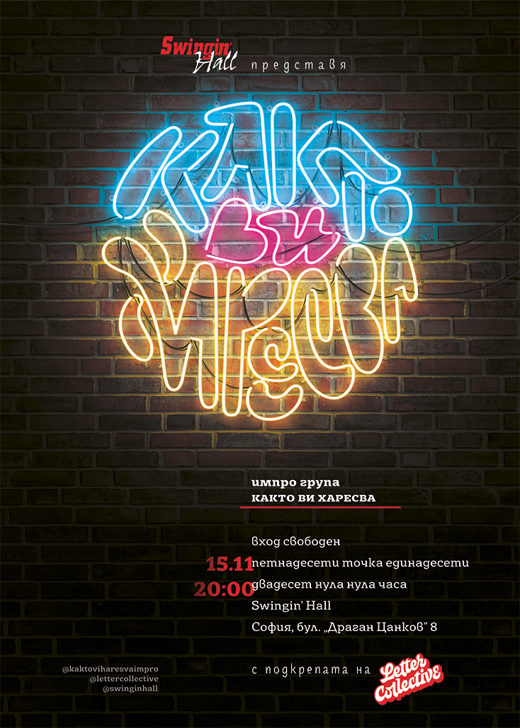
Client: Impro theater “Както ви харесва“
Project: Custom lettering
Work by: Todor Georgiev
Year: 2018
We made this quirky custom lettering for our hilarious friends at “Както ви харесва“. They approached us with a logo design brief for their improvisational theater group named “However you like it”. The various forms, proportions and sizes of the letters are a reference to the diversity of the actors. We did our best incorporate the feeling of the impro group into our design. In order to do that we constructed the letters to fit as if in a puzzle – a reference to improvisation and togetherness. We also added some ligatures here and there to represent the relationship between the actors.
Photos by: Asen Kralev

We are happy to share the Key visuals we have made for them during their first year.


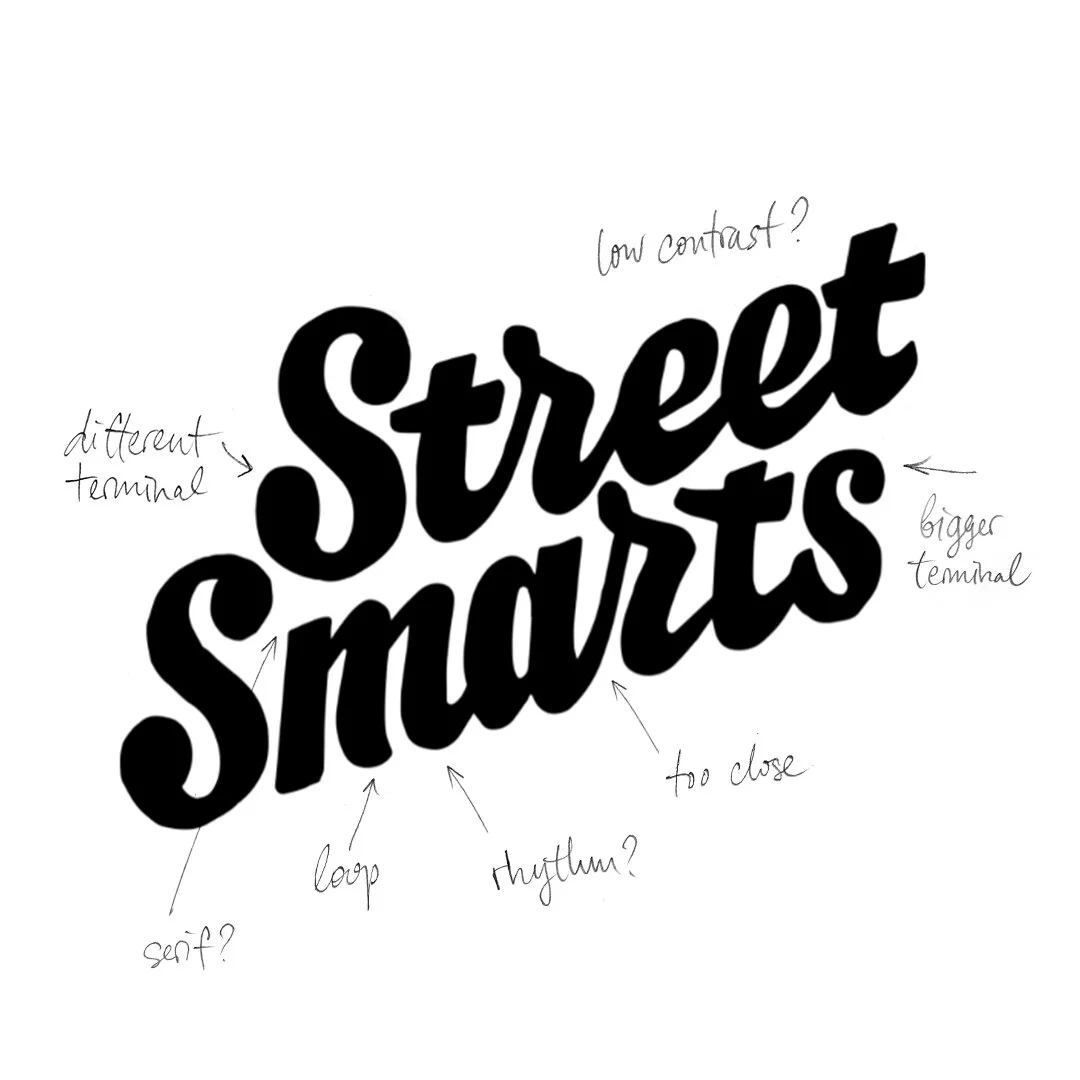
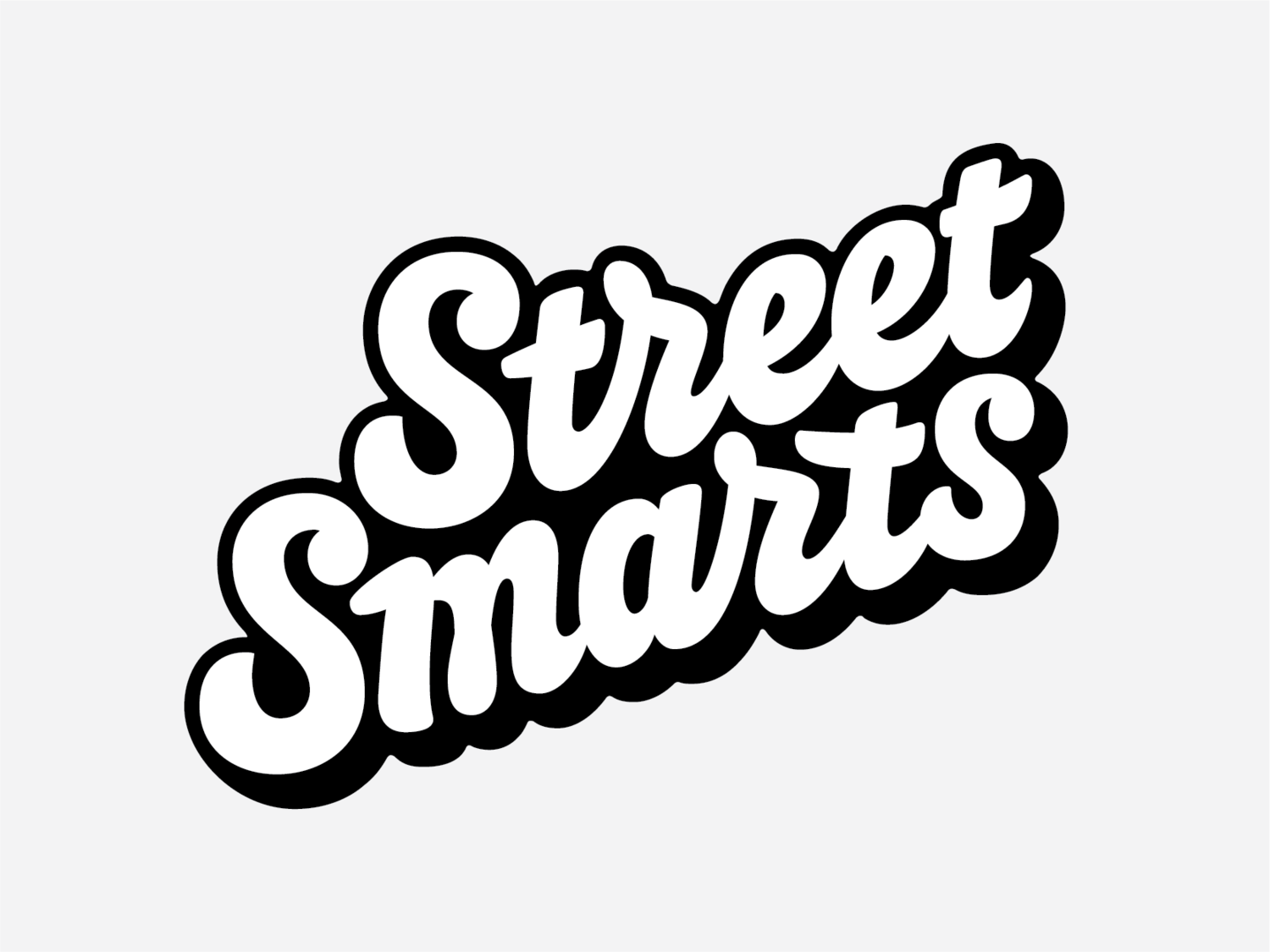
The idea was to create brand awareness around Street Smarts – a profile curating hand-written gems found on the walls of any corner of the world.


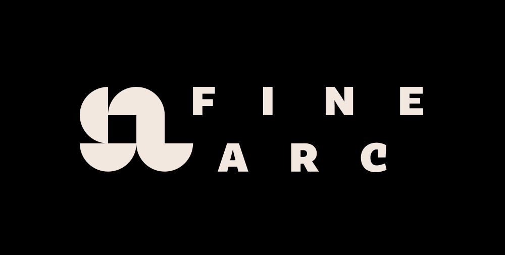
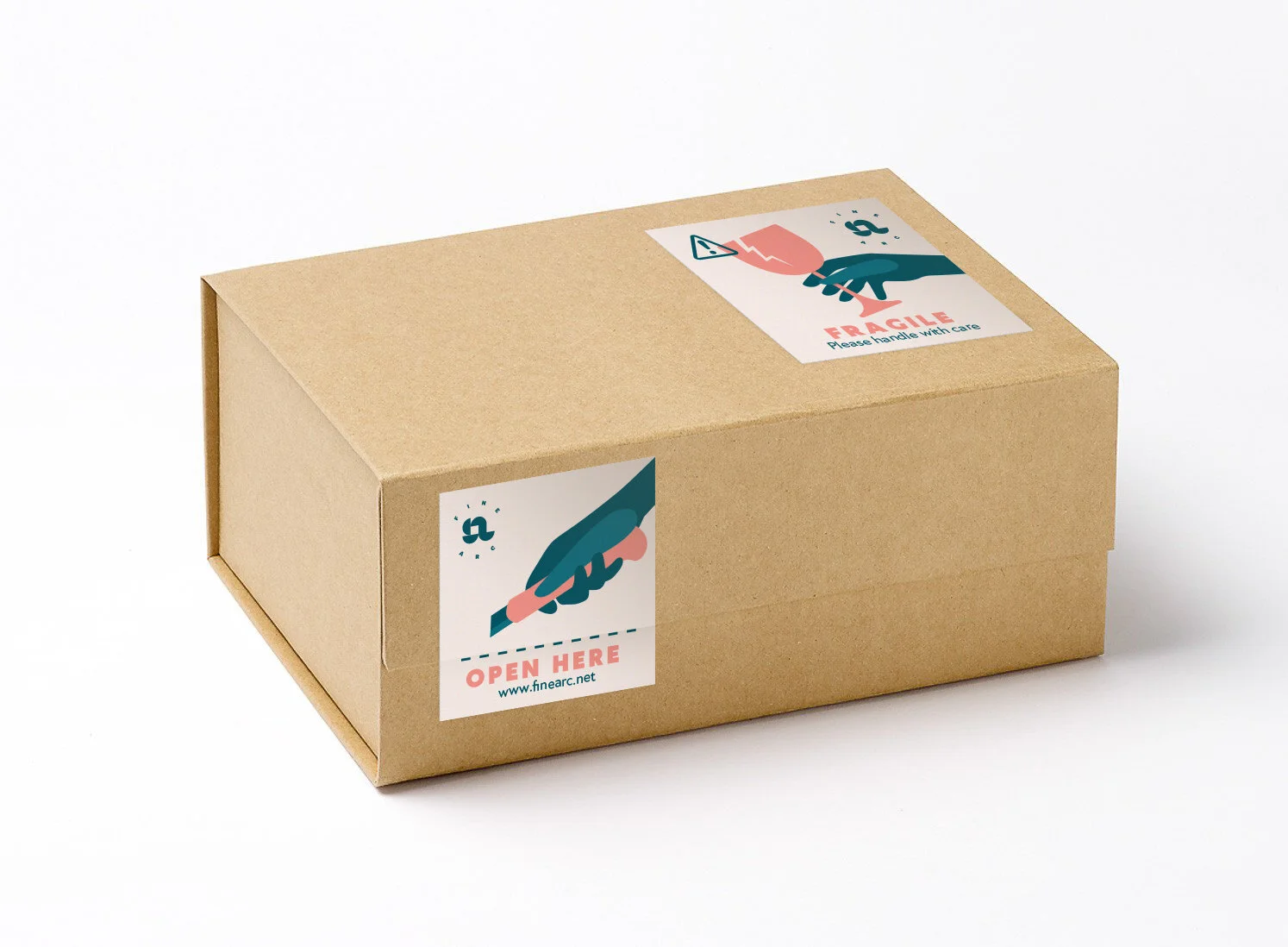
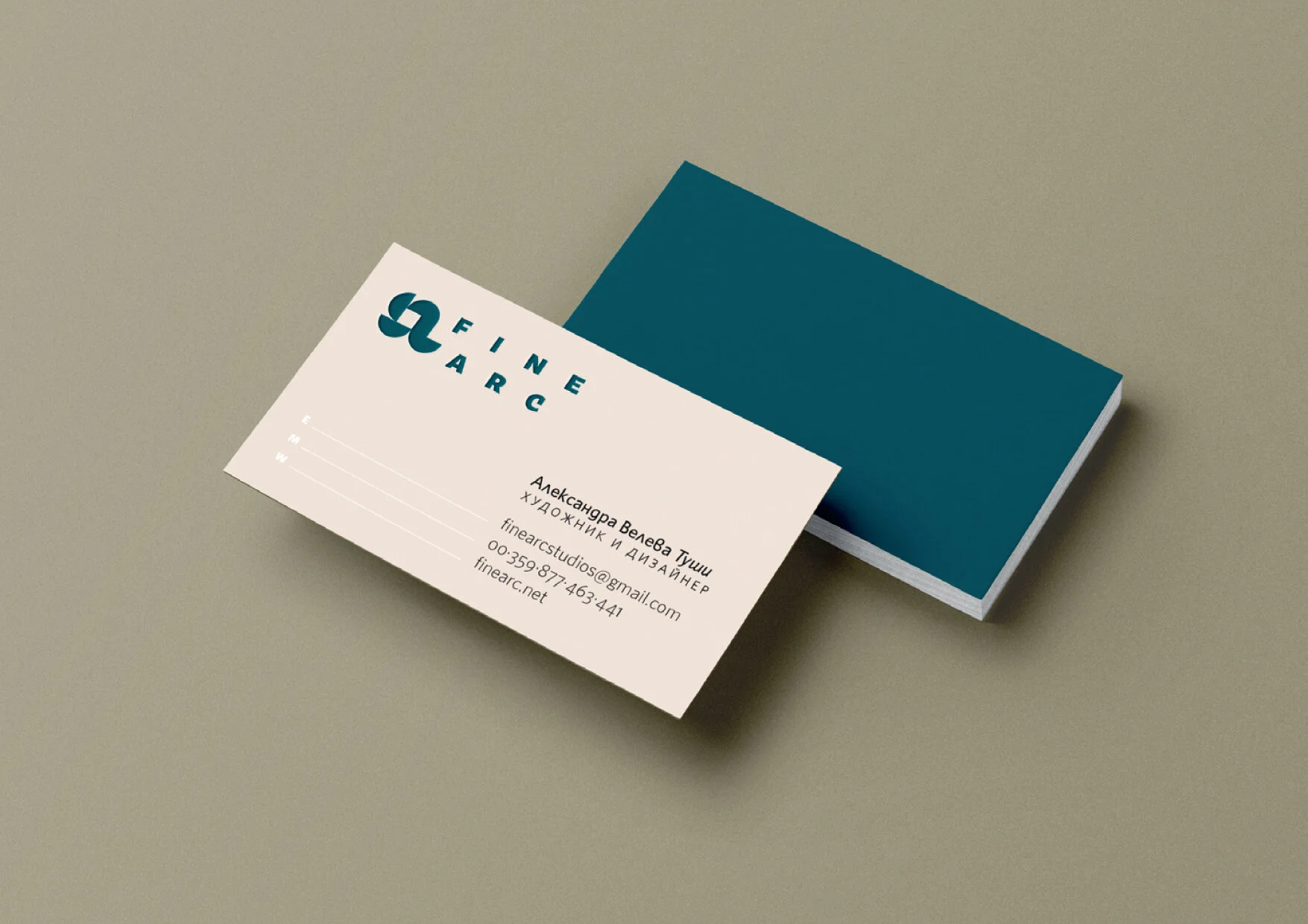
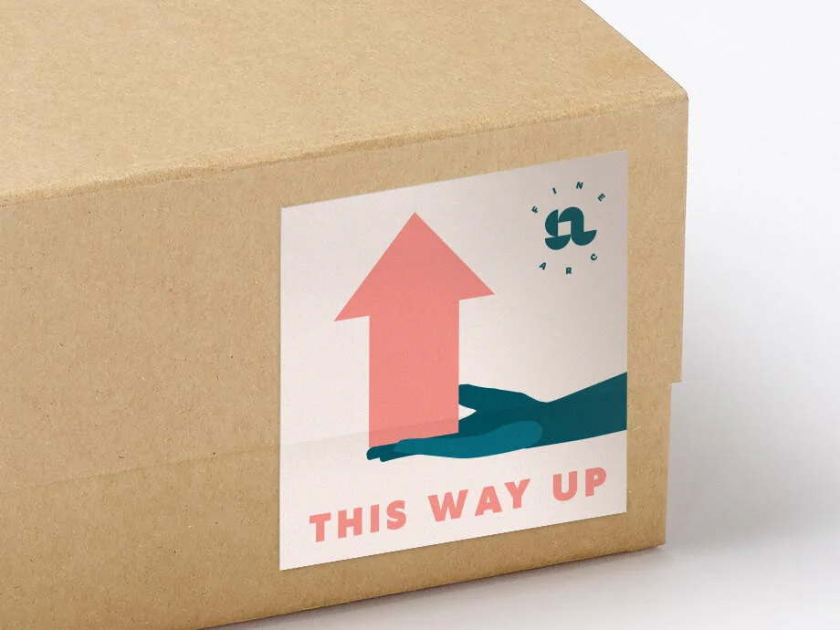
Client: Fine Arc
Project: Branding
Work by: Todor Georgiev
Year: 2018
We did this logotype a while back for our friends at Fine Arc Studio. They are a young couple of talented artists and glass workers with an eye for fine design. Their concept is that every material has its own attributes and depending on the project they choose what is most suitable for their expression. Be sure to check out their work.


Client: Self-initiated
Project: Type design
Calligraphy by: Jacklina Jekova
Type design by: Jacklina Jekova & Todor Georgiev (support)
Presentation by: Jacklina Jekova & Todor Georgiev
Year: 2021
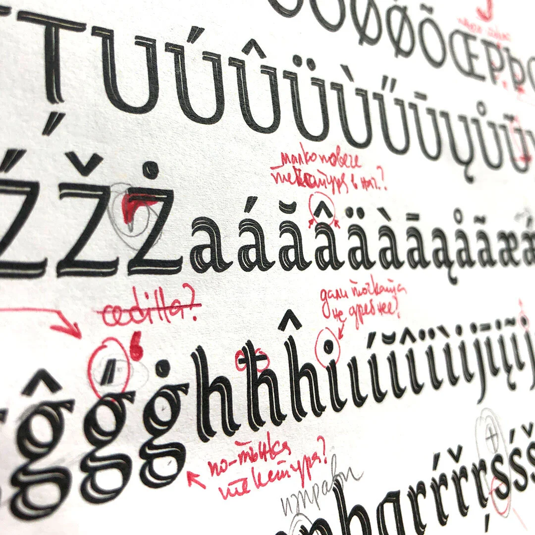
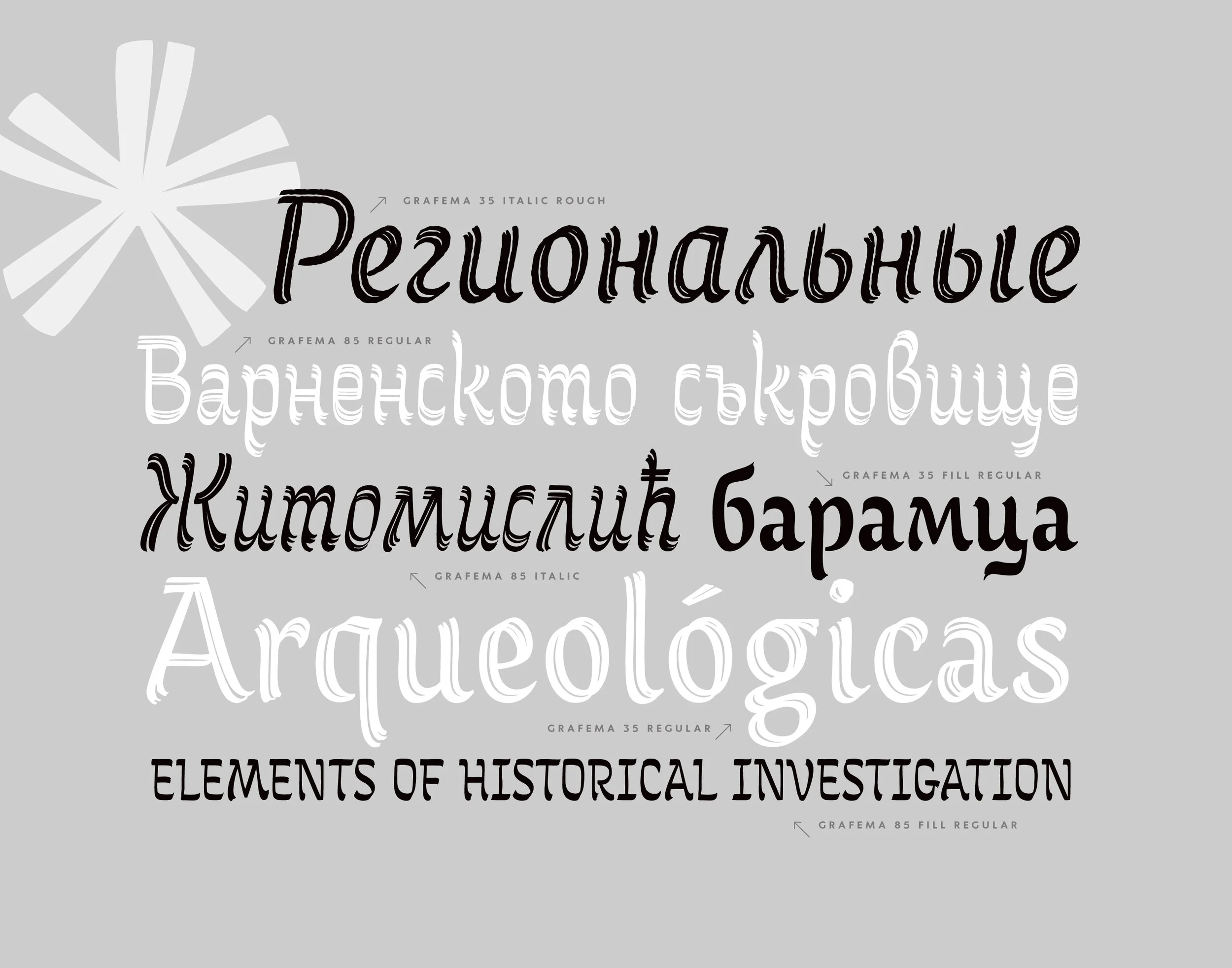
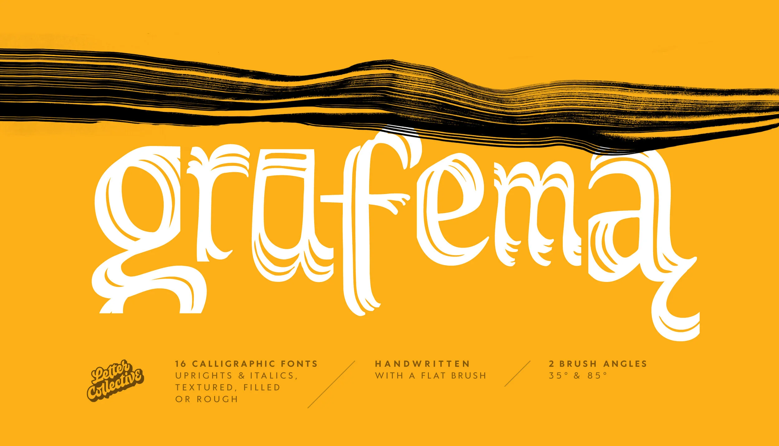
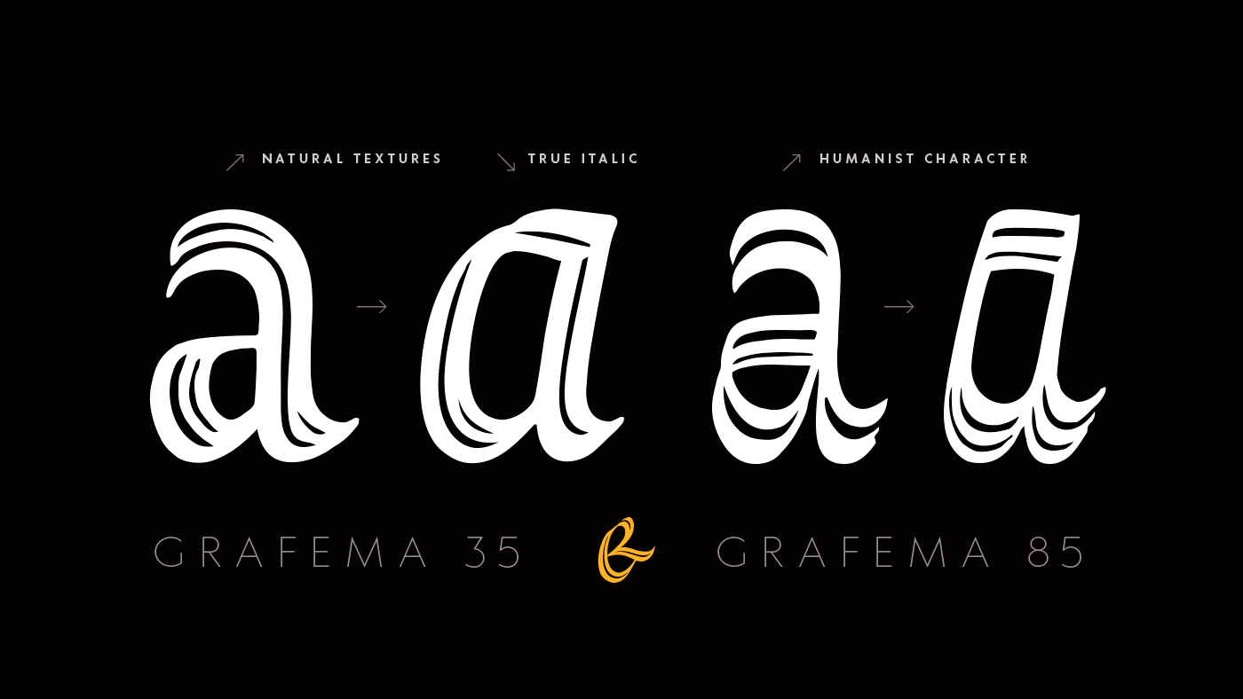
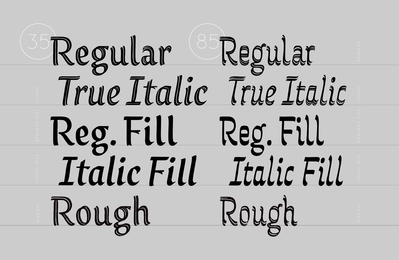
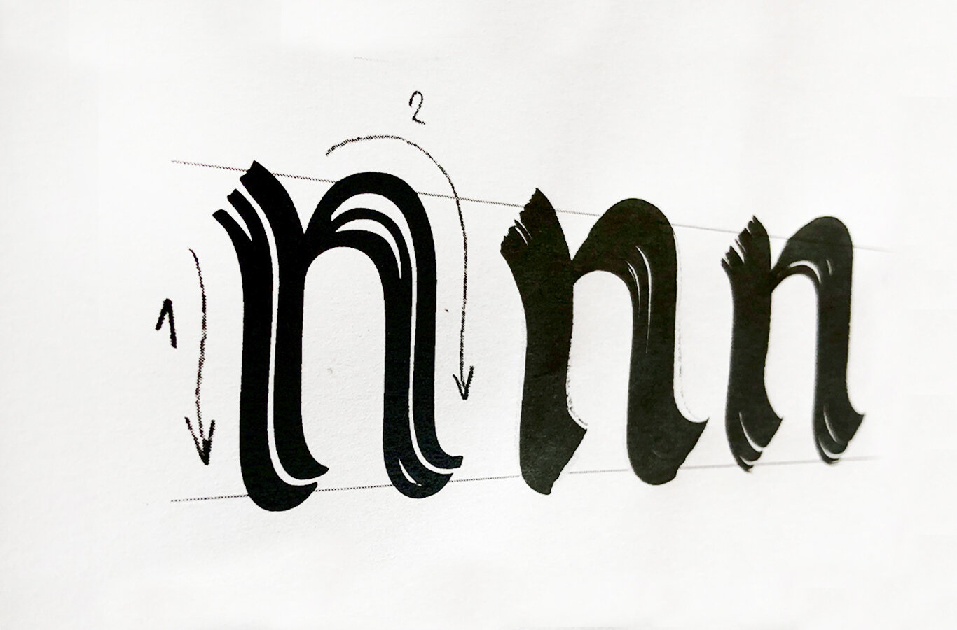
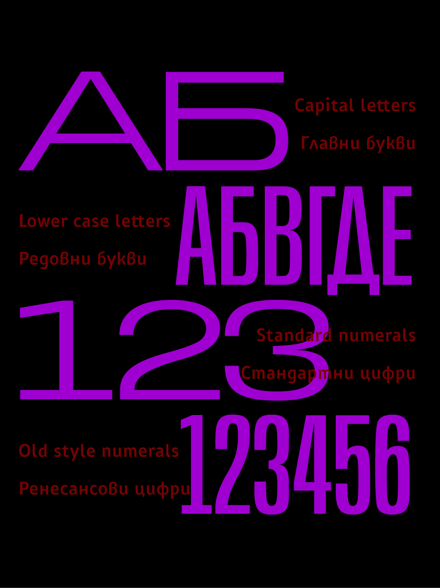
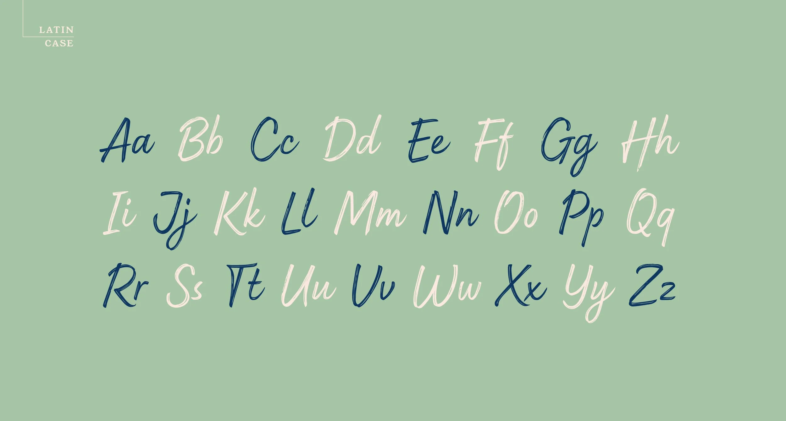
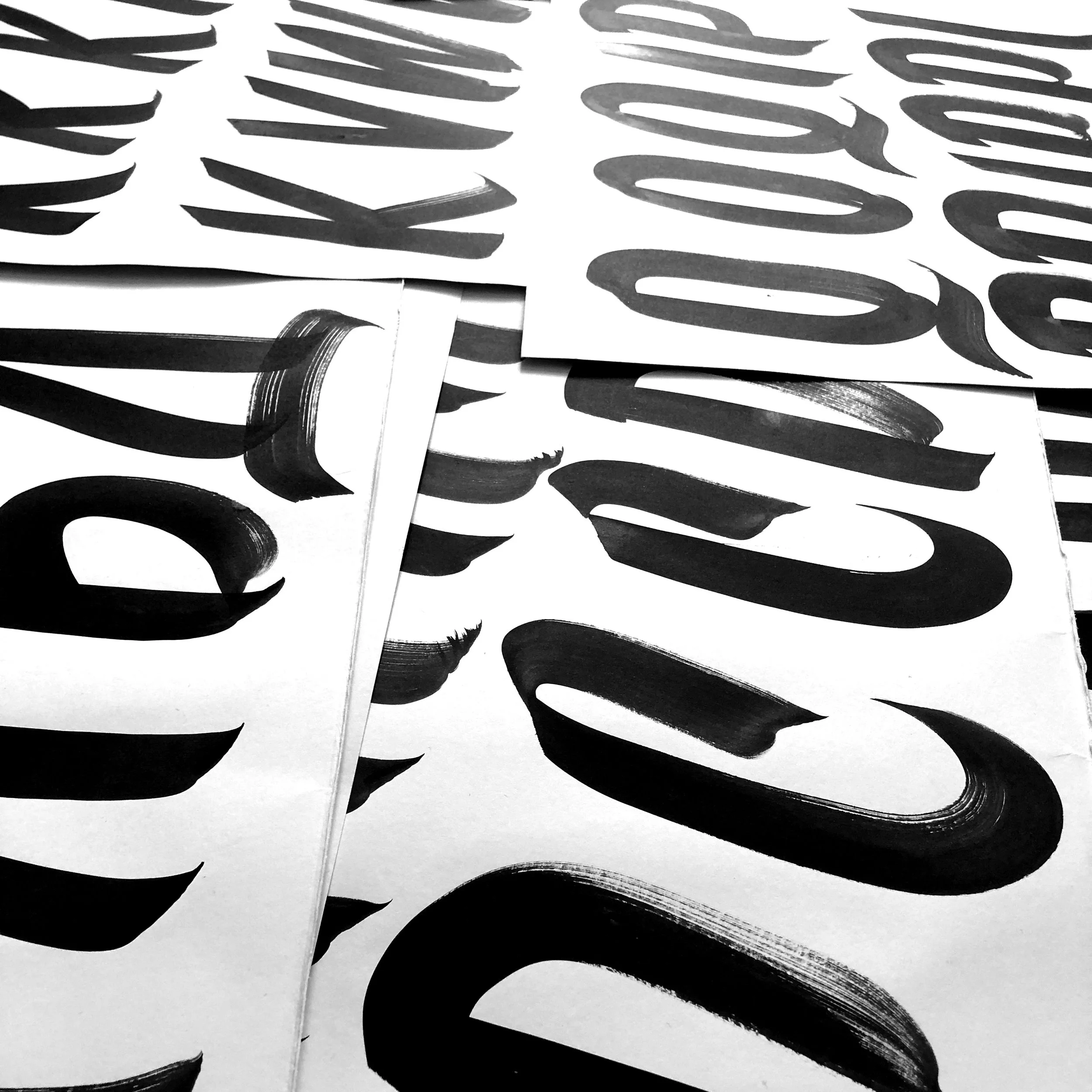
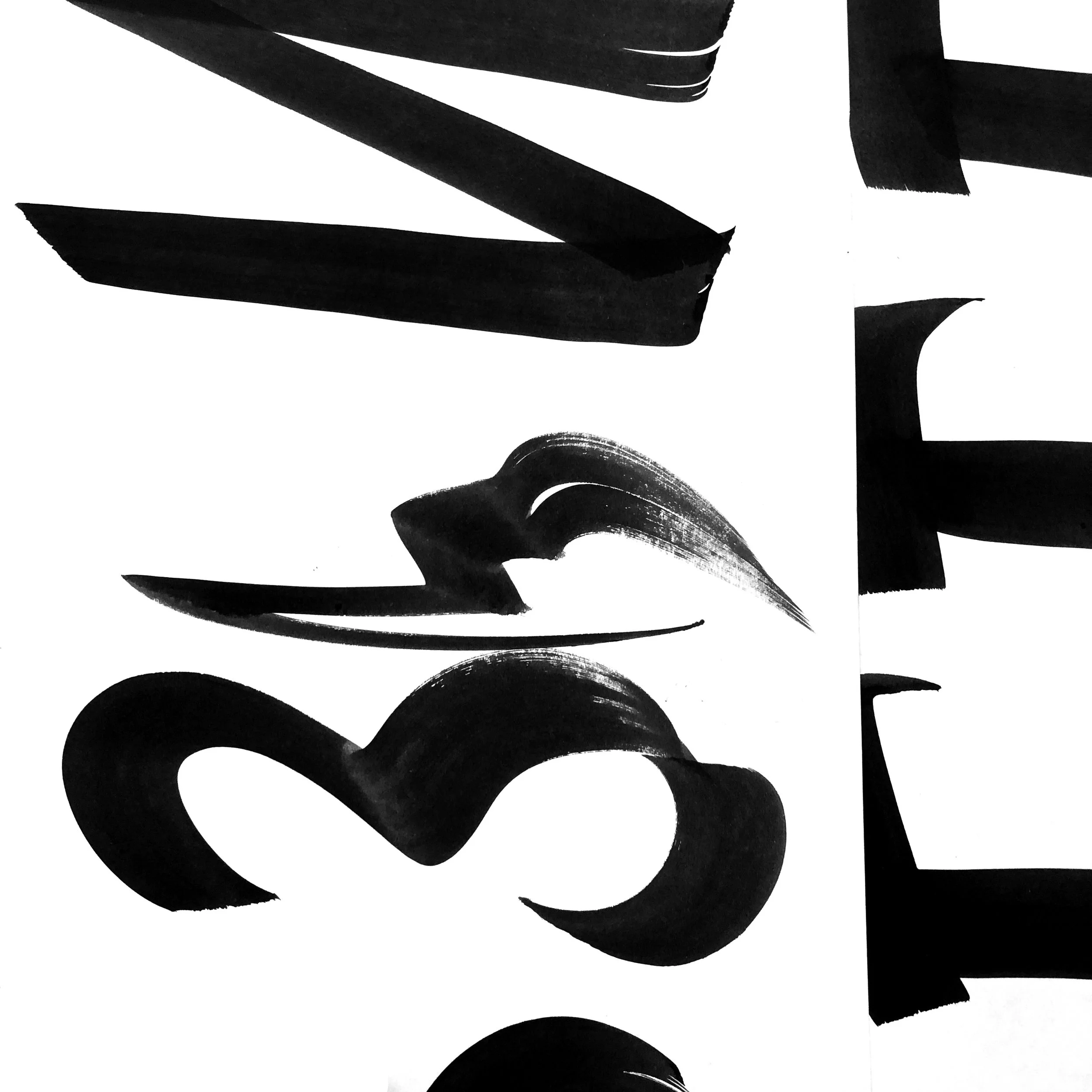
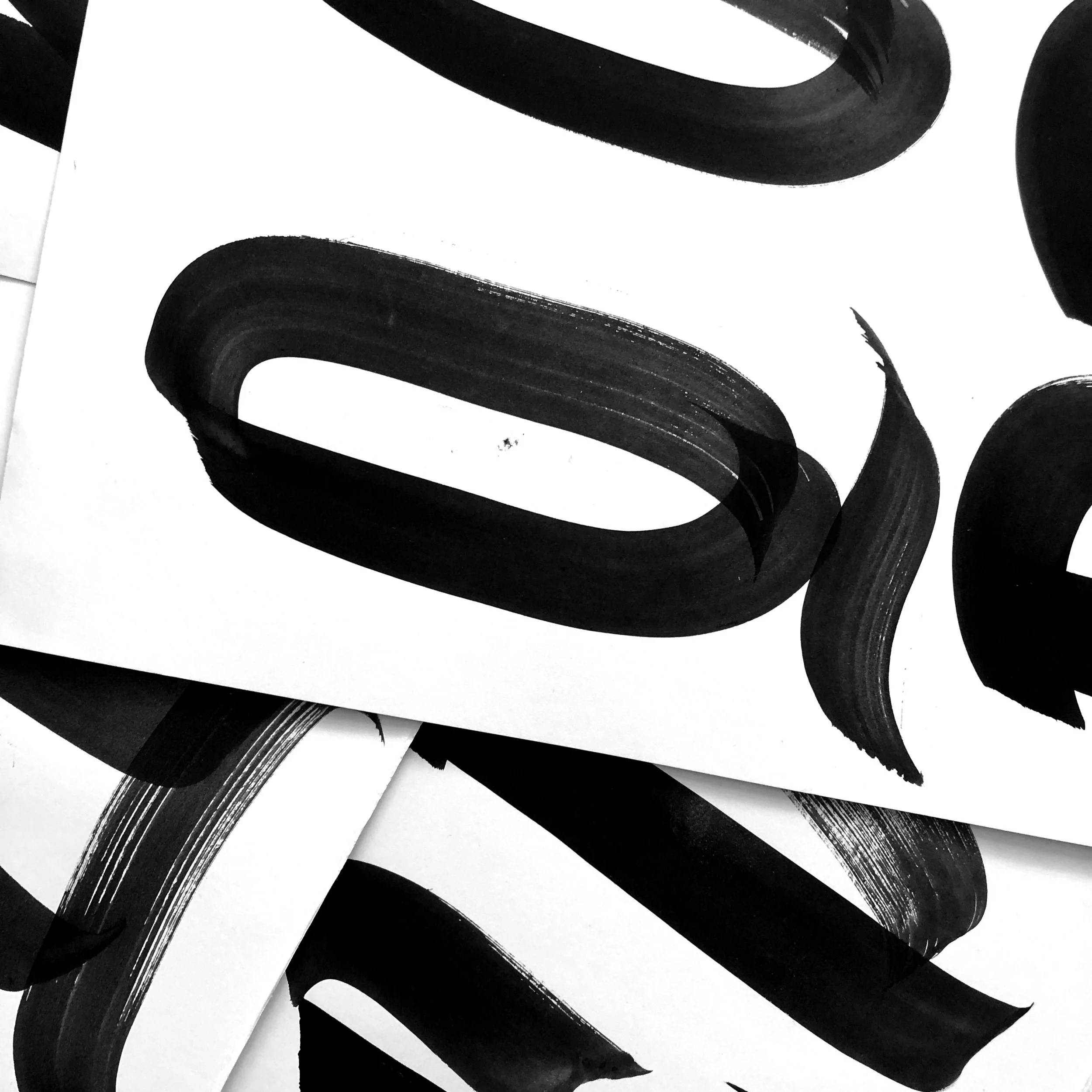
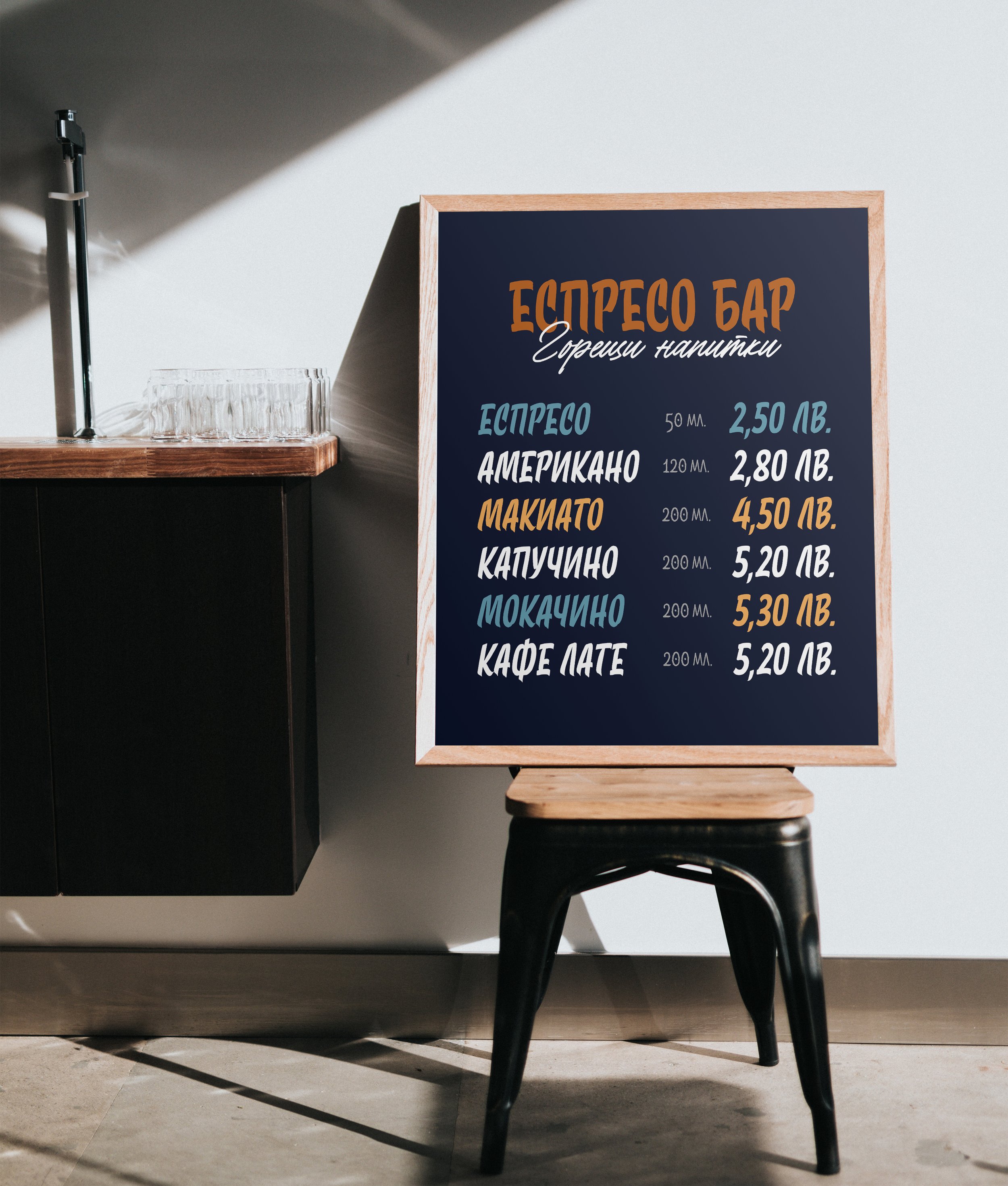
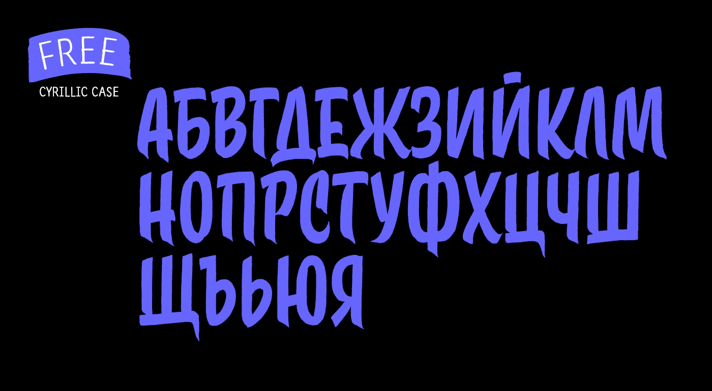
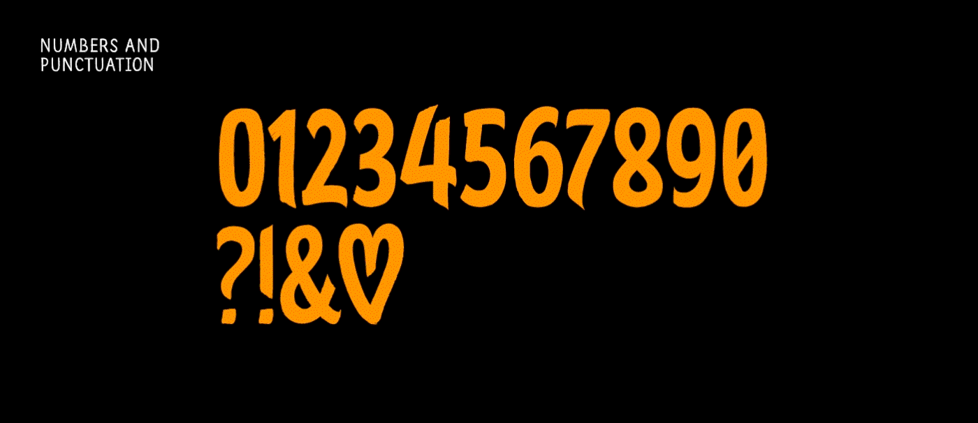
Grafema LC is a system of display typefaces consisting of 7 variants – upright, italic, textured, filled, rough, traditional contrast and inverted. Grafema LC started off as handwritten calligraphic works using a flat brush and variable angles of writing – 35° and 85°. It supports Extended Latin and Extended Cyrillic – more than 120 languages altogether. The balanced natural texture along with unique details makes Grafema LC perfect for headlines, but also suitable for lengthier texts. It is ideal for use in all kinds of graphic design projects such as the packaging, posters, logotypes, greeting cards and of course online content.
Grafema 35 has a more classical angle of writing – 35°, which makes the vertical stems of the letters broader since they utilize most of the instrument’s width. This cut is balanced throughout and suitable for large bodies of text.
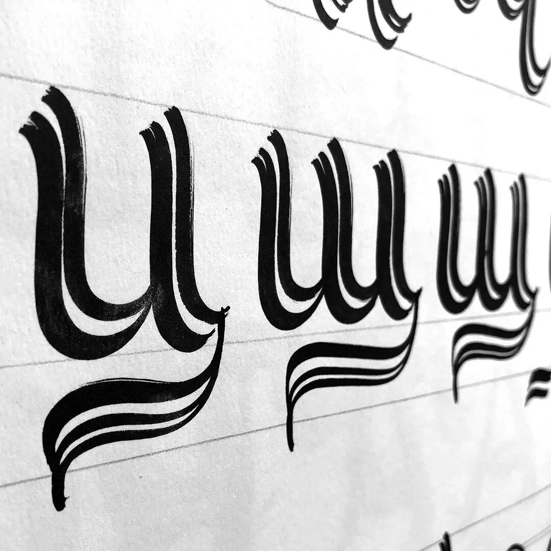
Grafema 85 stands out with its more decorative appearance and is more appropriate for usage in headlines, posters and all projects created with a personal touch. The angle of writing shifts the stress immensely and therefore reforms the overall proportions of the letter. This style is more condensed than the other and is easily distinguishable with its thin vertical stems and accentuated heavy serifs.


Both main weights of the Grafema family are distributed freely as demo versions for use by students and designers as well as everyone who has an interest in calligraphy and typography. The free fonts contain a basic set of uppercase and lowercase letters solely in Cyrillic and more precisely its Bulgarian local forms. You will also find standard lining figures and basic punctuation in the fonts’ palettes.
Try demo versions

(Bright holidays)
We were invited by Superhosting.bg to create a unique Christmas holiday greeting card for their special customers and friends. We started off with a lot of pencil drawings, of course, and then did the necessary precision digitization. We also had the task of managing production – we searched for the most appropriate paper stock and hot foil. The printing itself was done by inkpression – a studio focused on foiling, embossing, and letterpress. And we have to say it was a pleasure collaborating with them.
The final touch was the personalized handwritten inscriptions on the back of each greeting card. We did a total of 50 different wishes, all done with golden ink. The greeting card was a complementary element to a jar full of handmade chocolate candies made by Delifideli.


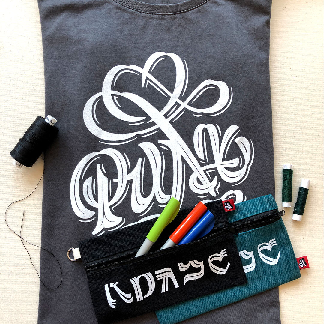
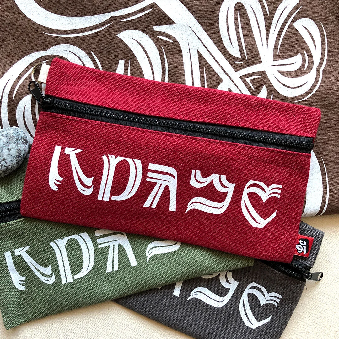
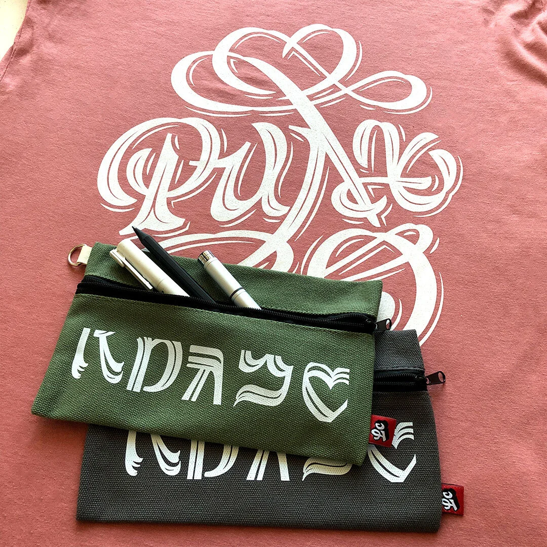
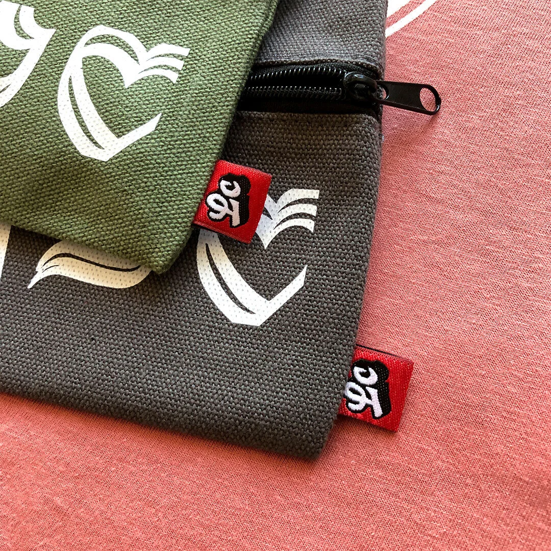
Self-initiated
Project: Merch
Work by: Todor Georgiev
Year: 2019
This is our very own product line of apparel for type nerds as well as those who appreciate fine design. Currently, we have t-shirts, tote bags, embroidered patches, and pencil cases available in several typographic styles.

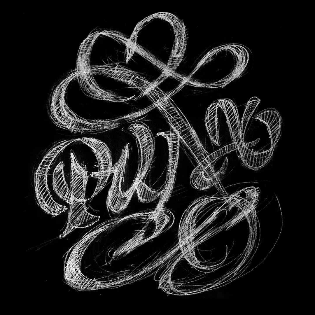


We design the typographics for the t-shirts and have them screen printed on 100% organic cotton. We do not sew them on our own, however, we do stitch on the labels ourselves. We have several sizes and colours available. Feel free to write to us if you are interested in purchasing some for you and your close ones. Stay tuned for more designs soon.


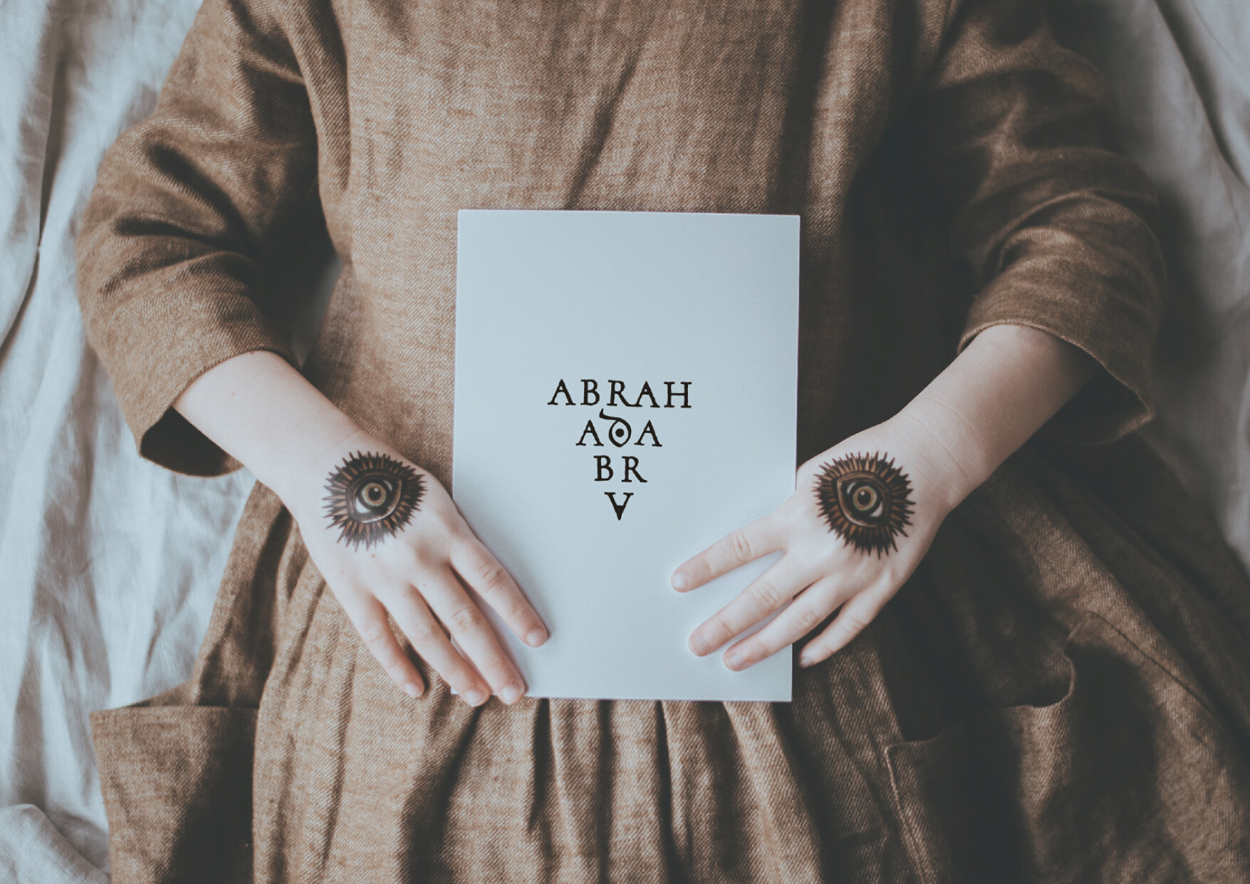
This project was commissioned by a group of lovely ladies who organize spiritual meetings with a focus on esoterics and astrology. A fair bit of witchery and magic is involved including rituals, amulets, and tarot cards. The main objective was to concentrate the typography around the symbol of the triangle and to incorporate an eye into the composition.
The client loved the final logotype so much she decided to have it tattooed on herself. Now that’s the kind of outcome we are going for on each project.


It is a long established fact that a reader will be distracted by the readable content of a page when looking at its layout. The point of using Lorem Ipsum is that it has a more-or-less normal distribution of letters, as opposedt is a long established fact that a reader will be distracted by the readable content of a page when looking at its layout. The point of using Lorem Ipsum is that it has a more-or-less normal distribution of letters, as opposed distracted by the readable content of a page when looking at its layout. The point of using Lorem Ipsum is that it has a more-or-less normal distribution of letters, as opposed looking at its layout. The point of using Lorem Ipsum is looking at its layout. The point of


Client: Self-initiated
Project: Type design
Work by: Todor Georgiev
Year: 2021
Laptev Brush is a single weight experimental typeface inspired by old Venetian type and realized as a humanistic Grotesk based on writing with round pointed brush.
The idea is for it to become part of a series of fonts which contain solely Cyrillic letters in their Bulgarian form. To sustain this they will be distributed free of charge in order to promote and encourage the use of Bulgarian Cyrillic.


The occasion for the creation of this typeface is the anniversary catalogue made for the 60th anniversary of the painter Rumen Laptev (1957 - 2013).
The rough texture contrasting with the elegant letterforms is a refference to his work. The font is used for the headlines and large quotes but its high legibility makes it perfect for small long texts.


Laptev Brush is free for personal use as well as for commercial use. In case you support this cause please feel free to share your designs while mentioning us.
Thank you!
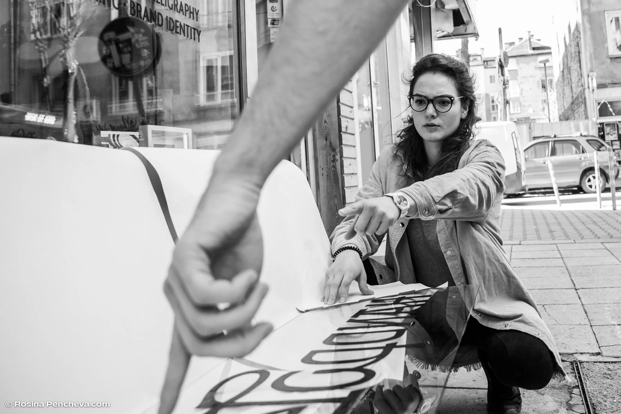
We are honored to have taken part in such a large and meaningful project. Studio Punkt invited us to hold a workshop for Plovdiv Typeface.
We started off with a lecture on handwriting, its graphological aspects and how that translated into penmanship. Later on everyone had the chance to try and experiment with different calligraphic tools and styles.
A big thanks to all the participants for their interest and concentration to write by hand.
Don’t forget to download the free font package Plovdiv typeface.
Thanks to Rosina Pencheva for the awesome photos!


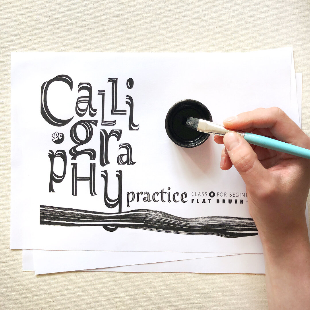
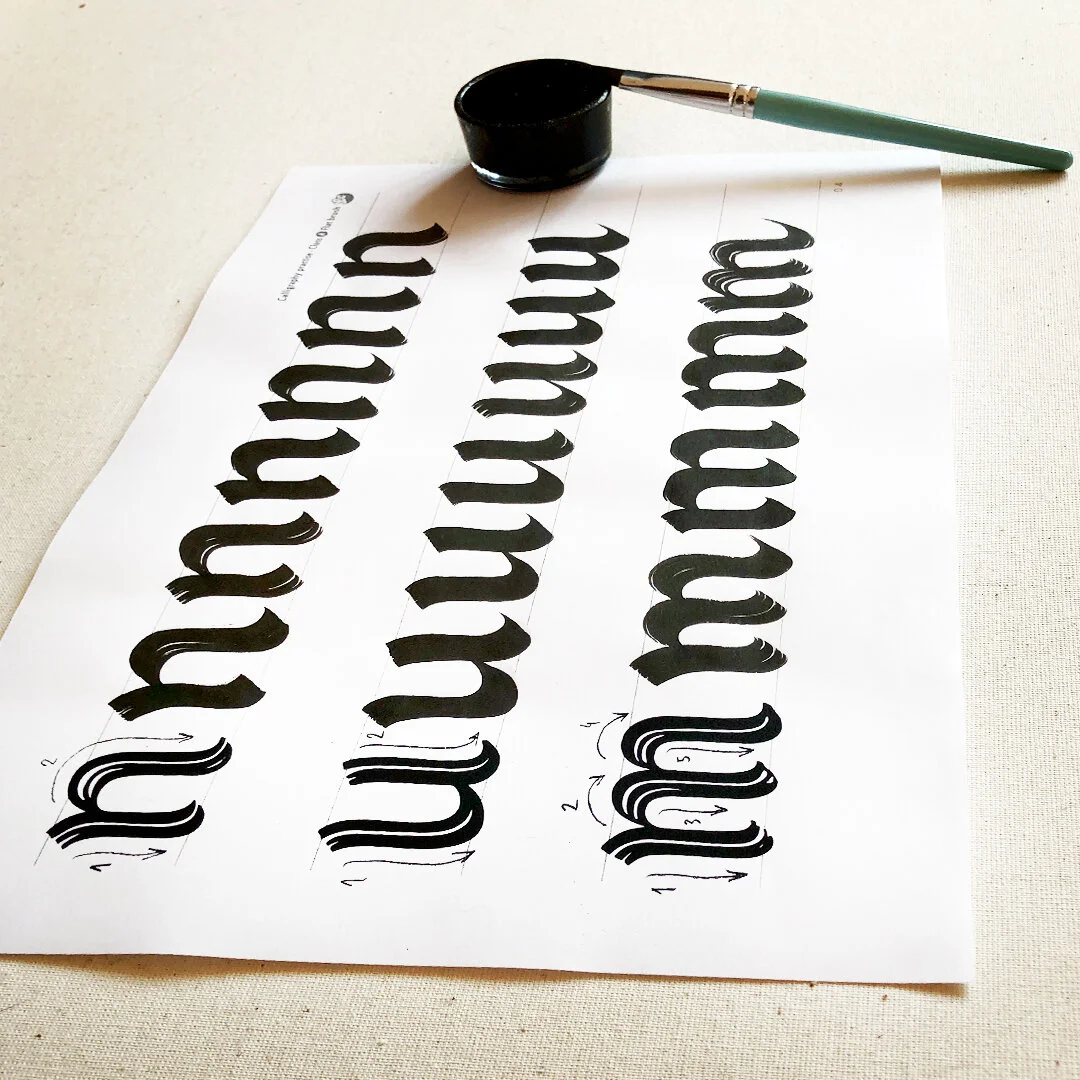
A series of classes suitable for everyone interested in the art of beautiful handwriting and calligraphy.
Class A is free and perfect for beginners who want to learn the basic parameters in typography and the basic lowercase letters of the Latin and Cyrillic alphabet. The calligraphic tool in this class is a flat brush.


Just a few steps before you start:
1. Find a nice flat brush (1cm width) and some ink;
2. Download the two versions and print them in A4.
3. Find a quiet place to practice.
Enjoy!
We'll be really happy if you share your results. Tag us or send us photos on our mail. An advanced class is coming soon!
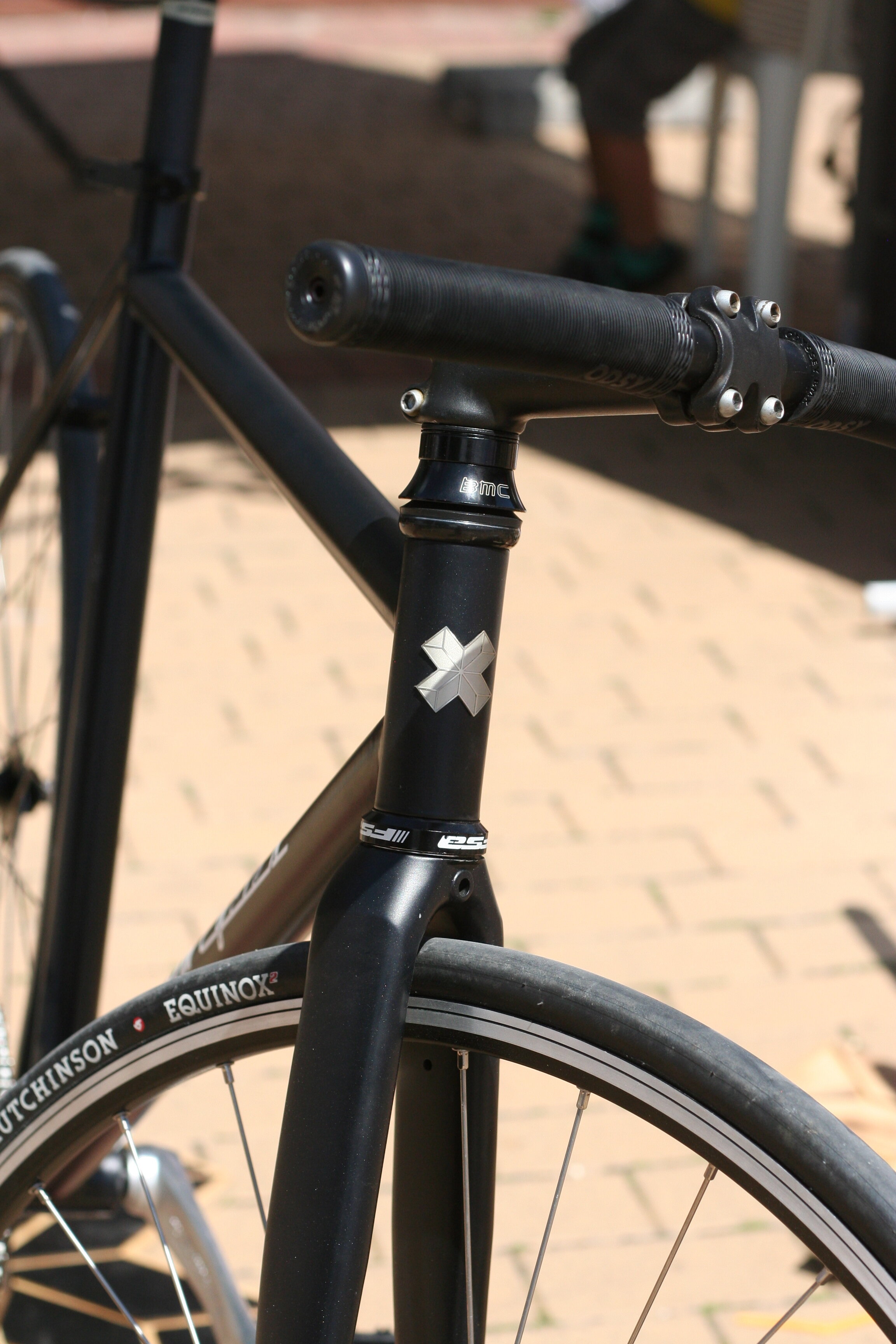
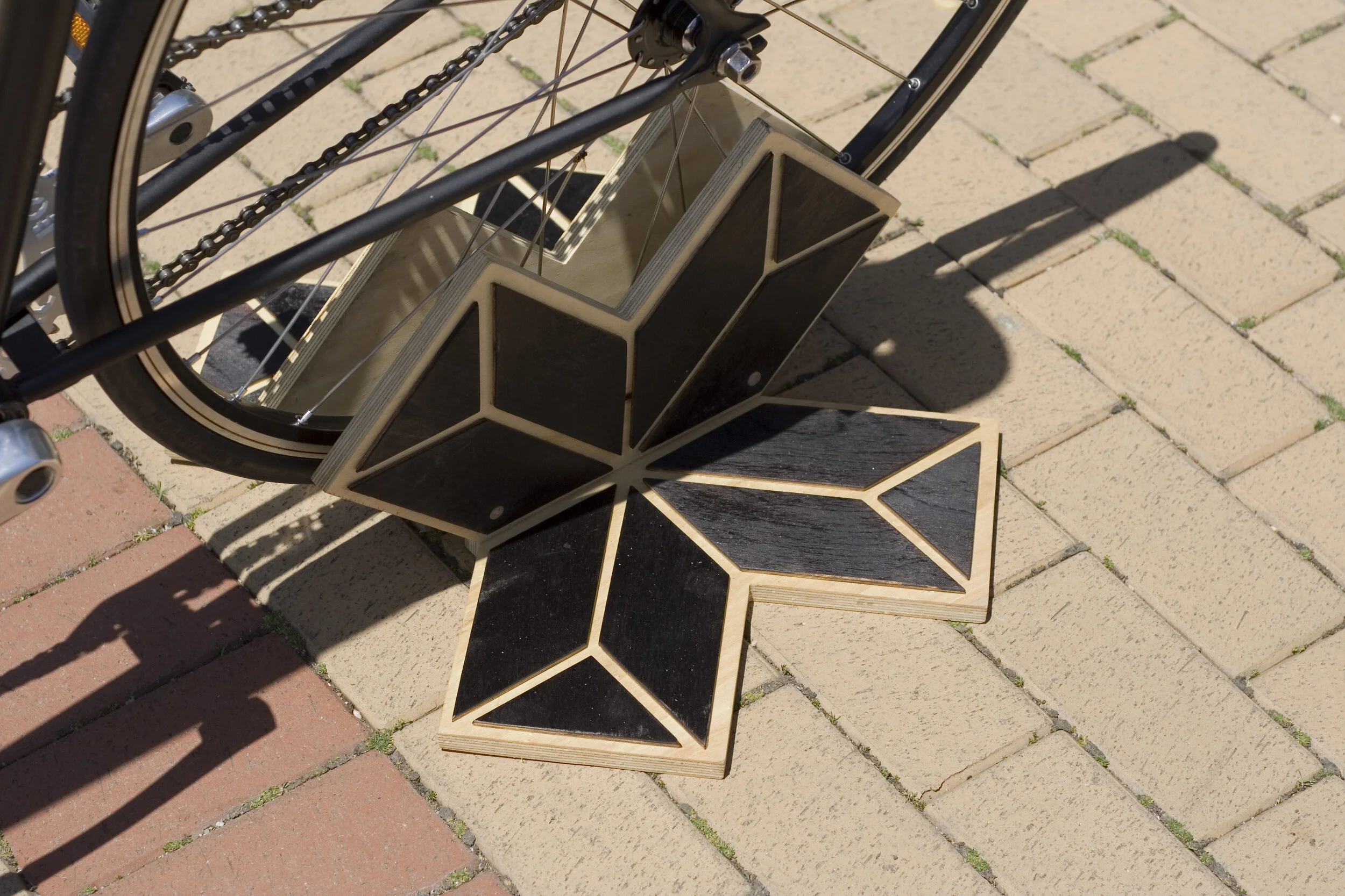
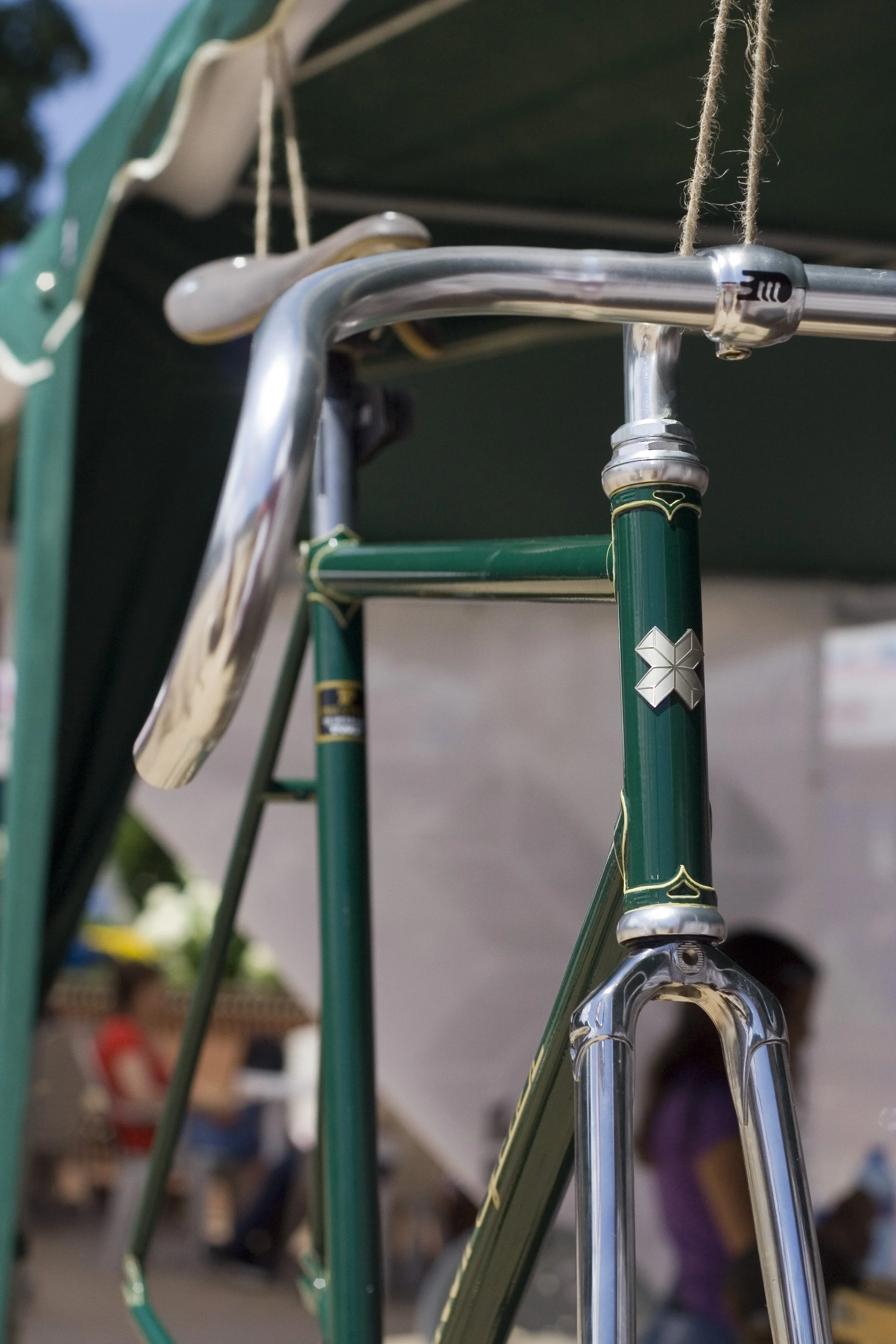
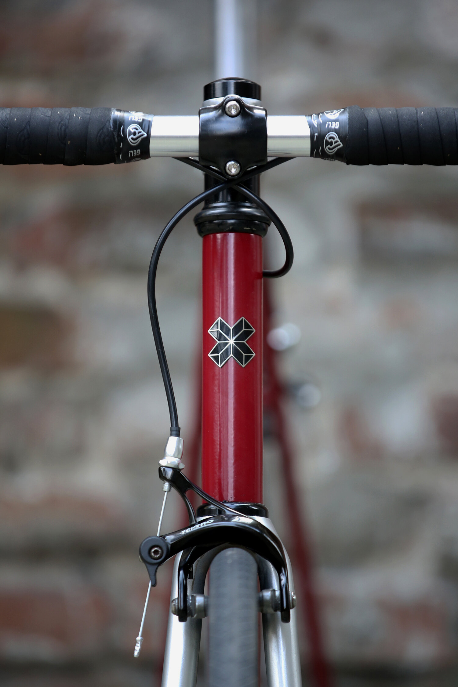
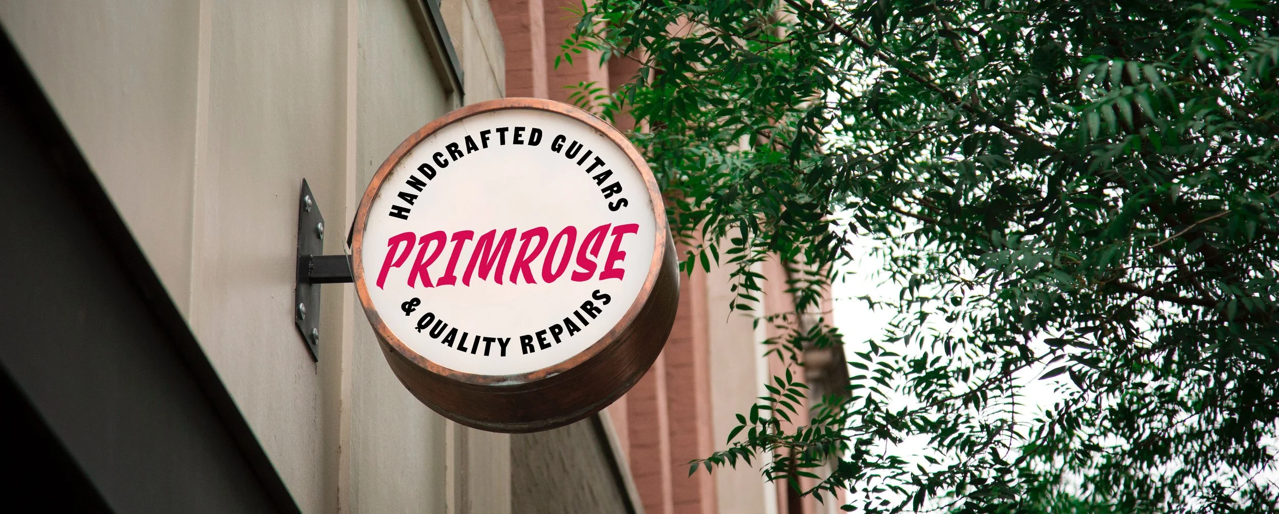
Client: Boycott cycles
Project: Logo design
Work by: Todor Georgiev
Year: 2016
Boycotts are a few friends, united by their love for design and bikes, who choose to live and work putting all of their hearts into every detail. Nowadays this is an act of rebellion, hence the name BOYCOTT.
“Nothing man-made is perfect. And there’s no need for it to be so. But it always has to express man’s uniqueness and individuality.”
A project we worked on back in 2016. Blending shapes from traditional Bulgarian embroidery with an X to stand for the symbol of a boycott.
We love bikes and it has been so satisfying seeing our mark live a happy life of constant motion.


Client: Delivino
Project: Lettering & Branding
Work by: Todor Georgiev
Year: 2019
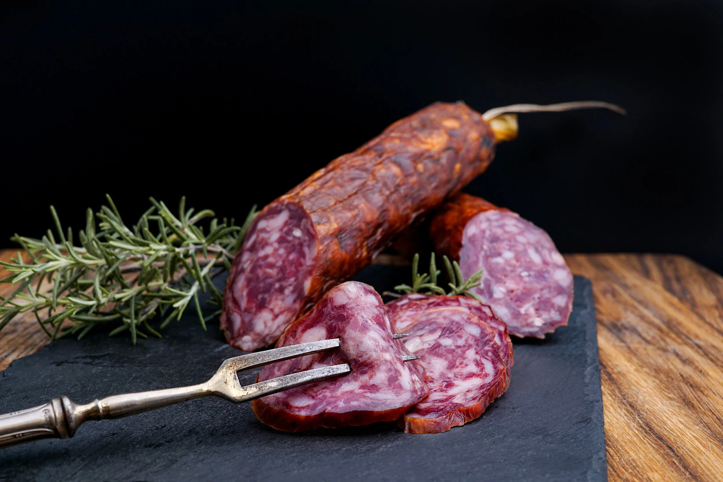
An Italian deli store based in Umbria, open since 1968. Delivino offers typical local delicacies particularly extra-virgin olive oil, wine, truffles, legumes, cheeses, and cured meats, including organic ones. The client wanted to have a unique logotype with a natural character based on lettering. We also had to design a small set of icons to match and we did basic stationery branding. If you are planning to travel to Italy, don’t miss to check the region of Umbria and Delivino`s delicacies.


Contrasta
Client: Self-initiated
Project: Type design
Work by: Todor Georgiev
Year: 2021
Named after one of the font’s base features – lots of contrast between thick and thin. Comes in 1 Heavy weight.
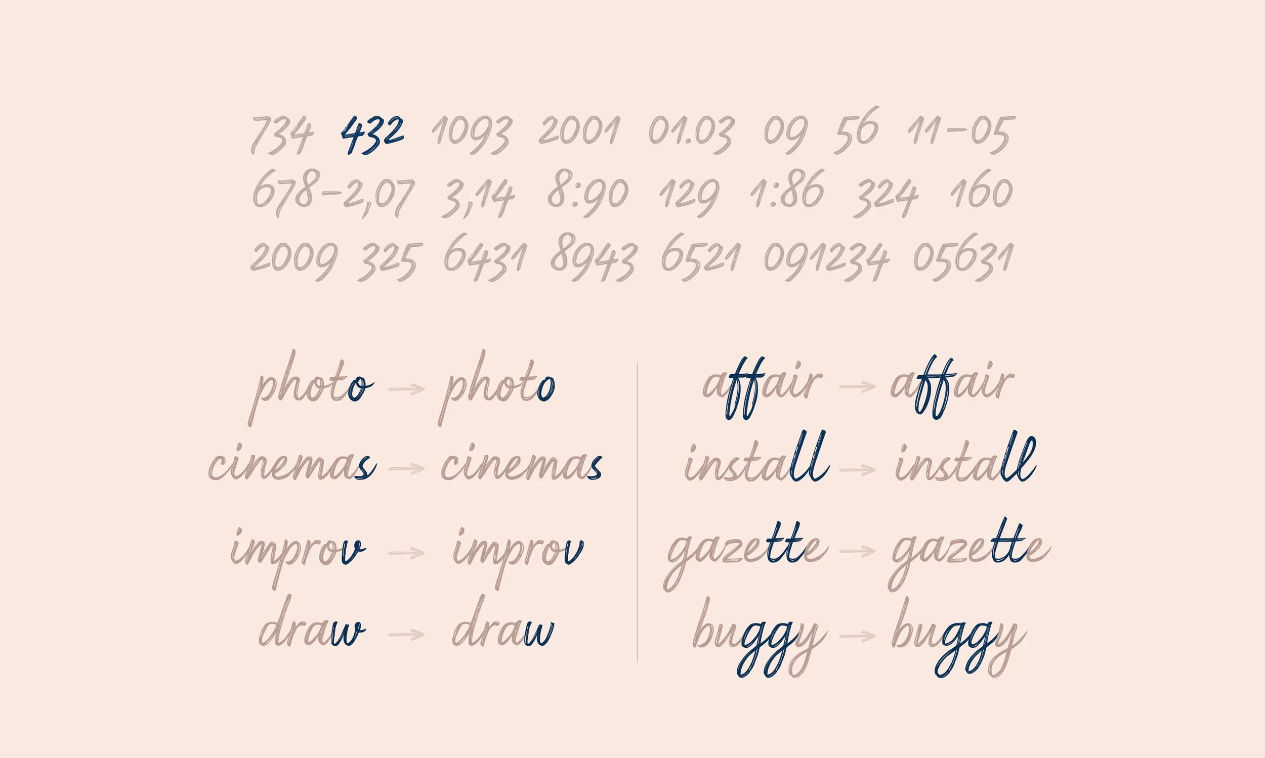
Inspired by Todor Georgiev’s lettering pieces done over the past years and experimentations with letter shapes, combined with the current trends. Contrasta revolves around the idea of not looking like a font at all. The mechanism behind it relies on numerous substitutions happening live as you type as long as the basic [liga] feature is turned on. This results in differing combinations depending on the sequence of the letters. To achieve this Tozzi made 200+ alternates and ligatures, governed by 1400 lines of code which control the Open type features. Baseline, x-height and width may vary from time to time depending on the letter combinations.
Constrasta pairs letters automatically as you type as long as the basic ligature function is turned on.
Some combinations are merged into ligatures while others fit together as two (or more) puzzle pieces. In some cases the sequence is based solely on similar and complimenting shapes.
These automated letter swaps are available to the lowercase only. Uppercase is fitted with a few ligatures.
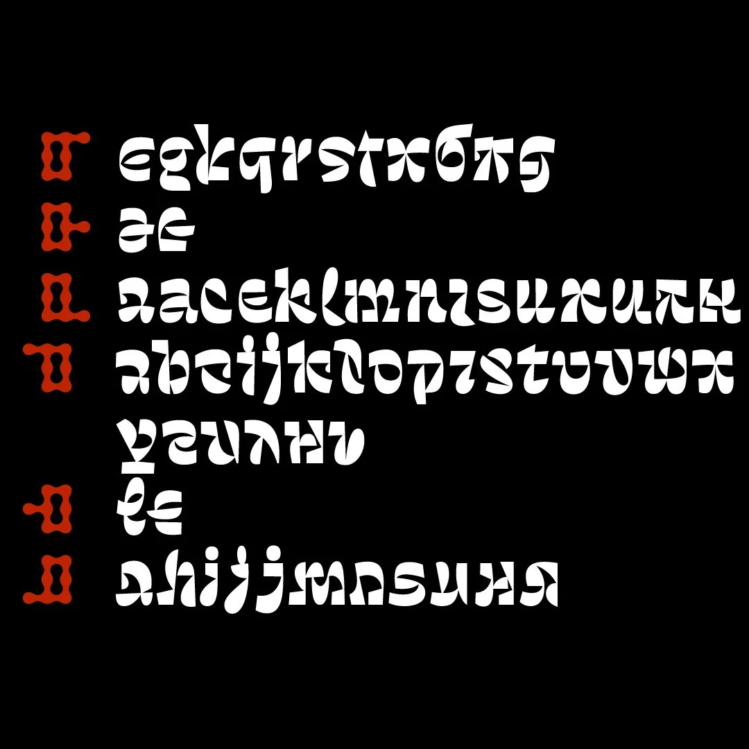
Puzzle fitting is divided into 6 main categories. Whenever aesthetically pleasing and possible, letter pairing is governed by this joinery principle.
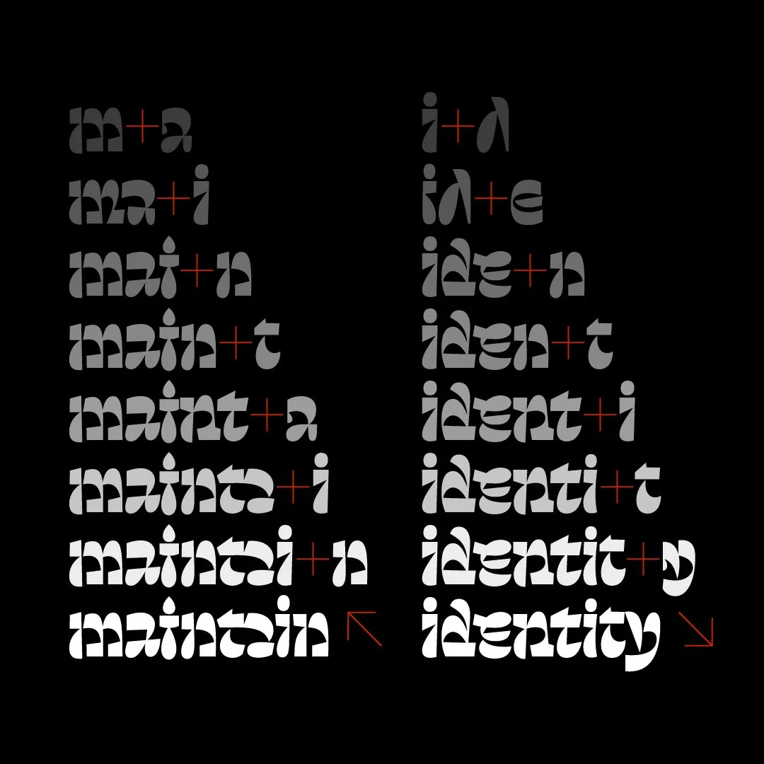
Automated letter swaps produce various unexpected glyph shapes and combinations in the process of typing text.
Notice how two 8-letter words bring out 4 different shapes for "i", 3 for "t", 3 for "n", 2 for "a", etc.
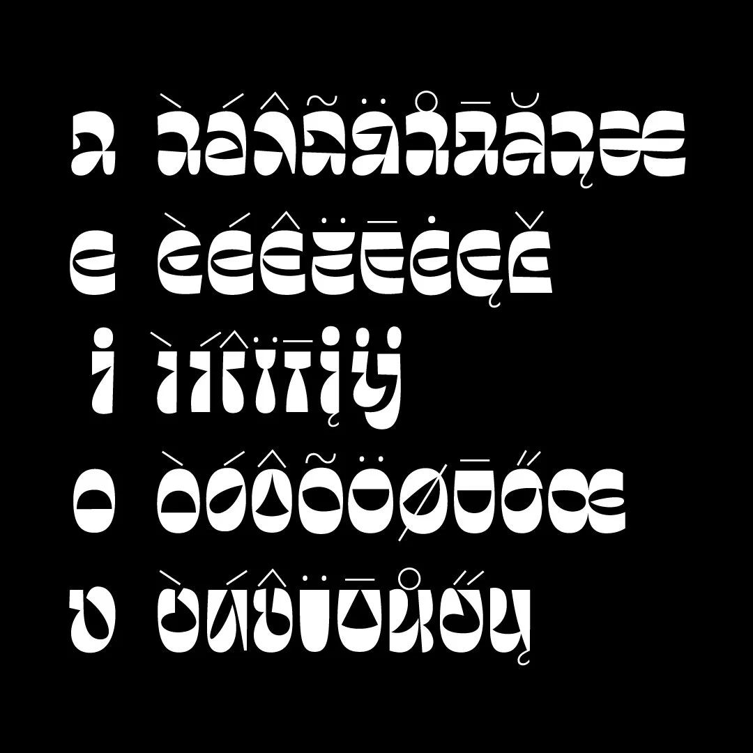
Lowercase letters do not share the same base glyph when it comes to their accented counterparts, digraphs or diphthongs, but rather differ in each individual case.
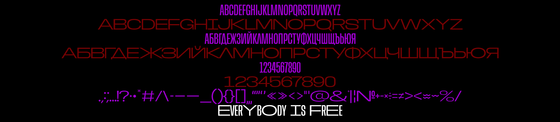
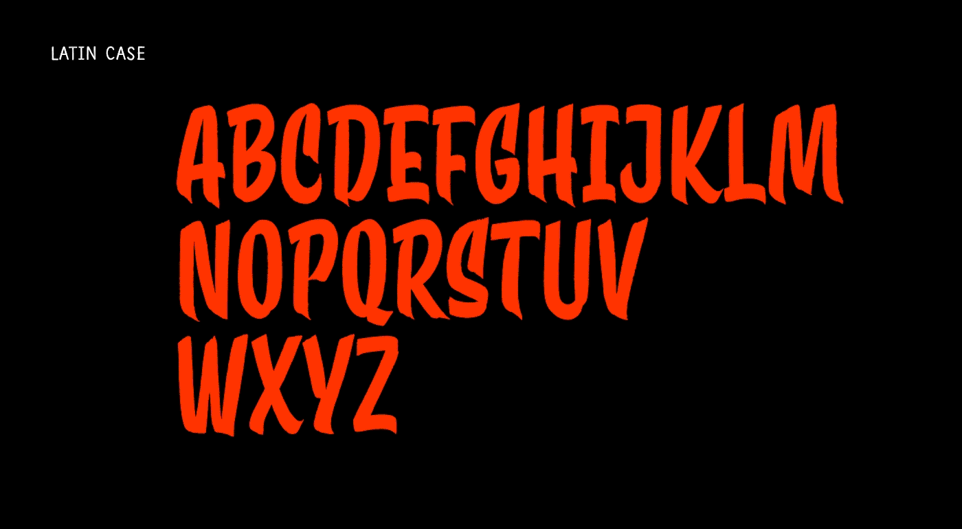
Contrasta features an edgy, brutalist aesthetic with shapes that clash, collide, and coexist. Its forms are a balanced mix between sharp and rounded, highly geometric. Intended to serve as a display face for large sizes and relatively short pieces of text for use in headlines on posters, album covers, festival visuals, apparel, magazine covers and any project which requires a strong and assertive presence, one that stands out and defies conventional norms.
Created with the intent to fill the gap of Bulgarian non-conventional typefaces and motivated by experimentation and exploration.
Glyph count is 674 featuring Latin and Cyrillic script covering 112 languages including English, Afrikaans, Belarusian, Bulgarian, Danish, Estonian, Indonesian, Irish, Icelandic, Spanish, Italian, Latvian, Lithuanian, German, Dutch, Norwegian, Polish, Portuguese, Russian, Slovak, Slovenian, Ukrainian, Hungarian, Finnish, French, Croatian, Czech, Swedish.
Font file is OpenType PostScript (.otf).
Designed & produced by Todor Georgiev in the period 2020–2024. Any feedback is welcome.
Get ready to ditch the conventional.
Get Contrasta.
Everybody is free!
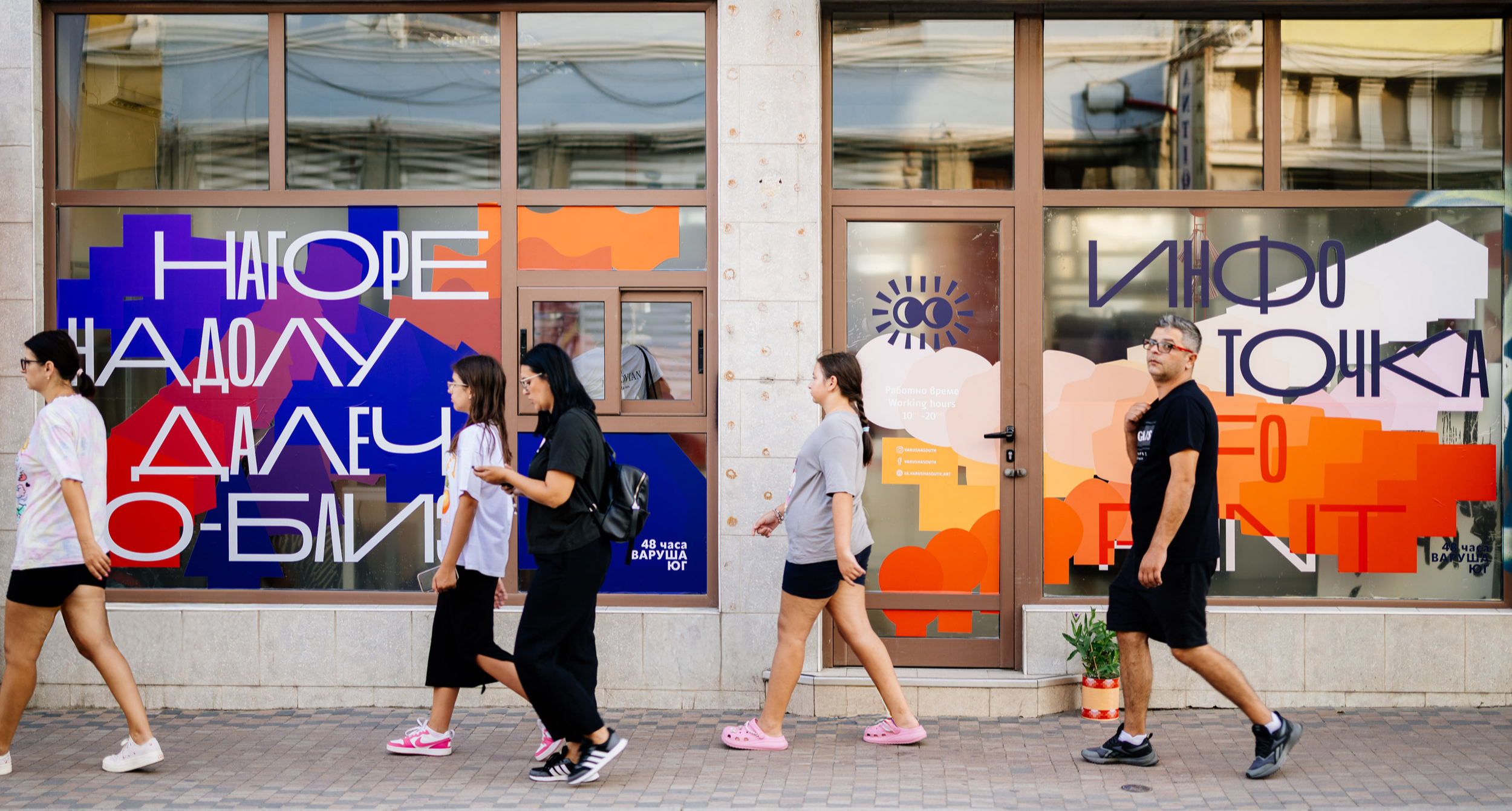
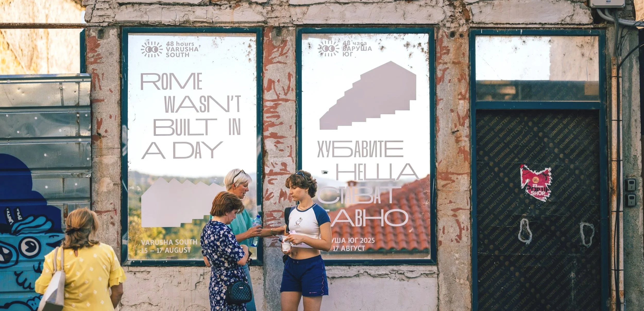
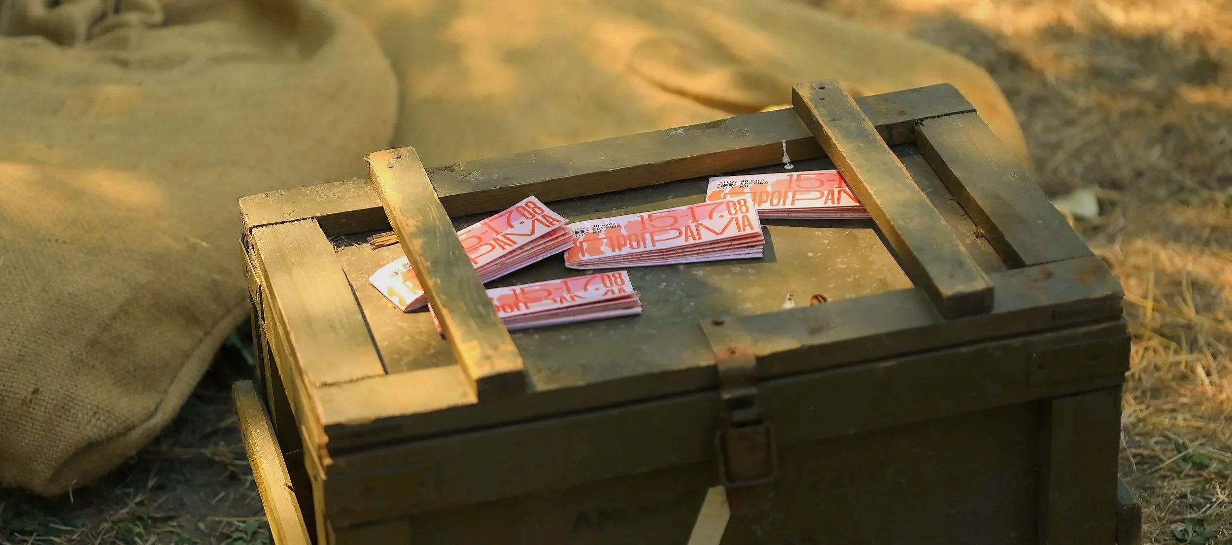
Client: 48 Varusha South festival
Project: Type design
Work by: Todor Georgiev
Year: 2025
A font inspired by Veliko Tarnovo’s Varusha district – a place where the distant meets the near, the old embraces the new, and contrasts do not divide, but shape character. It became part of the visual identity of 48 hours Varusha South festival 2025 which was crafted in collaboration with Izabela Markova.
The typeface features a basic case including capital Latin & Cyrillic (BG) as well as numerals in ExtraNarrow and ExtraWide.
Instead of a variable font, Everybody was constructed the way it is so that non-designers could use it in simpler image-creation software.
@Pavel Gramatikov
@Pavel Gramatikov
@Juliana Murr
Based on the open source typeface Anybody by Tyler Finck. This font is released under the SIL Open Font License 1.1 (OFL).
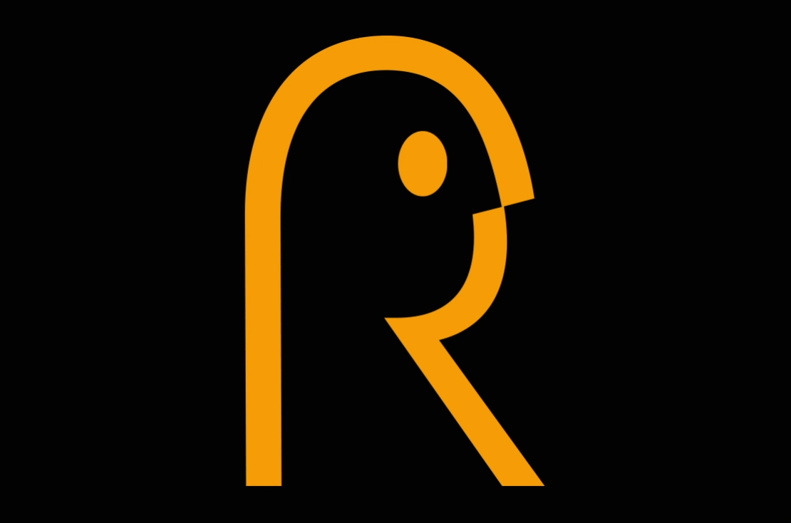
One of our quickest logo projects so for was for BGReklamist.com – an independent space dedicated to stories, videos and imagery from the advertising world. It was fun exploring the letter R and we are quite happy with the final minimalistic result. Most importantly, our client was super stoked with the final outcome.
In addition to the mark itself we did custom lettering to spell out the name with simplicity and legibility in mind.


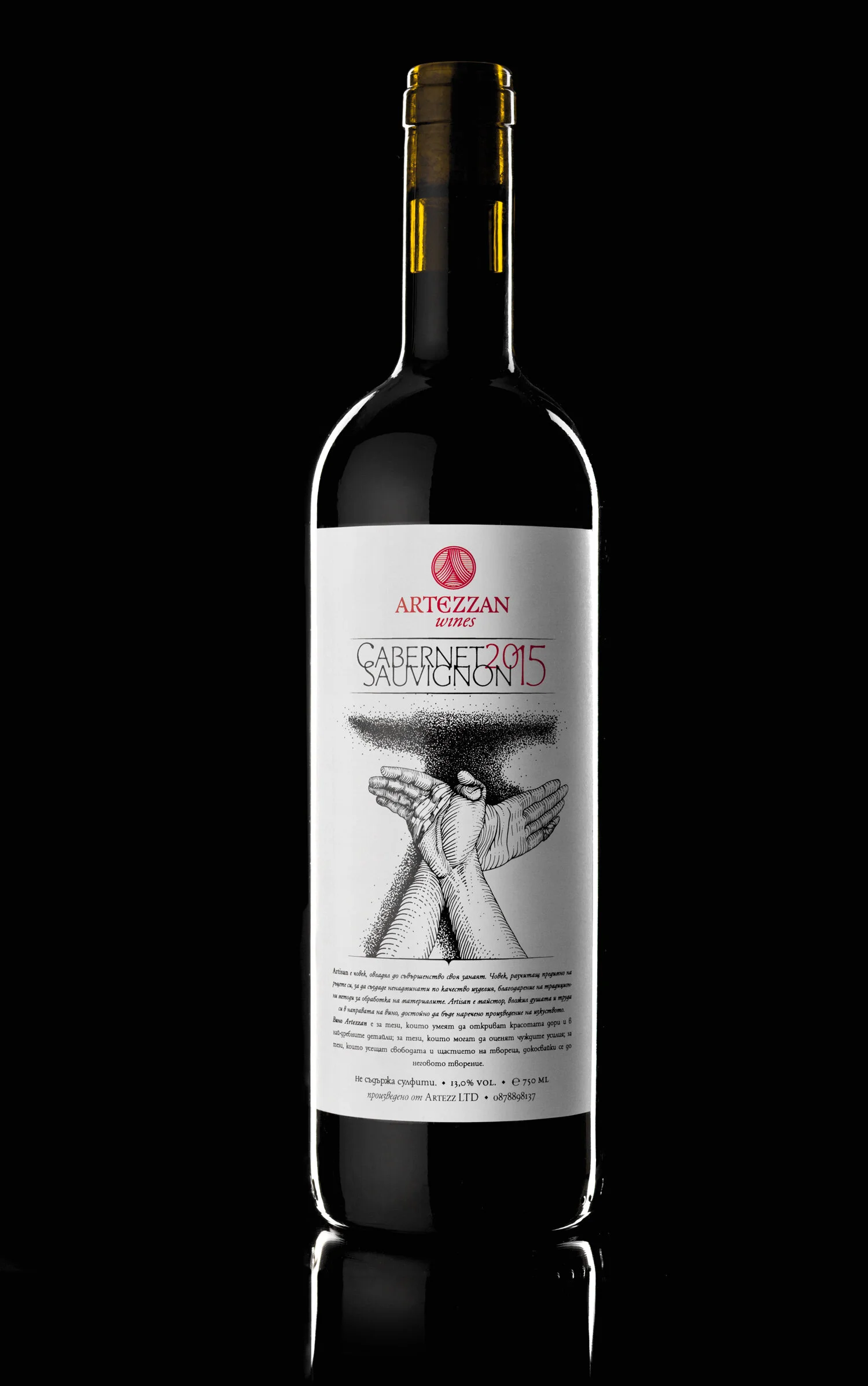
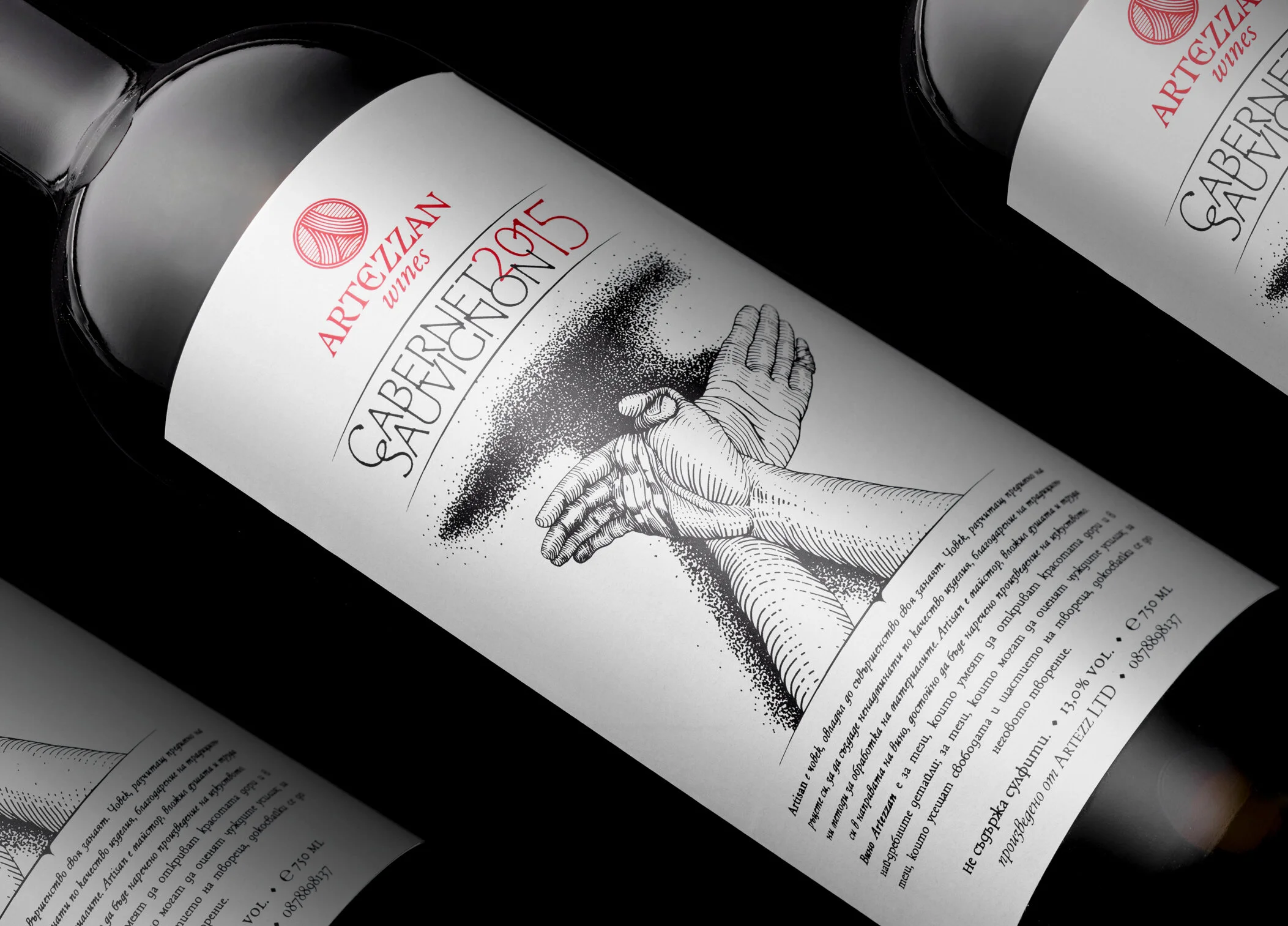
Back in 2015 we were commissioned to design the brand identity of a small-scale wine maker. The product is made locally from selected grapes and intended for sale on farmer’s markets at a low to mid-range price.
We were given the creative freedom to present the artisanal nature of the wine however we see fit, with the only limitation that the logo be based on a certain photograph of a woman wearing a red dress (not shown here).
For the label we were somewhat limited to basic digital print and a rectangular format. So instead of post press enhancement effects such as hot foil or embossing, we had to rely on an eye-catching image.
We did a custom illustration depicting two hands covered in bandages – diligent and work-worn. They form the well-known shape of a bird – a symbol of freedom, inner peace and happiness. In other words exactly what work is to the artisan – to do what he does best and to be happy doing it. When he crafts something by hand it makes him free. The shadow forms the shape of an anvil – a symbol of manual labor and hard work.

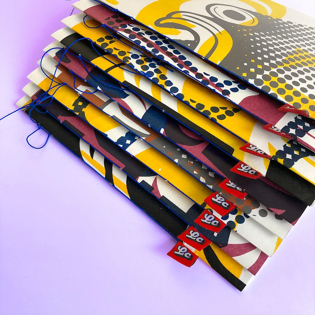
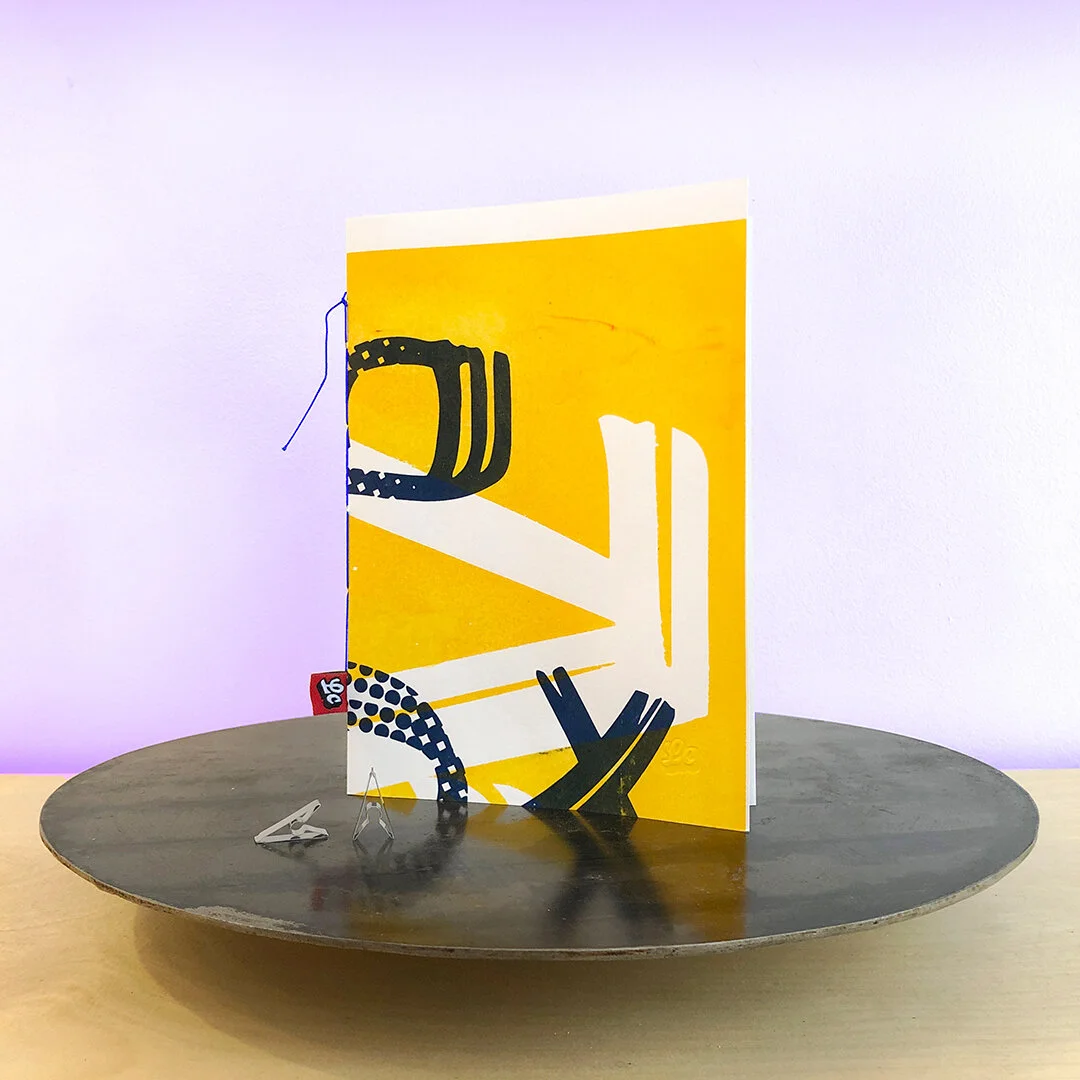
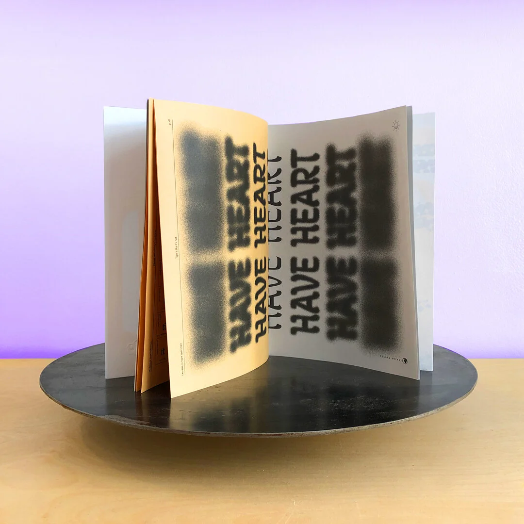
Self-initiated
Project: Grafema Type Specimen
Work by: Todor Georgiev & Jacklina Jekova
Year: 2020
24 pages showcasing our calligraphy based typeface - Grafema LC. First edition of 20 copies designed and handbound in-house. Covers were screenprinted on 200 gsm white paper by @Dzhingibi at nopointatelier and each one is unique.
Printed on 80 gsm offset coloured paper. Stitched with a sturdy 100% cotton thread in reflex blue.
Get yours for just €10 shipped anywhere. Postage quotes upon request. For orders just drop us a message.


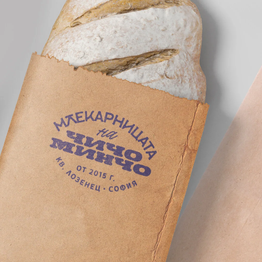
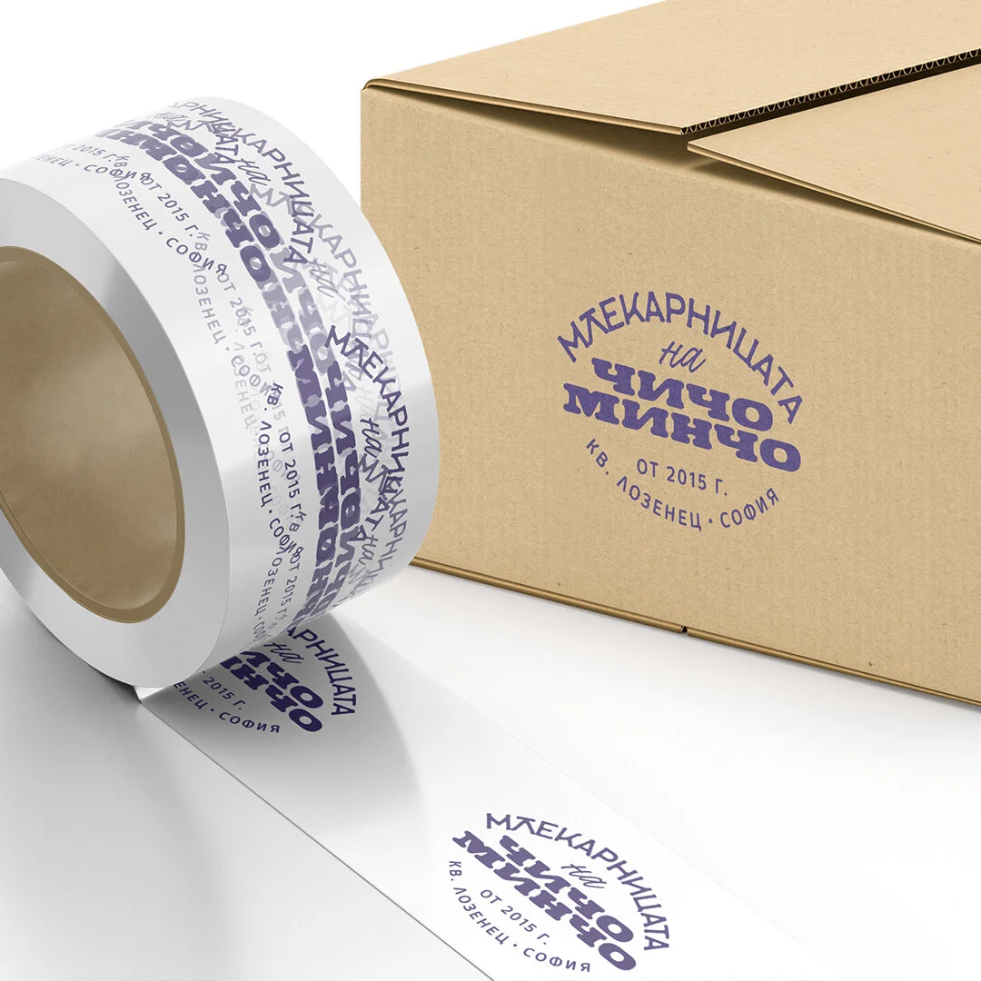
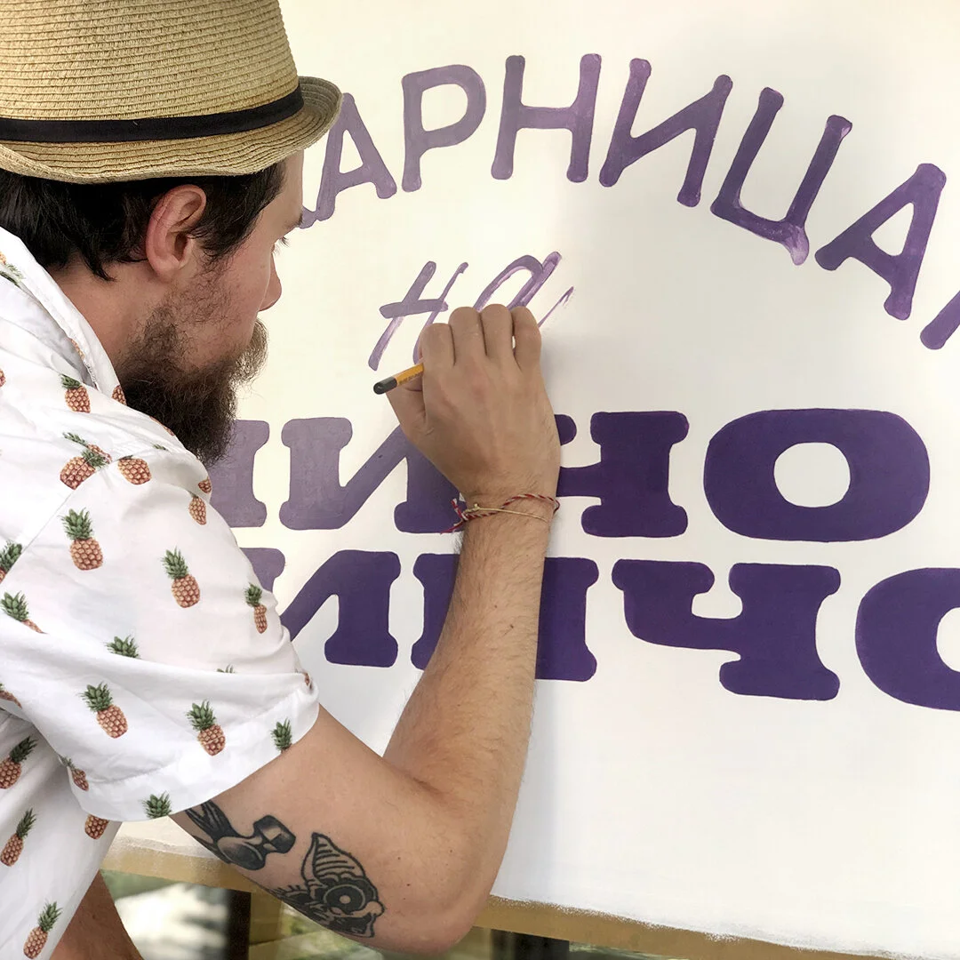
Client: Млекарницата на чичо Минчо
(Uncle Mincho’s dairy shop)
Project: Logo design and signpainting.
Design by: Todor Georgiev
Signpainting by: Todor Georgiev & Jacklina Jekova
Year: 2020
Probably one of our quickest commissioned projects to date. This one is a logotype for a small shop selling bio products from independent farmers. No big brands here, just healthy clean produce. It was required of us to make the logo with a rustic and old-timer feel. Since we were working on a budget, we put custom marks and letterings aside and focused on the general typographic composition using ready-made typefaces.
We had the pleasure of doing this window painting on the storefront of the little shop located in Lozenets district, Sofia. We did the logotype in the middle of the summer of 2020 and soon after had the chance to bring it to life. It was a lovely sunny day of pouncing and painting the lettering on the shop window. The happy faces and cheers of the local friends and customers and above all the shop owner himself were most rewarding.


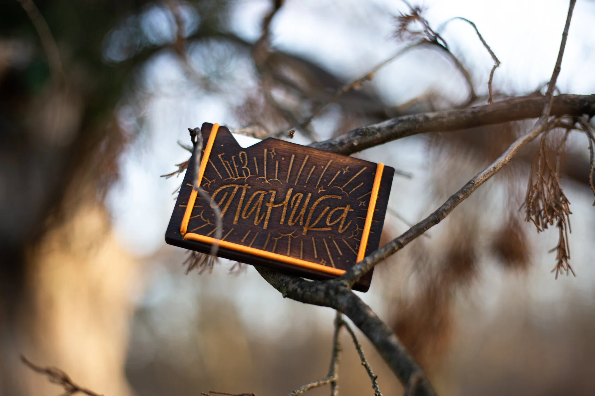
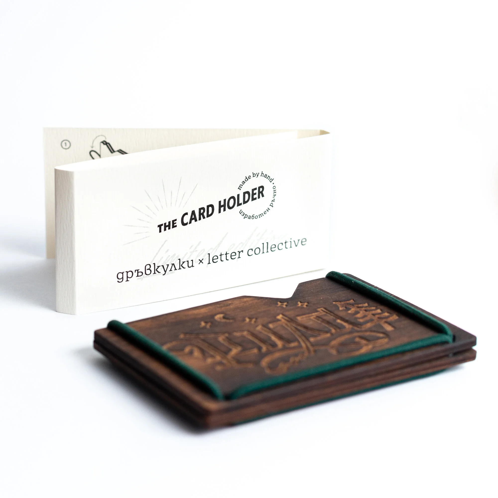
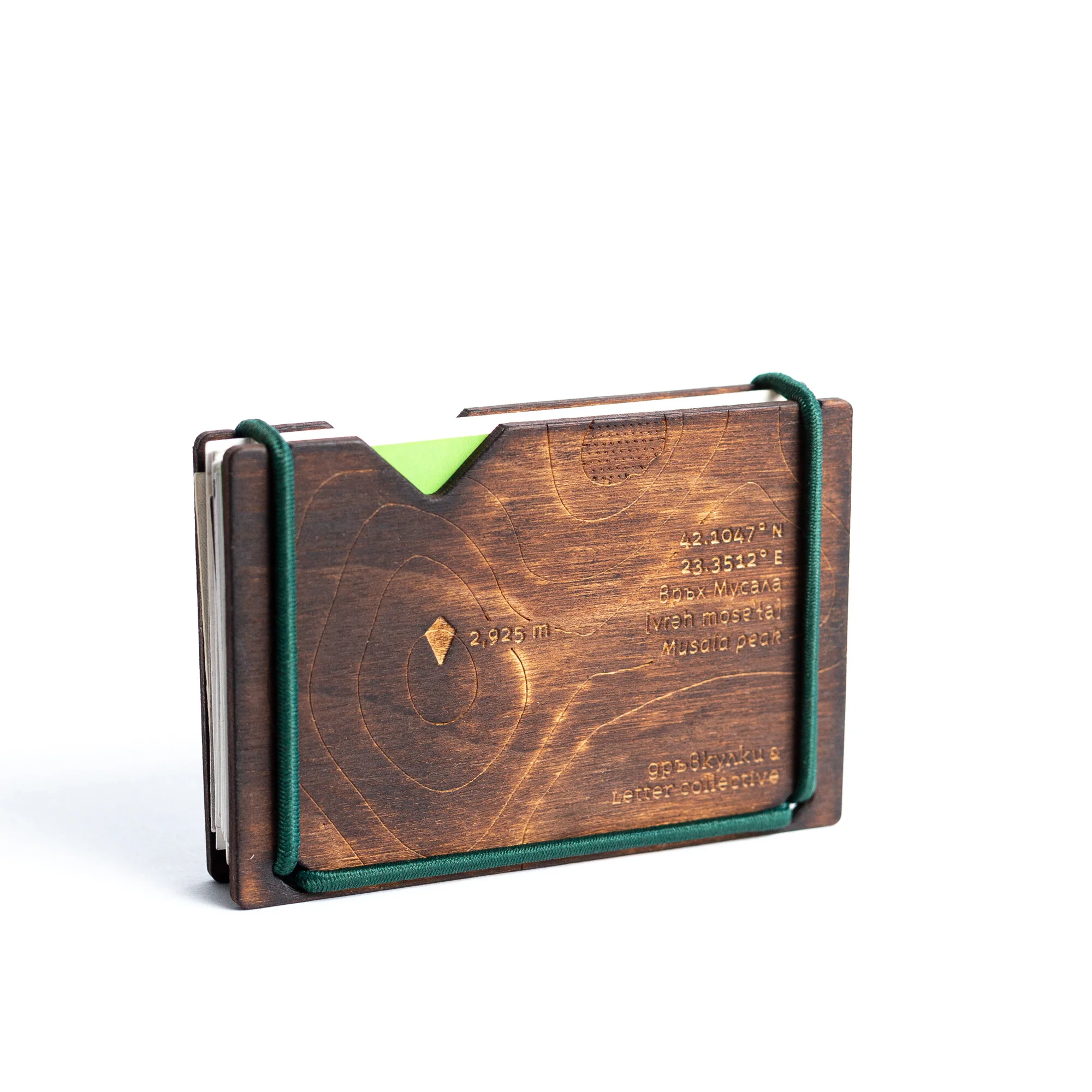
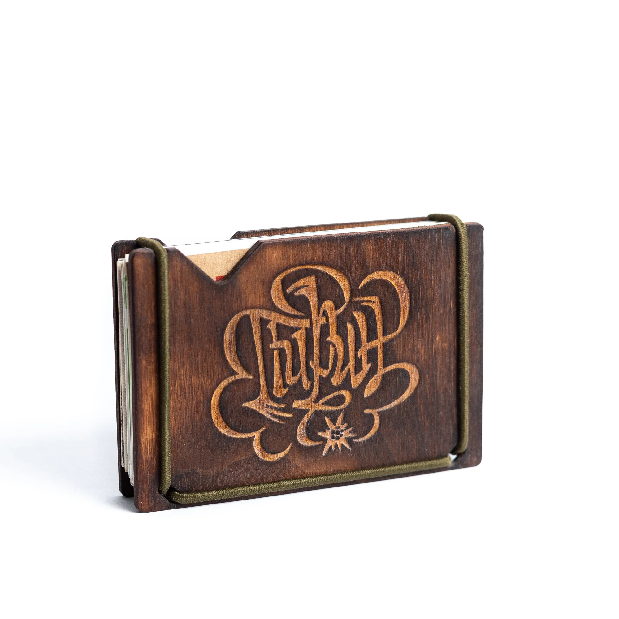
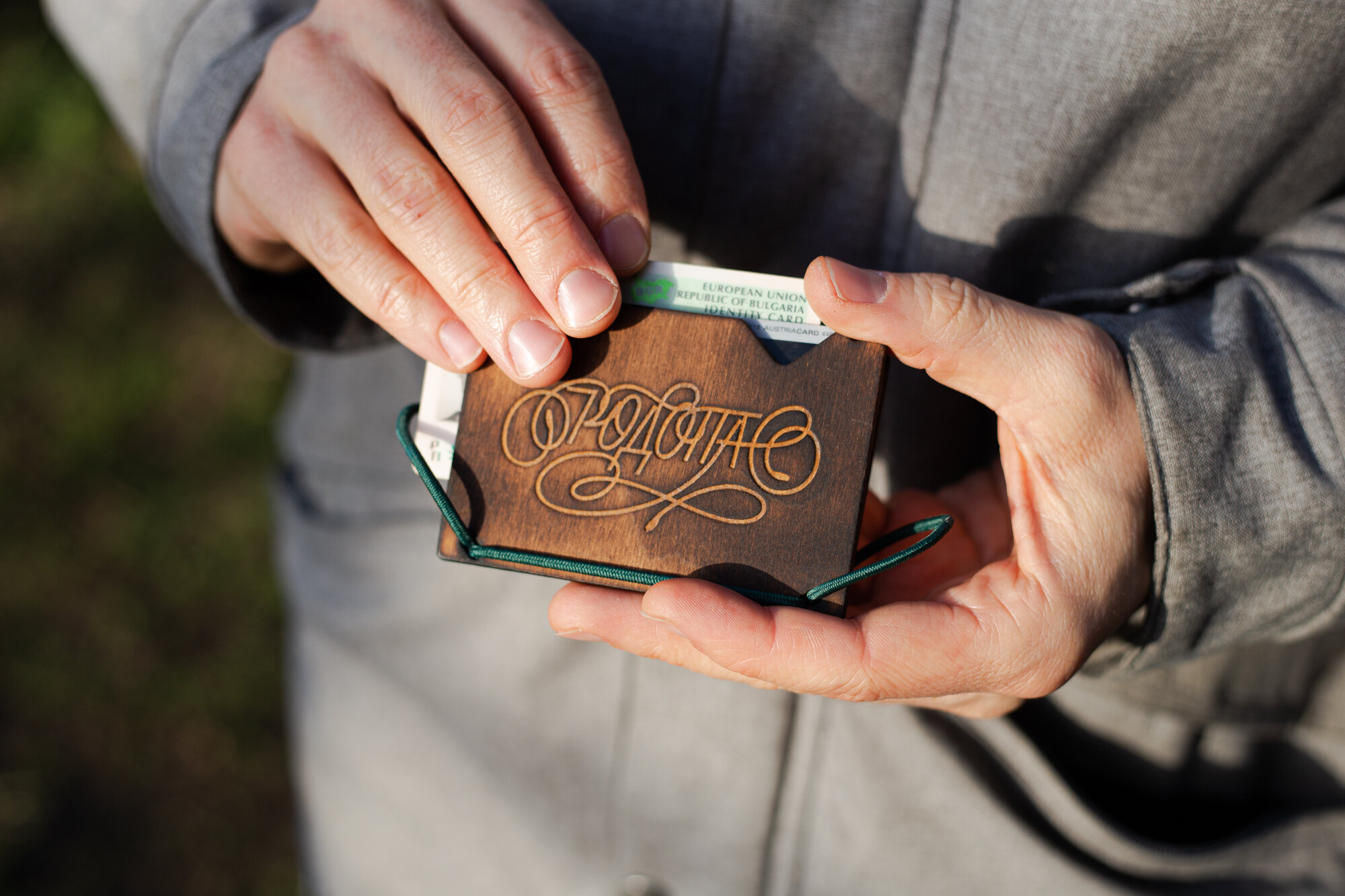
Client: Dravkulki
Project: Custom lettering
Work by: Todor Georgiev & Jacklina Jekova (“Търпение” piece)
Year: 2020
This awesome brand is run by an even awesome lady who designs, prototypes, and manufactures these super cool accessories made out of plywood. She approached us with the proposal to collaborate on a limited edition series of her cardholders – compact and minimal substitutes for a conventional wallet with engraved fronts and backs. Needless to say, we were instantly on board with the idea.
The first series is strongly influenced by the pandemic and the need to lift our spirits in any way possible. Together we came up with a few inspiring words each of which aims to serve as a motivational message every time you look at the cardholder. The lettering pieces we worked on depict the concepts of FREEDOM, BALANCE, PATIENCE, and DON'T PANIC. These are intended for sale in Bulgaria, so the designs are written in Cyrillic script. For all of you unable to read or understand the engravings, we added transcription and translation of the word on the back.


The second series is somewhat tied to the depiction of Freedom from the first series. Here we started with a design we had already made for our Bezier Club clothing line – PIRIN, а mountain range in southwestern Bulgaria. That started the Bulgarian mountains series and along came RILA, RODOPA, and VITOSHA. All favourite places of ours with Vitosha being the closest to us – a half an hour's drive from the studio. For all of you mountain lovers, we added a topographic map of each of the highest peaks together with transcription and translation of its name.
Be sure to have a look at all of DRAVKULKI's products.
Photography: DRAGA PHOTOGRAPHY


Client: Self initiated
Project: Sign painting
Work by: Todor Georgiev & Jacklina Jekova
Year: 2021
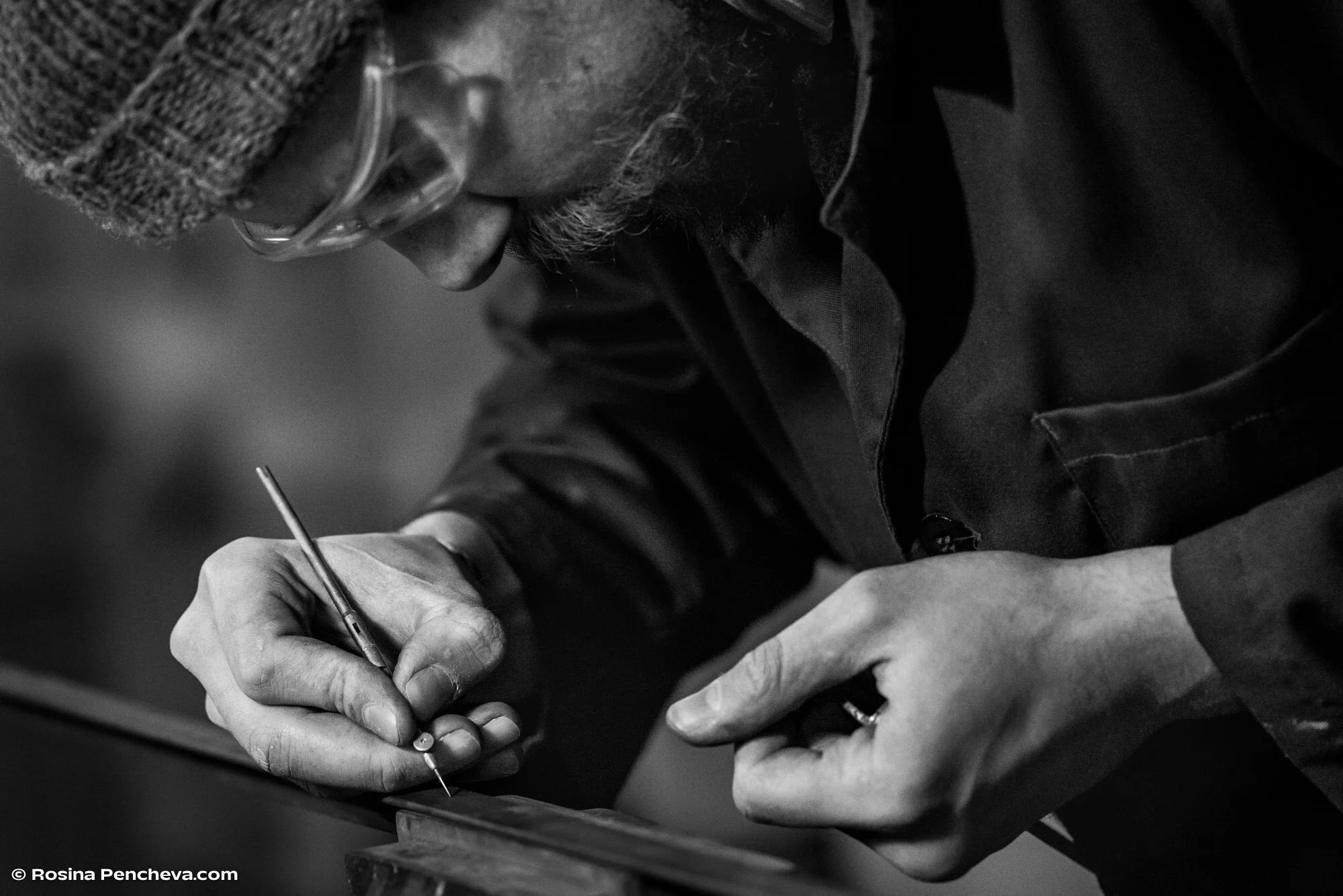
This was one of the last projects we made while we still had our studio on Karnigradska str. and one of our projects that became part of the exhibition Without an audience by Rosina Pencheva. She captured the process of creating a hand-painted sign for a tattoo parlor – from the initial sketch, its digitisation, and transferring onto glass. We also crafted the metal frame for the glass to sit in - a simple structure from cut and welded angle iron. We did not have access to quality enamels for glass at this time and used an acrylic-based paint and basic flat brushes along with spray paint. Lesson learned.


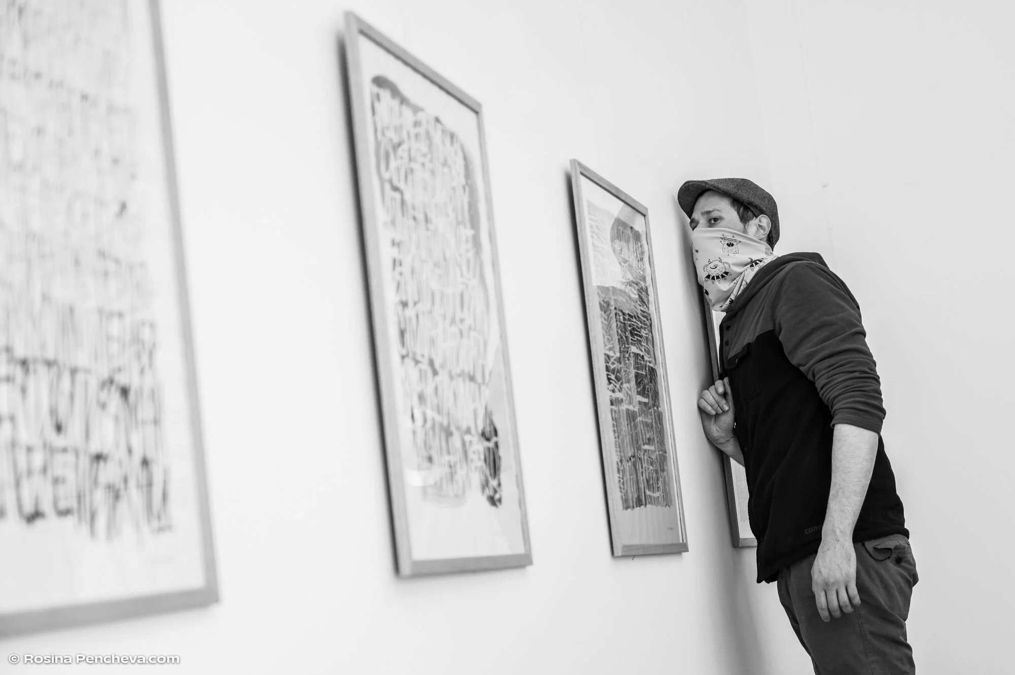
Client: Self initiated
Project: Exhibition
Crafting of objects: Todor Georgiev
Calligraphic works by: Jacklina Jekova
Year: 2021
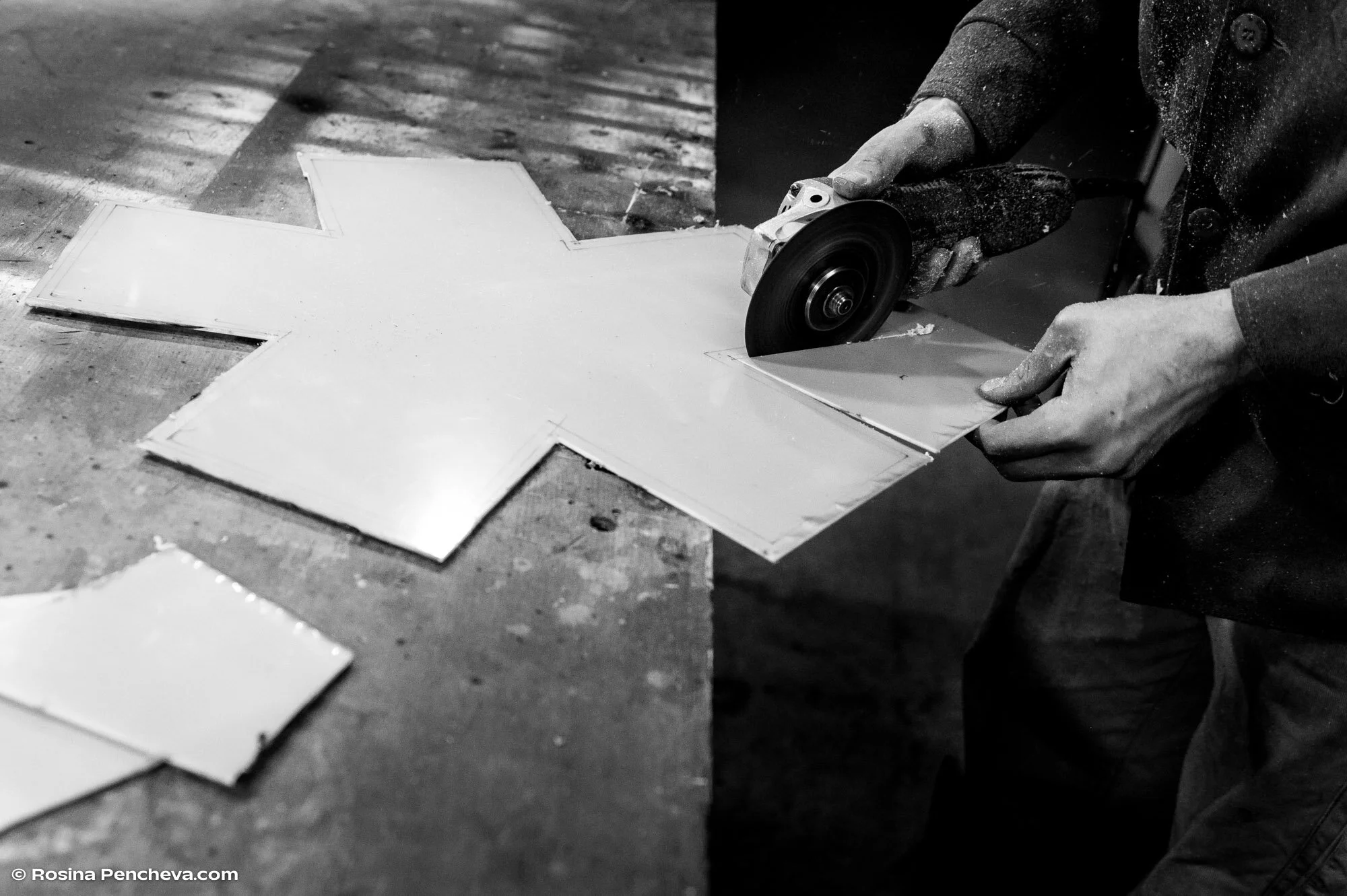
Altruist is a cosy urban café in the heart of Sofia where we had the opportunity to showcase some of our non-client work during the first wave of the Covid-19 nonsense. Some of our pieces from previous shows were ready to display, however, we felt it'd be cool to create something fresh just for the occasion. Since at that time most of us were isolated and worked from home, we decided to work on two separate projects, both in the field each one of us was currently comfortable with.
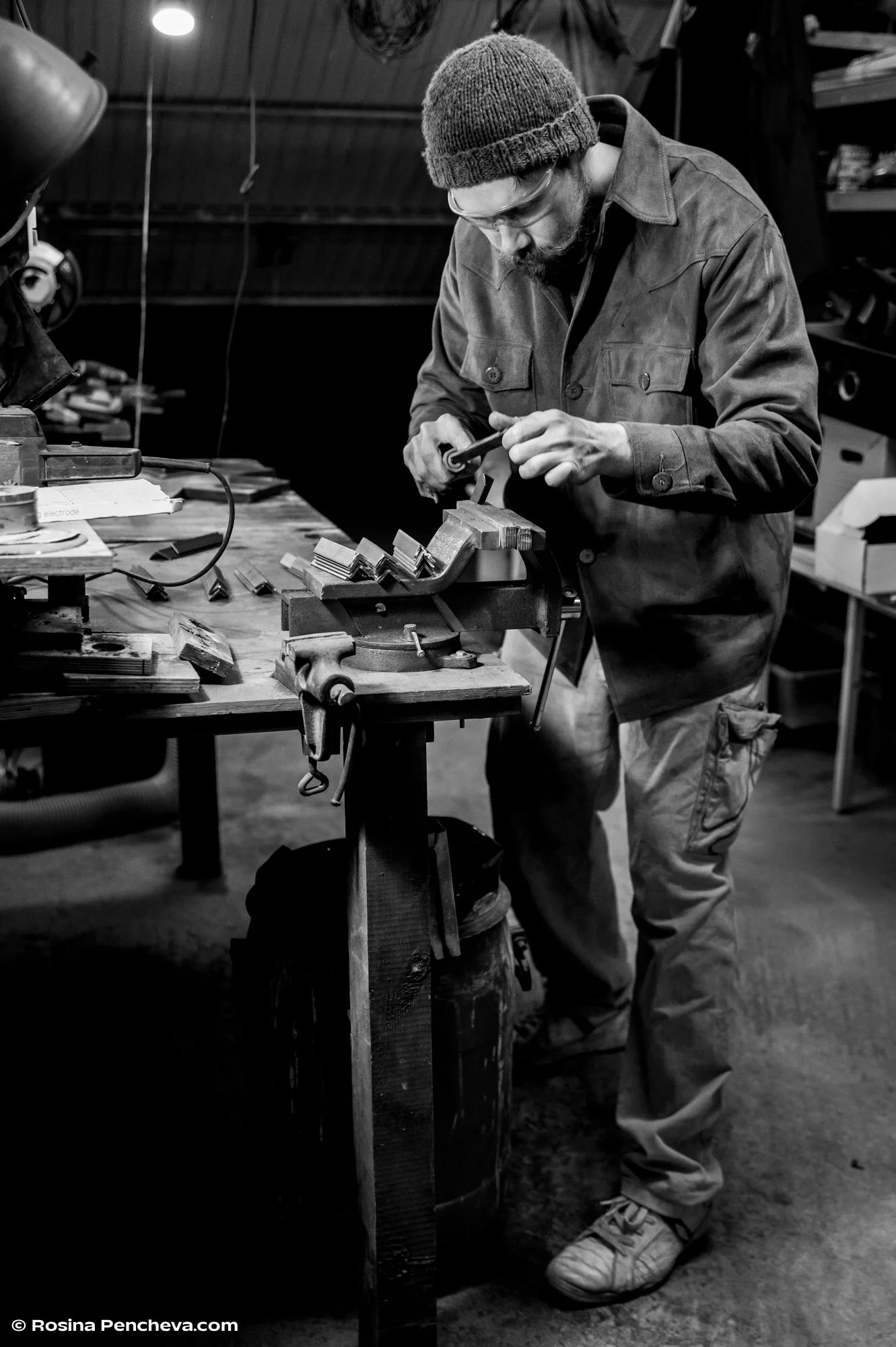
Tozzi went with the fabrication of a LED lamp with a steel frame in the shape of an аsterisk*. Handmade from start to finish – cut, welded, wired, and assembled in his home workshop. This piece now resides with Mirela Belova (Type Forward foundry).


Jacky chose to work on calligraphy experiments using masking fluid, ink, flat brushes, and a ruling pen on paper. The result was a series of framed 50 × 70 cm works. All sold out.
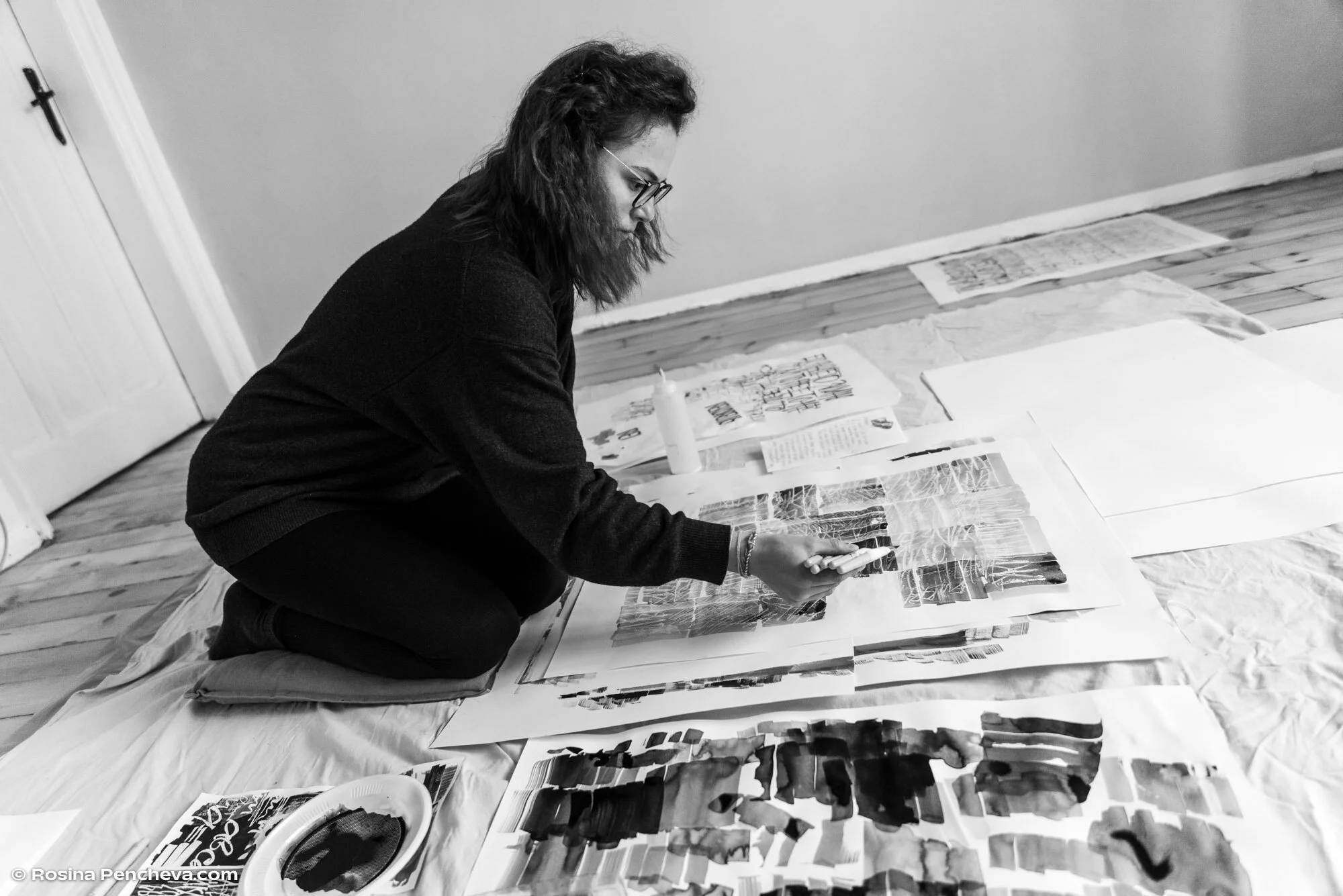

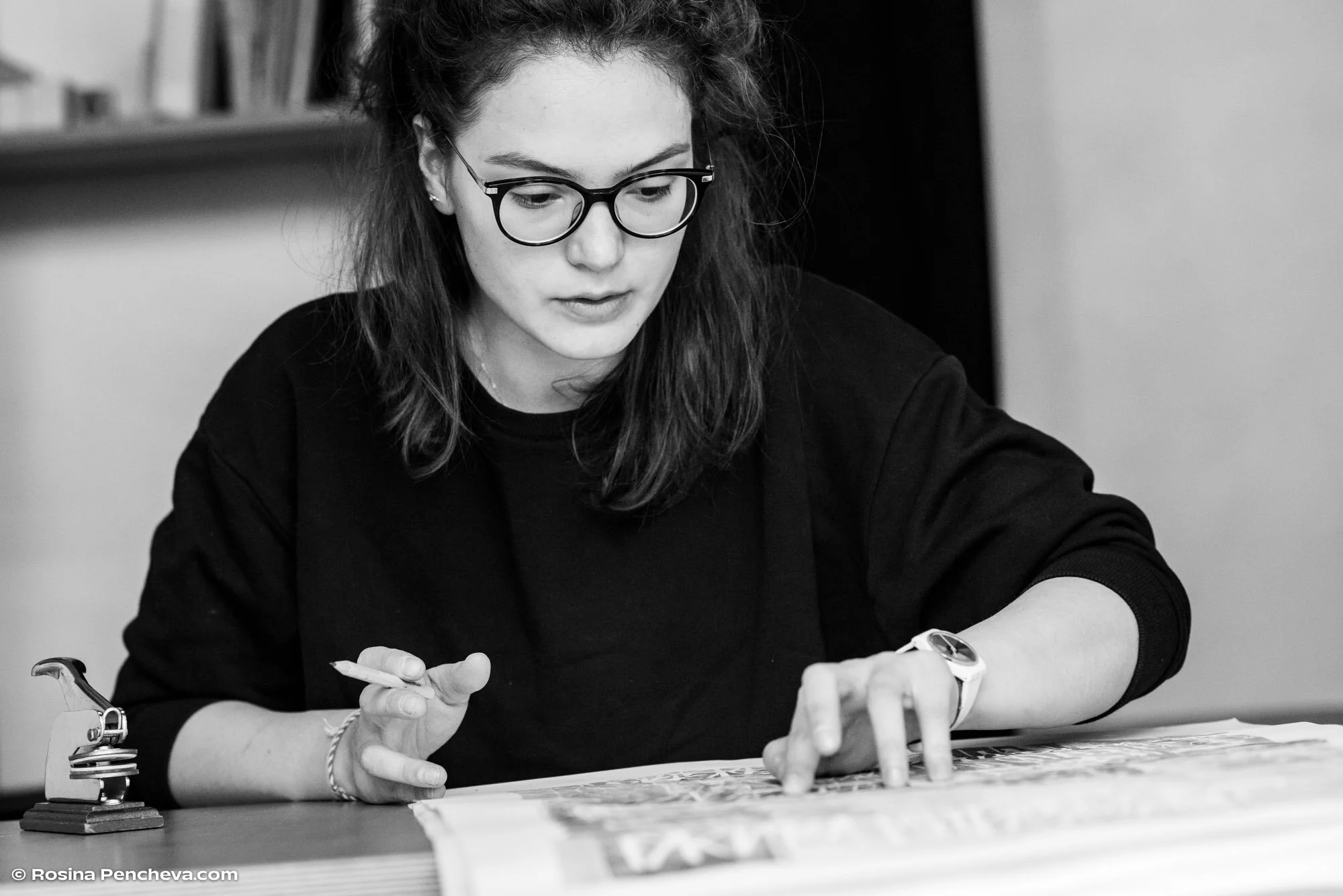
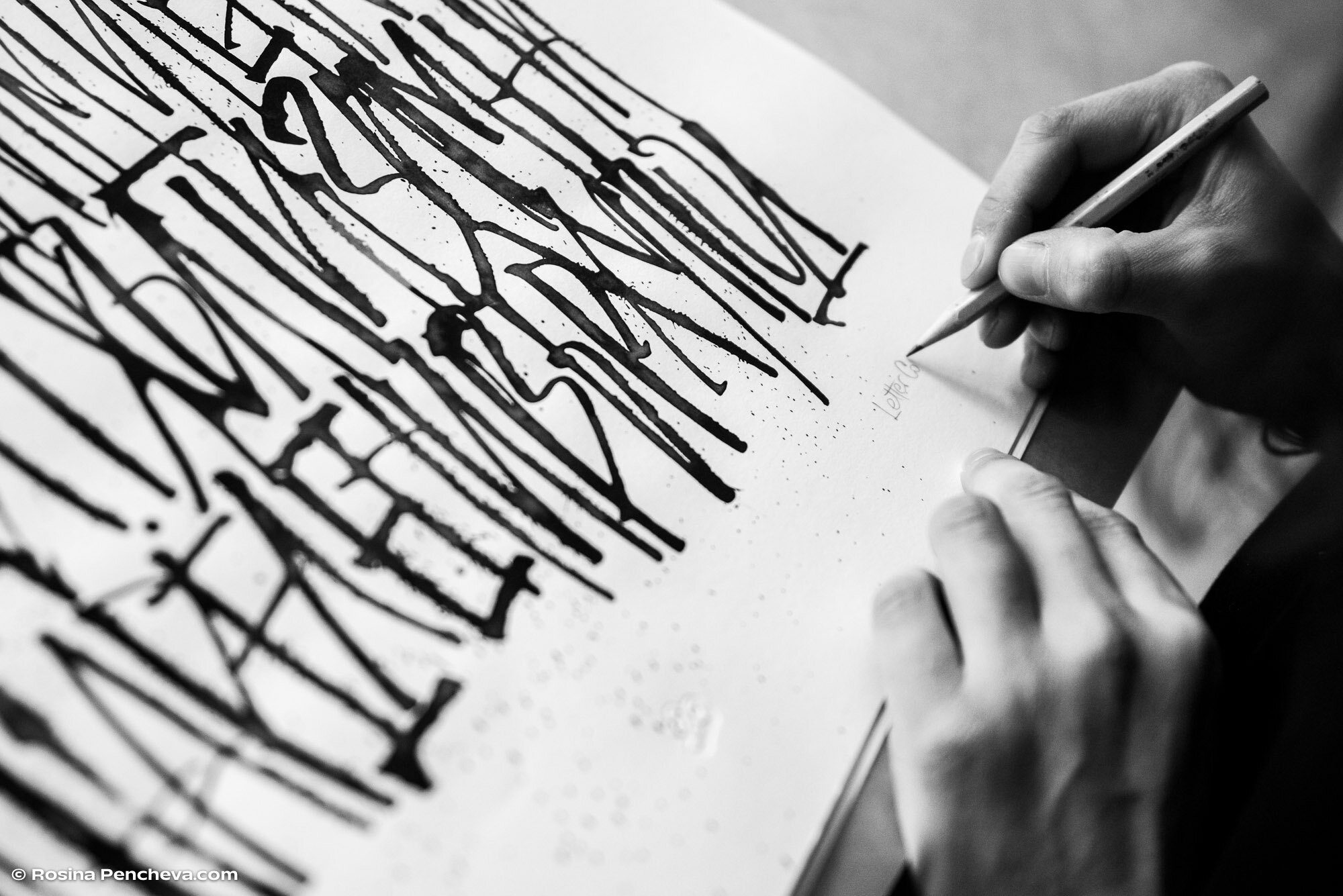
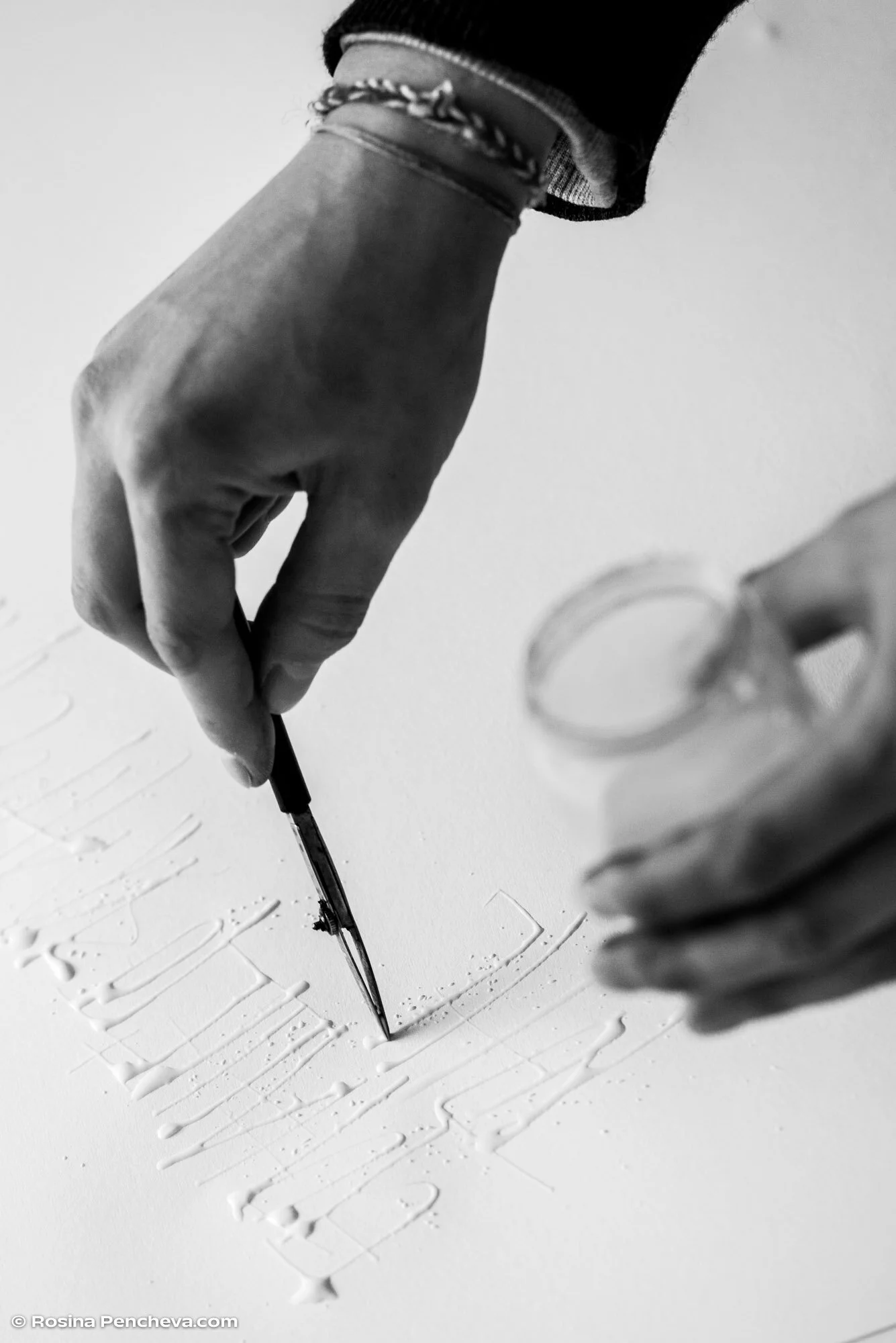


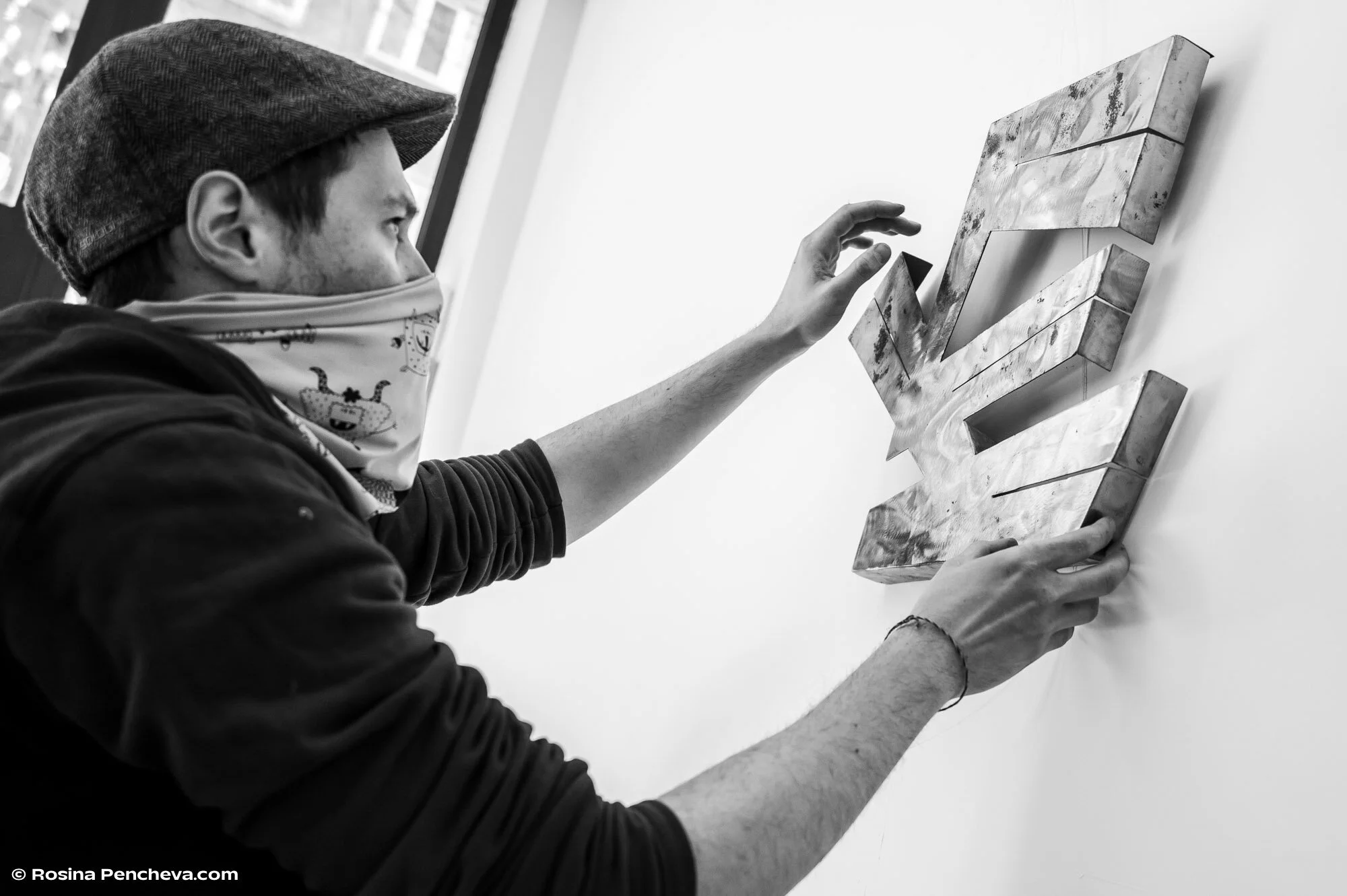
We were super fortunate to have Rosina Pencheva capture the process of bringing these pieces to life. As a result, we ended up as a part of her photographic project “Without and Audience” which documents the creative process of artists during this difficult period of the pandemic.

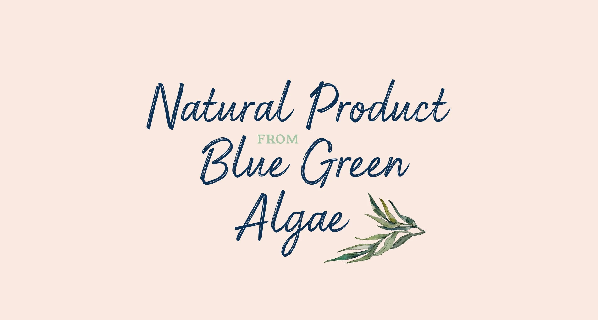
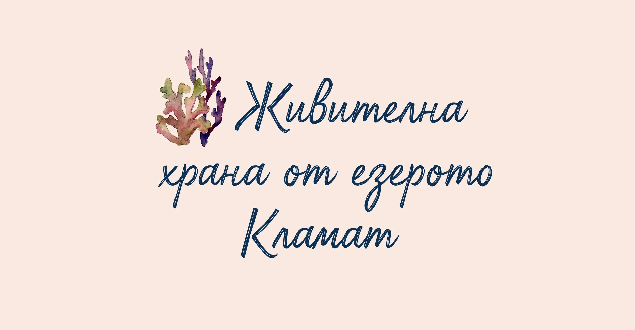
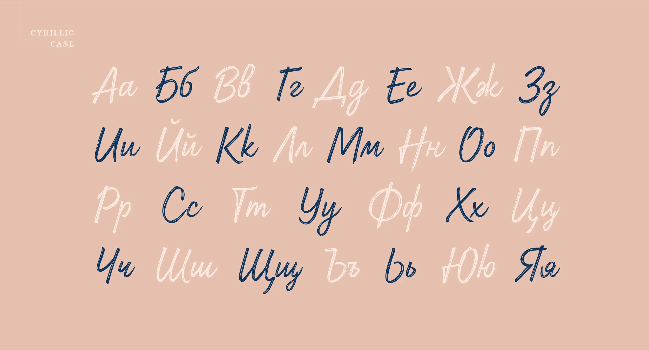
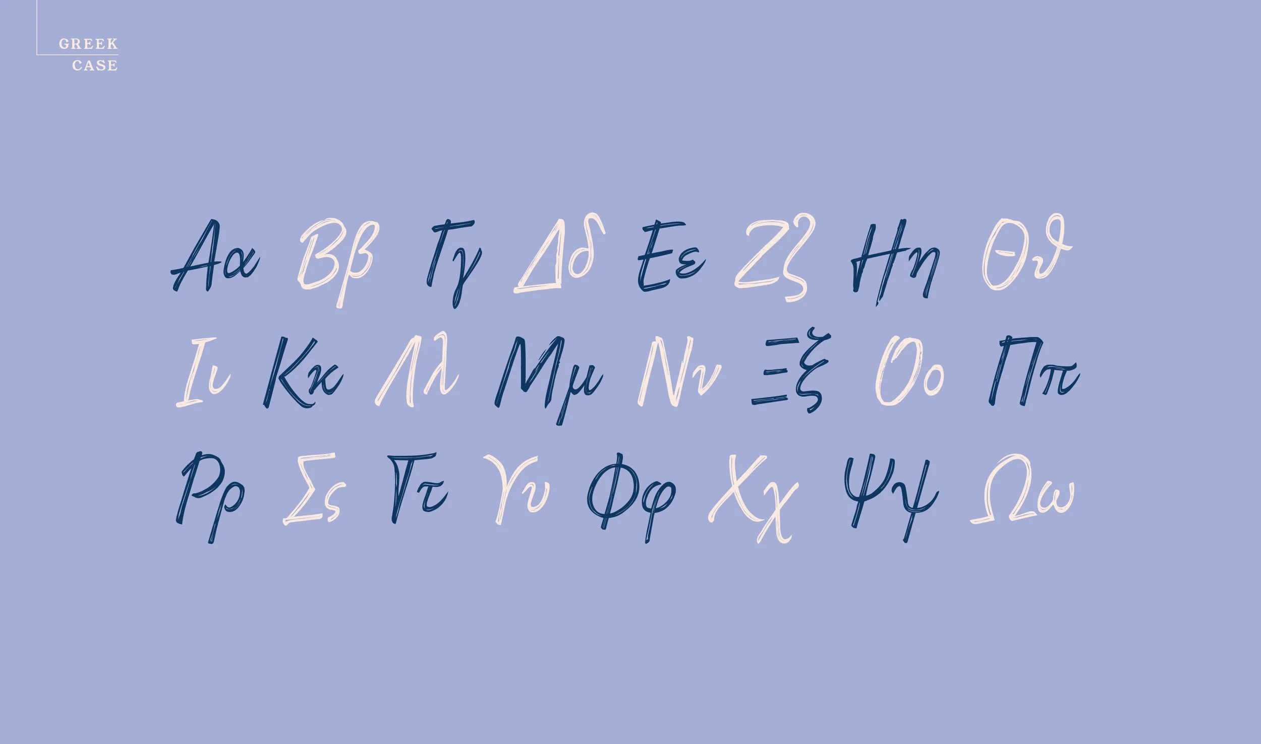
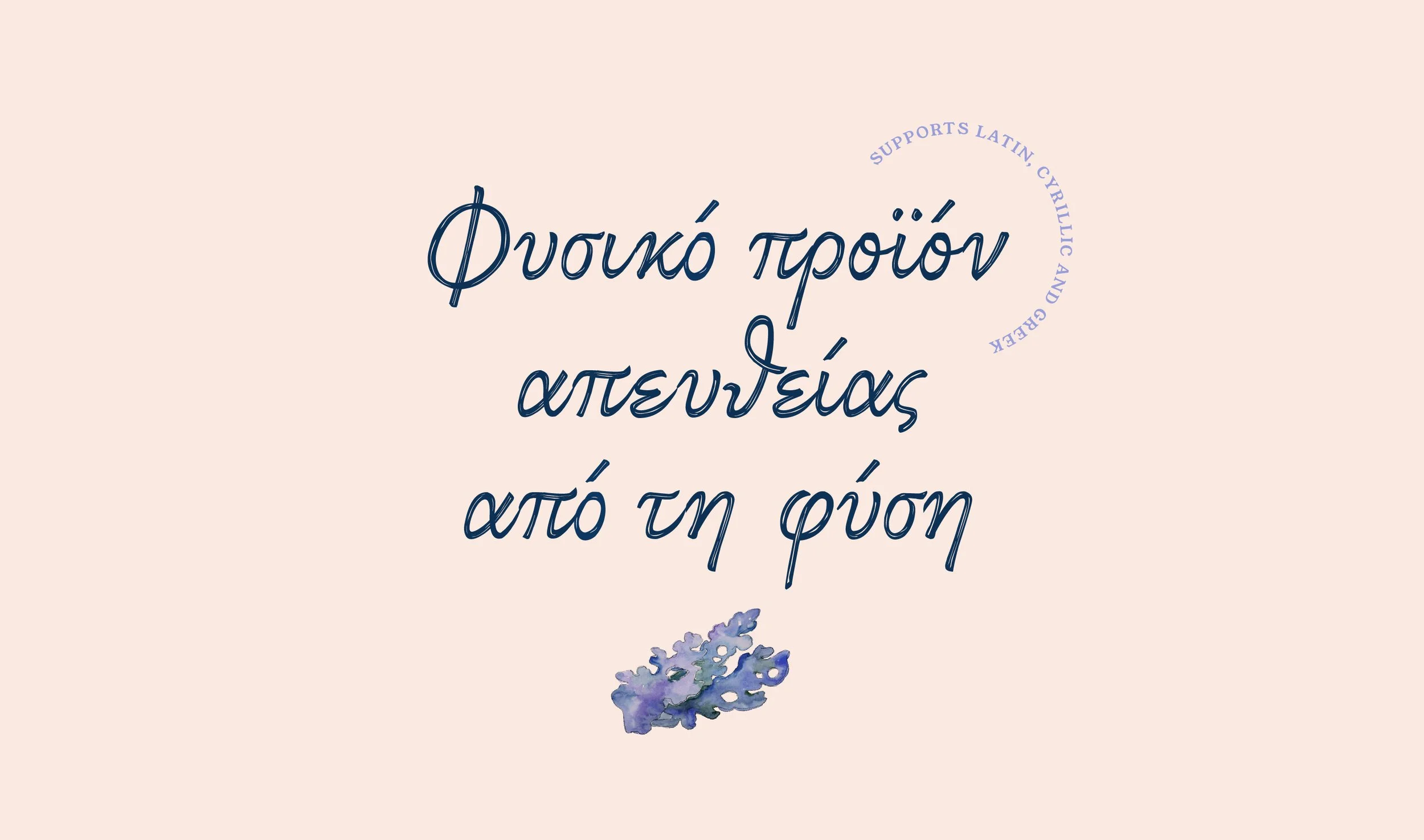
Client: AquaSource
Project: Custom typeface
Calligraphy, type design
and presentation by: Jacklina Jekova
Year: 2021
Klamath script is a handwritten font developed exclusively for AquaSource for use by all its branches worldwide for on and offline communication. We had the pleasure of working with this British brand which produces natural products for beauty and wellness with blue-green algae from Upper Klamath lake.
The typeface supports Latin, Greek, and Cyrillic, featuring Bulgarian local form. We did a lot of research on natural handwritten forms, especially for Greek script which was a first for us and our studio. The weapons of choice for this project were the Pigma™ FB brush pen from Sakura, Adobe Illustrator, and Glyphs 3.


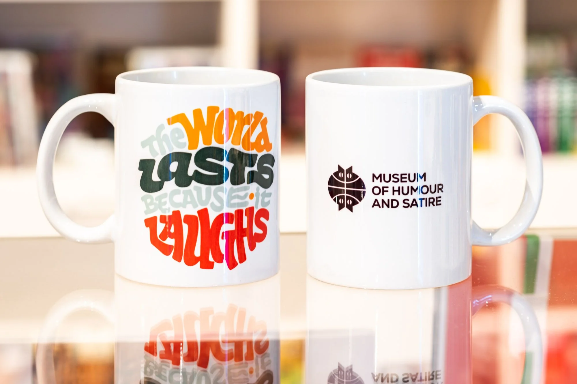
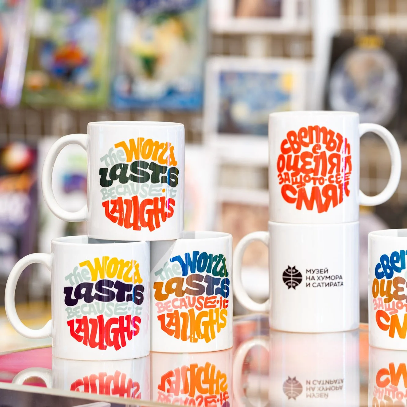
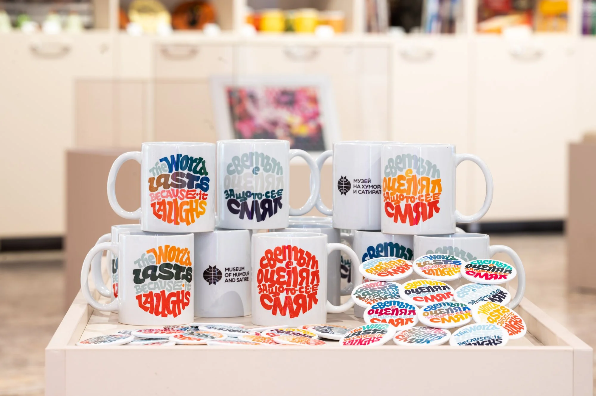
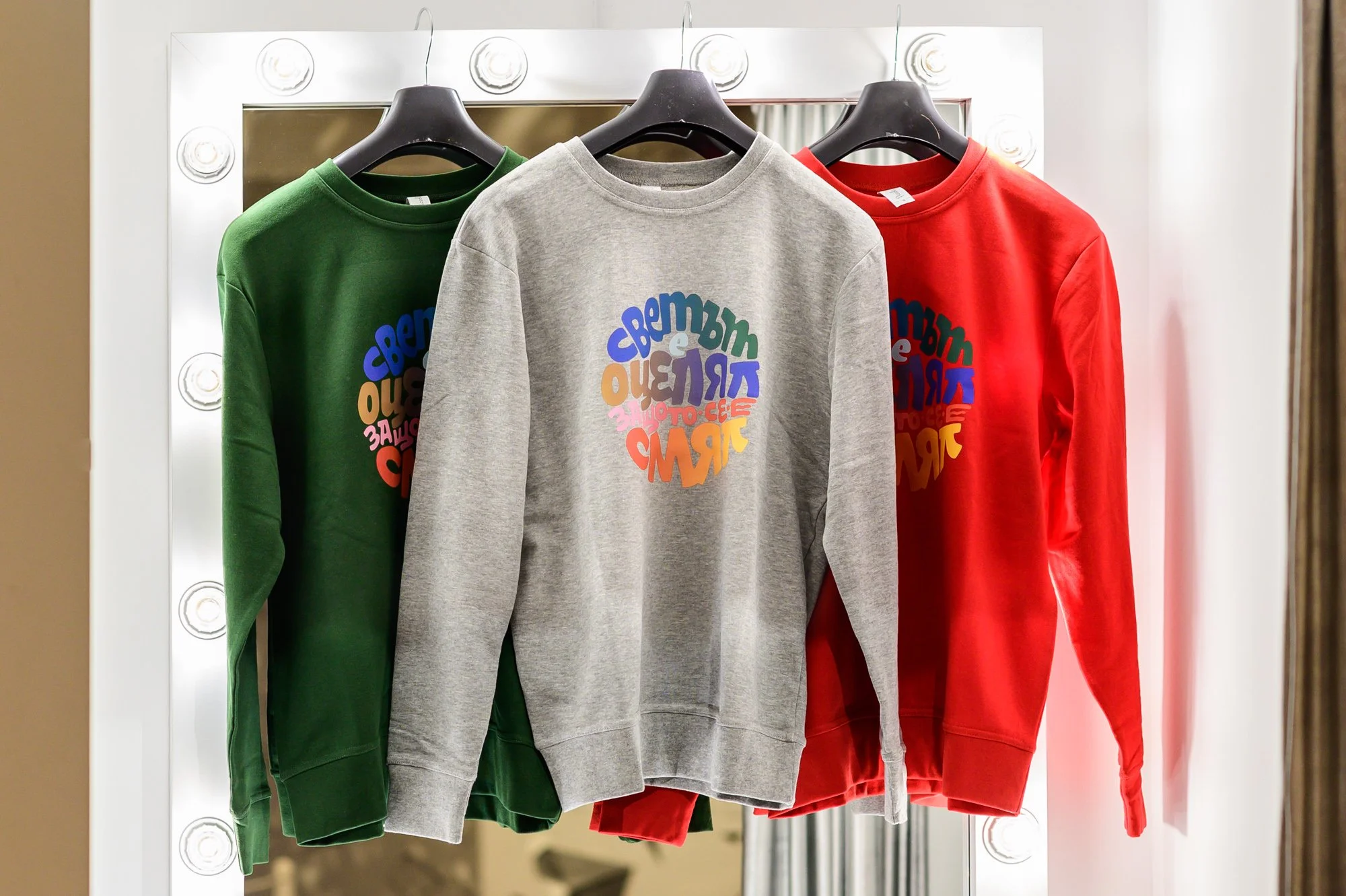
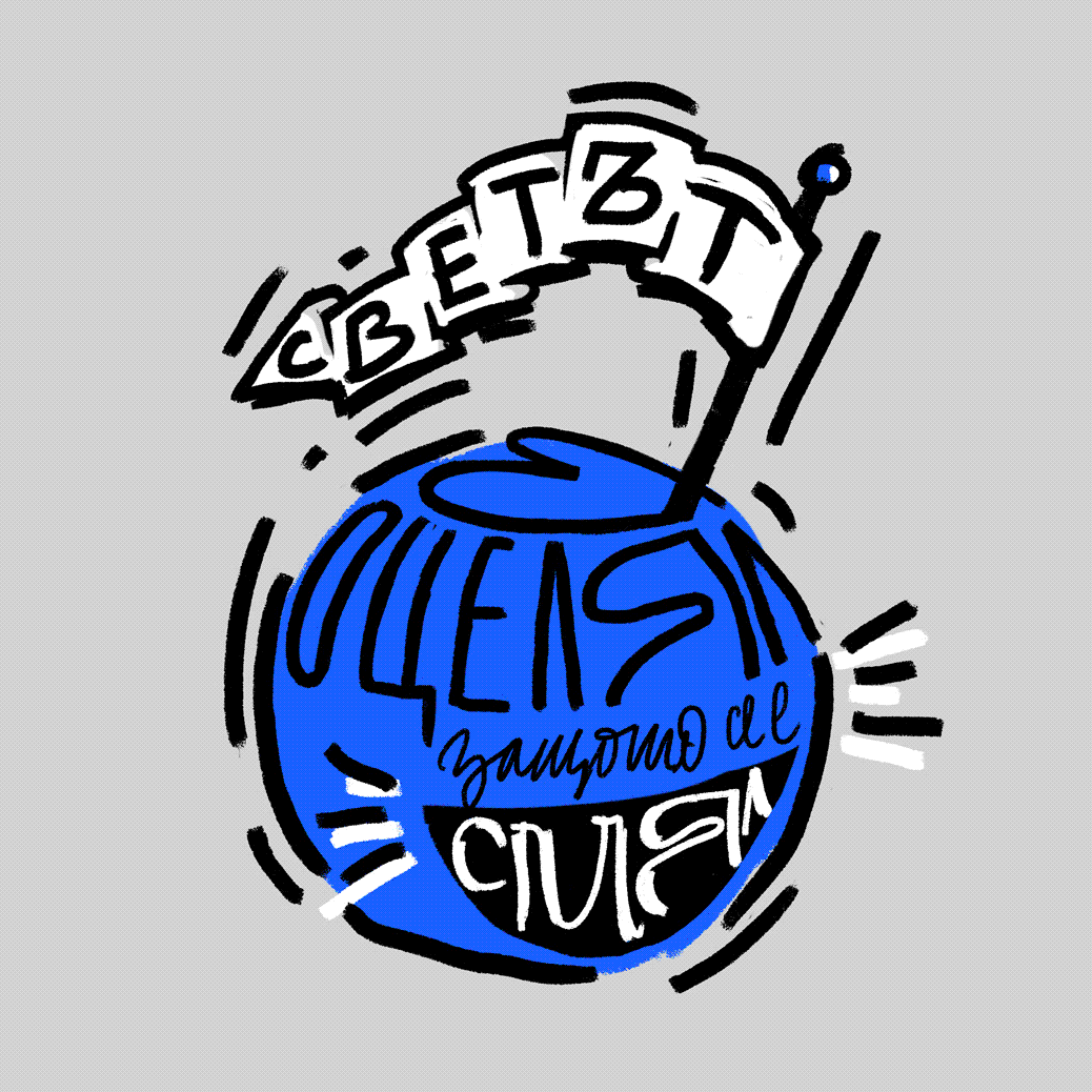
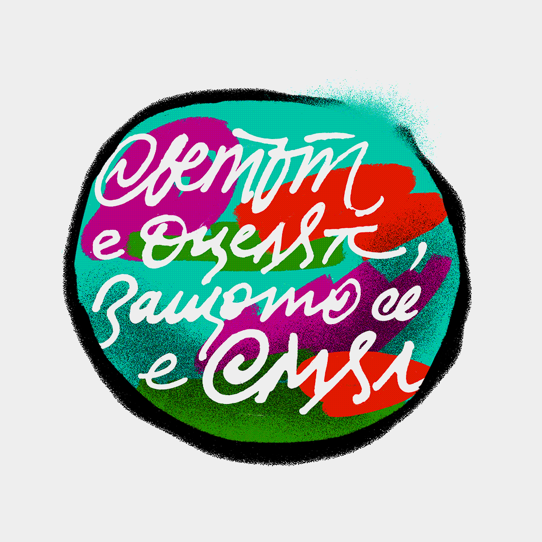
Client: Museum House of Humour and Satire
Project: Custom lettering
Work by: Todor Georgiev
Year: 2021
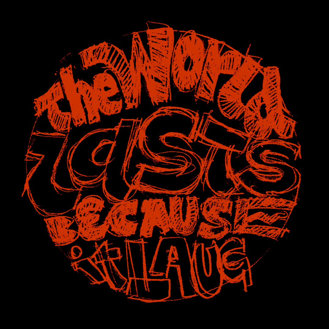
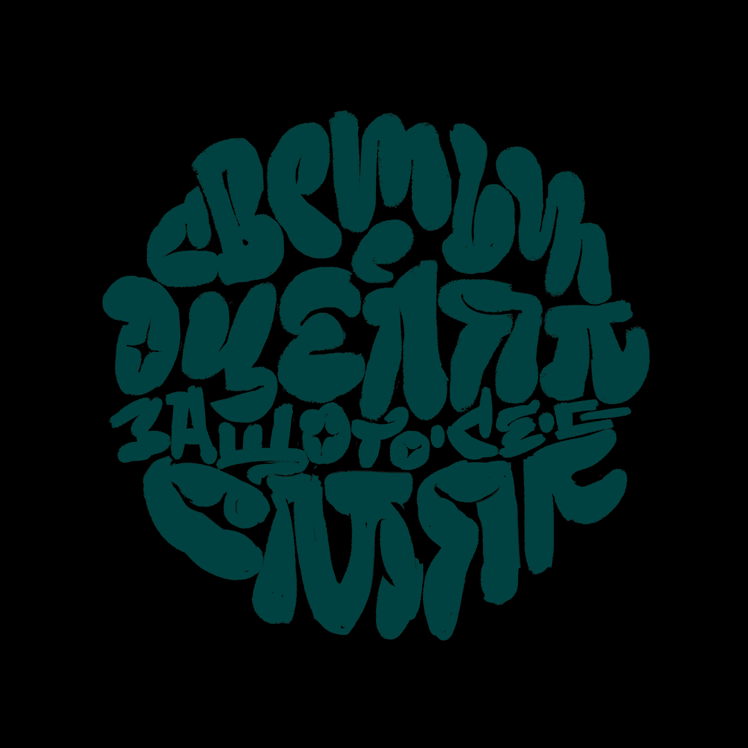
Museum of Humor and Satire resides in Gabrovo – a town situated in Bulgaria’s geographic center which has long ago been named the country's capital of humour. The museum houses traditional local humour art, including cartoons, photographs, paintings, sculptures, and verbal humour.
We were commissioned to create custom lettering for the museum's official slogan from words by Bulgarian poet and satirist Radoy Ralin “Светът е оцелял, защото се е смял” which in order to keep its rhyme is best translated to “The world lasts because it laughs”. Shown here is our process of creating the final visual which was used for the first set of merch produced by the museum and is now available exclusively at the gift shop.
Snapshots are taken by the talented photographer Rosina Pencheva
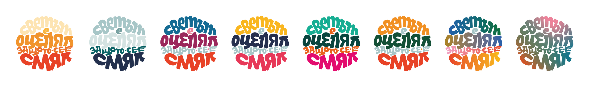
These visuals below were part of our exploration phase and are not part of the final graphic set.
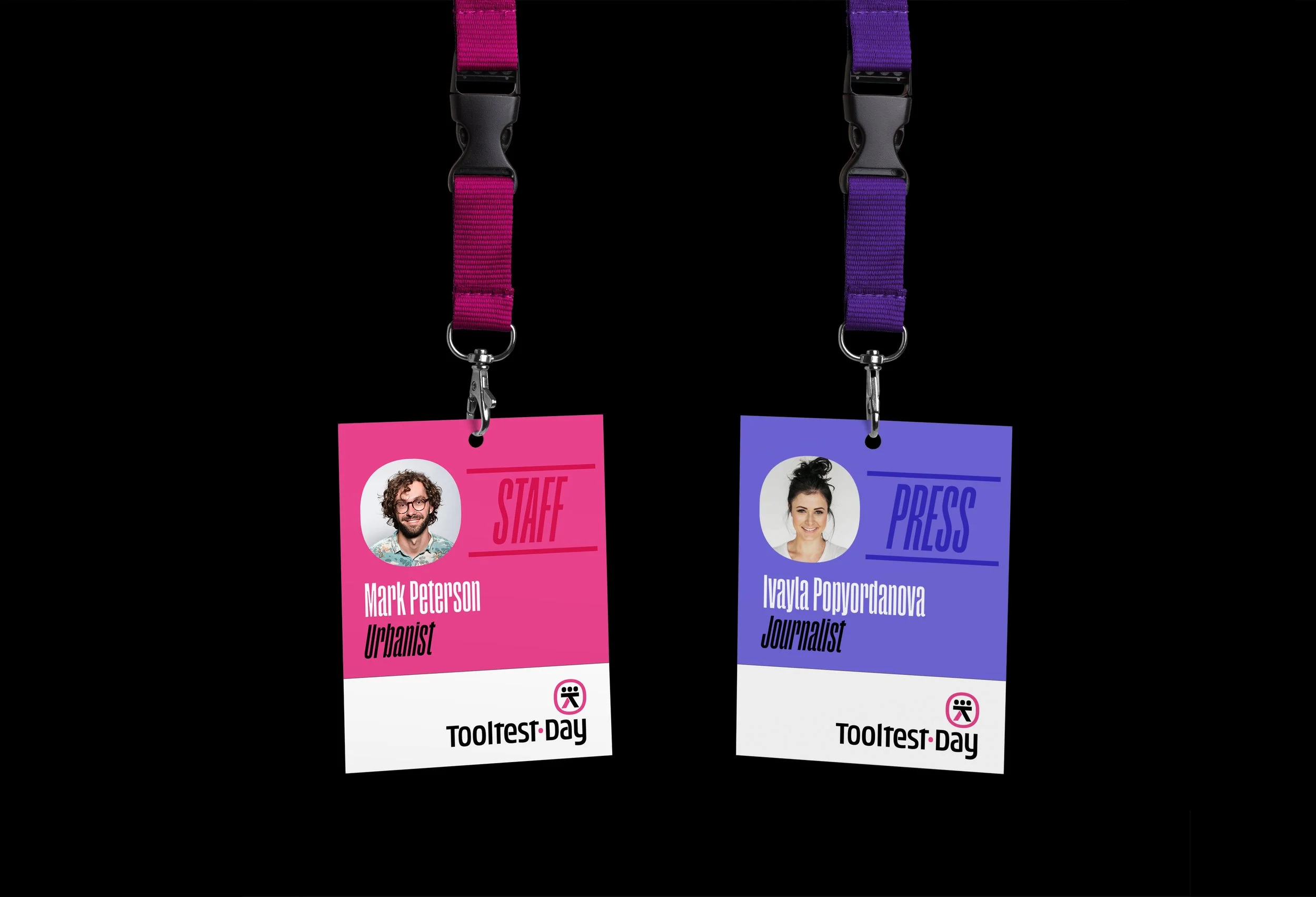
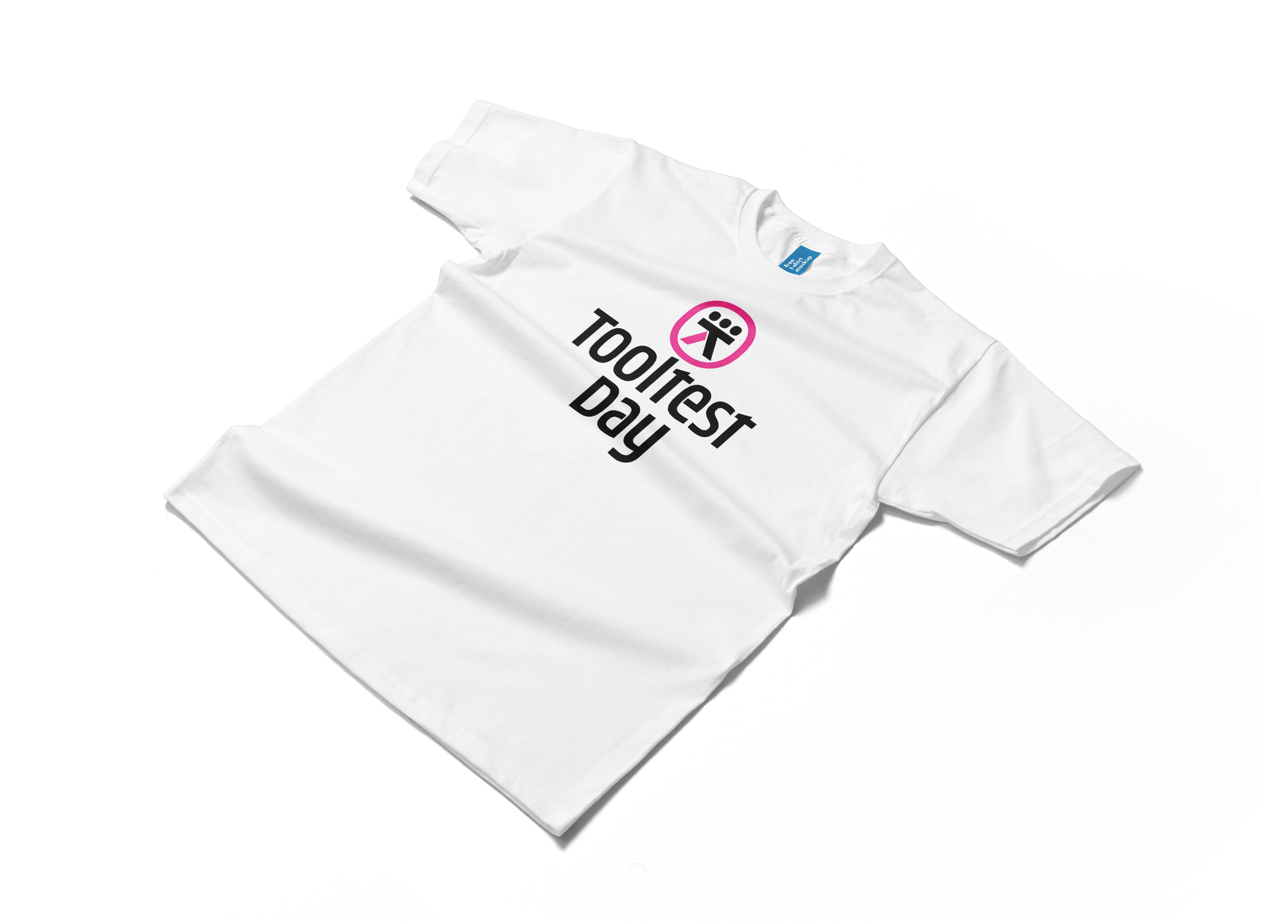
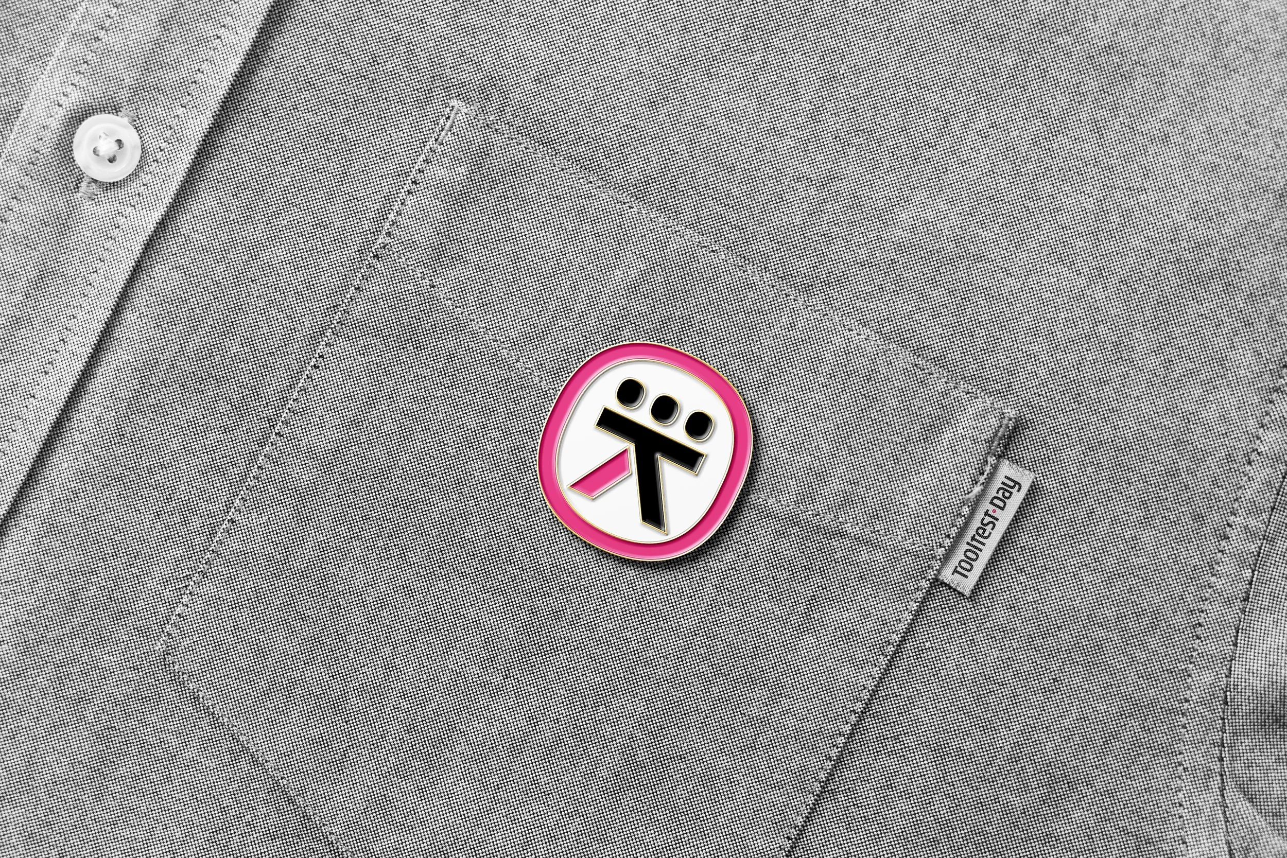
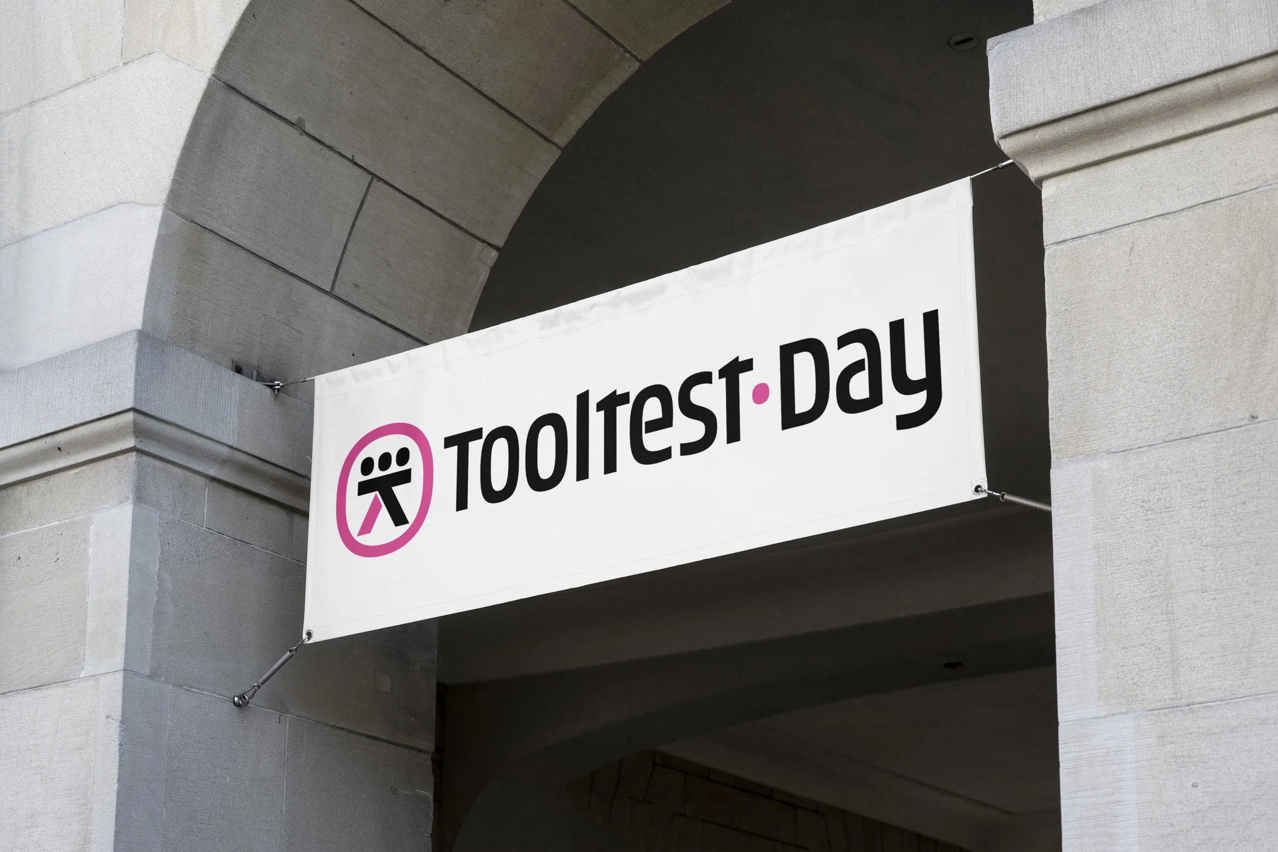
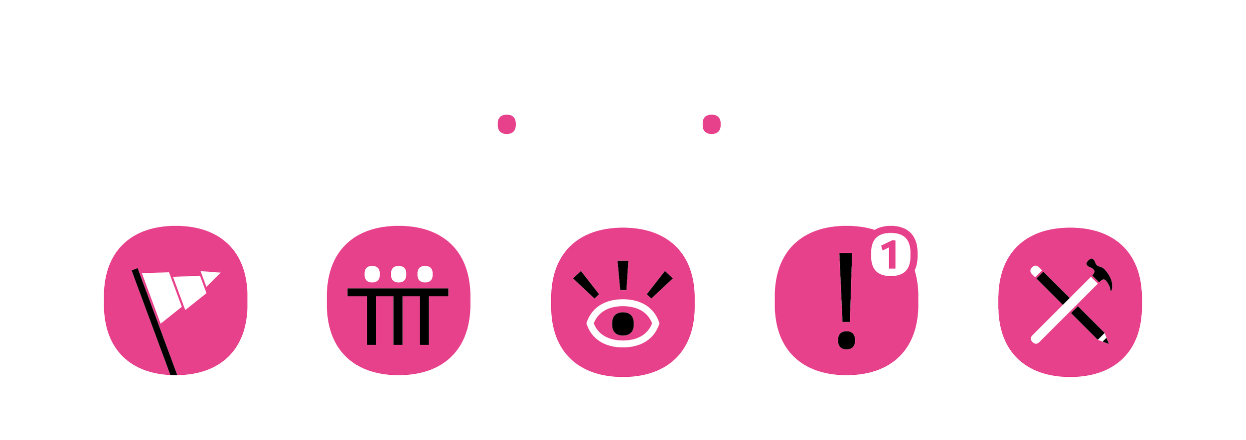
Client: Tooltest Day
Project: Logo, lettering & pictograms
Work by: Todor Georgiev
Year: 2022
Tooltest Day is a platform dedicated to collaborative development of the Placemaking Europe network’s Toolbox. Its core is about rapid prototyping of simple placemaking solutions within the framework of tactical urbanism, short-timed, pressure cooker actions on the ground followed (or initiated) by webinars. The aim is to test the tools on the ground in different contexts and collect the data and feedback of everyone participating.
We were commissioned to create a logo design consisting of 2 parts – a mark and custom lettering to go with it. As well as a set of pictograms.
The emblem is based on several separate ideas:
• A human with 3 heads symbolises a group of people who think/work/act together, or in other words – collaboration;
• Ellipsis (...) – as a symbol for to be continued, namely – results/development/further work/ideas;
• A workbench/solid table on which people can (symbolically or physically) meet, share thoughts and ideas, sketch, doodle, discuss and make decisions;
• Аn encircling shape around the symbol tо further emphasize the sense of community/team/togetherness.
The overall aesthetic of the letterforms is a subtle mix of “technical” and “humanistic”, exactly what the mark’s idea and construction were intended to convey.

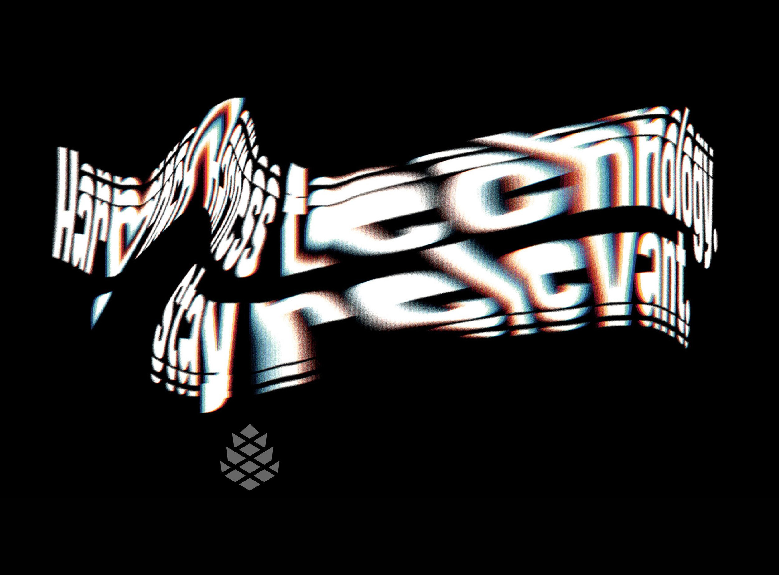
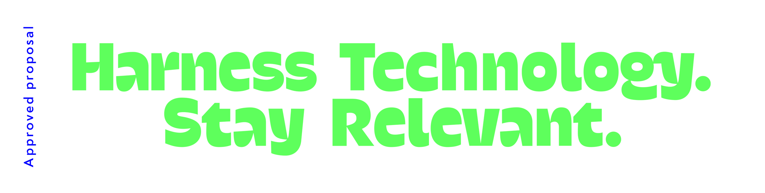
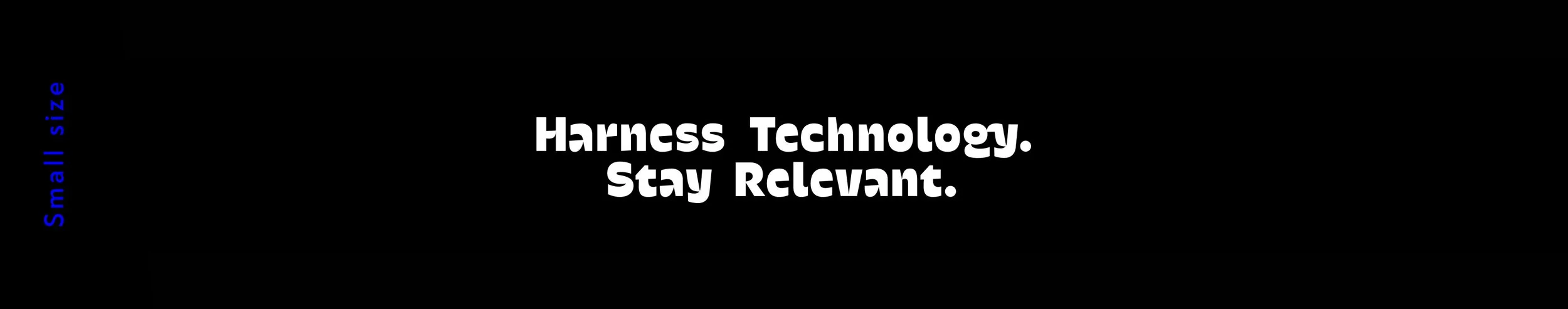
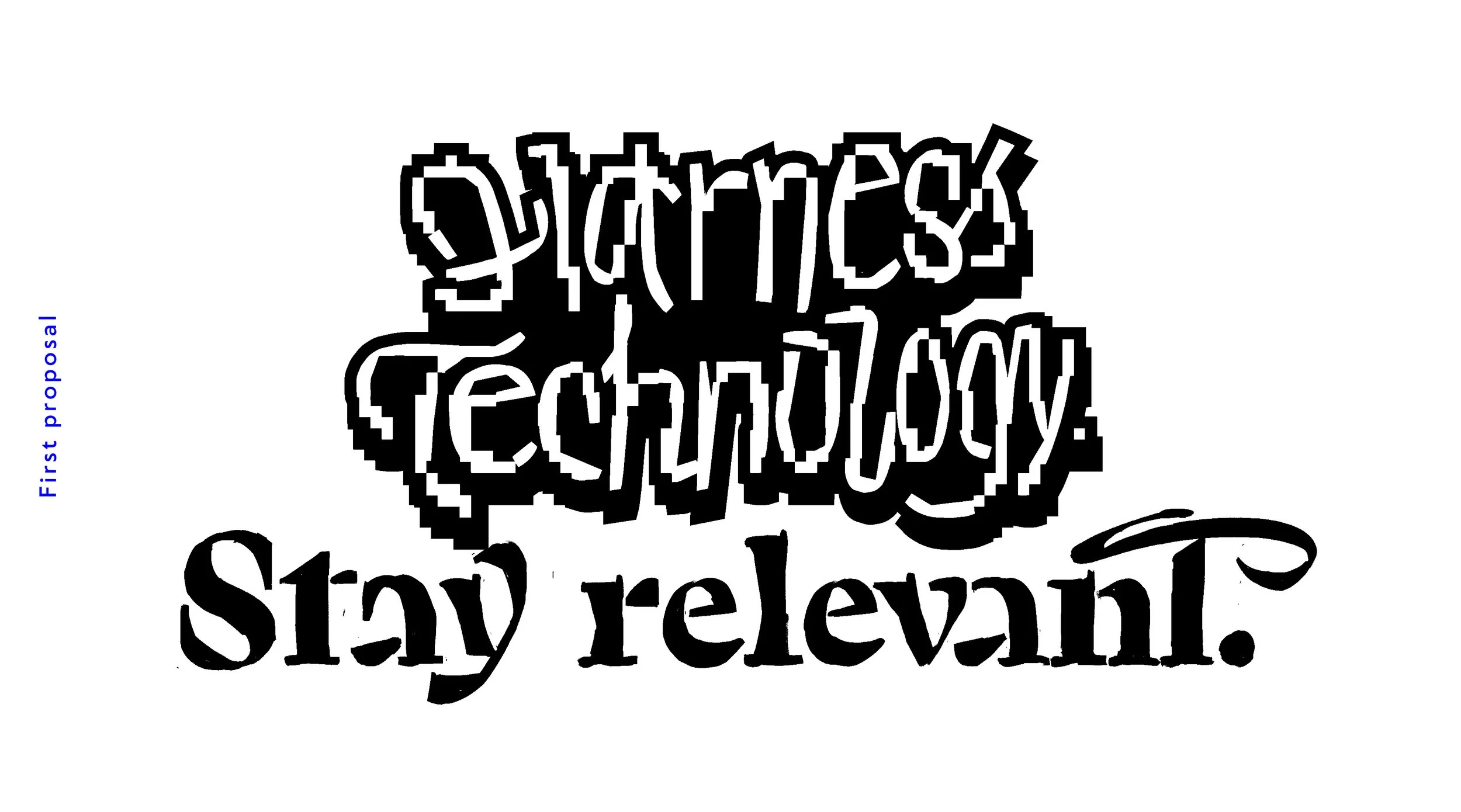
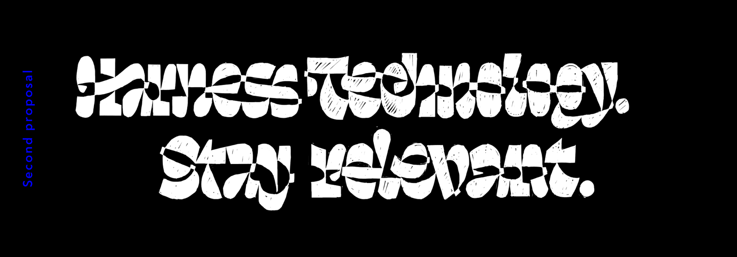
Client: Clever pine
Project: Custom lettering
Work by: Todor Georgiev
Year: 2021
Clever pine is a team of young tech geniuses who specialise in software solutions for small and large-scale businesses. They approached us with the task of breathing life into their company slogan and giving it a fresh contemporary look. The project kicked off with the only point of reference being the word "cool" and a card blanche for the style we use. Our initial proposal had was based on a pixelated look combining a techy feel with a casual handwritten approach – exactly what we feel the "Harness technology" part of the slogan entails. As it turned out, that was not on point for the client and we continued with a new direction based on our WIP typeface Contrasta as a reference. That too was not minimalistic enough and Apple-like for the brand so in our final proposal we cleaned things up a bit with maximum legibility in mind. After that, the cutting edge details came easily.

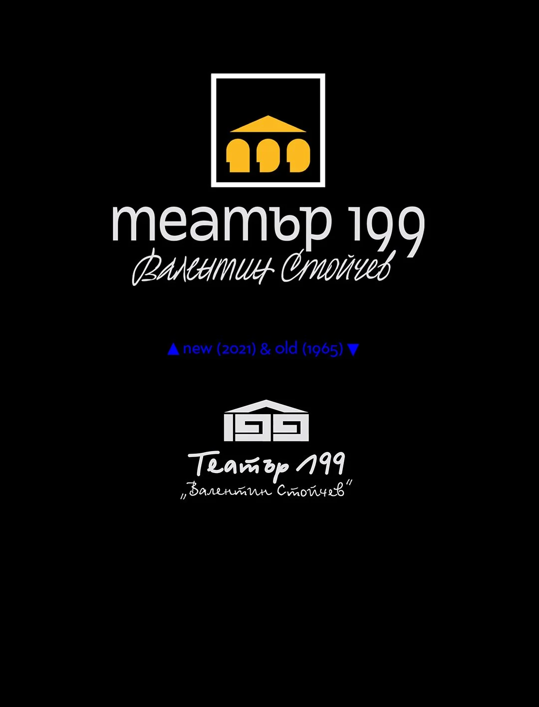
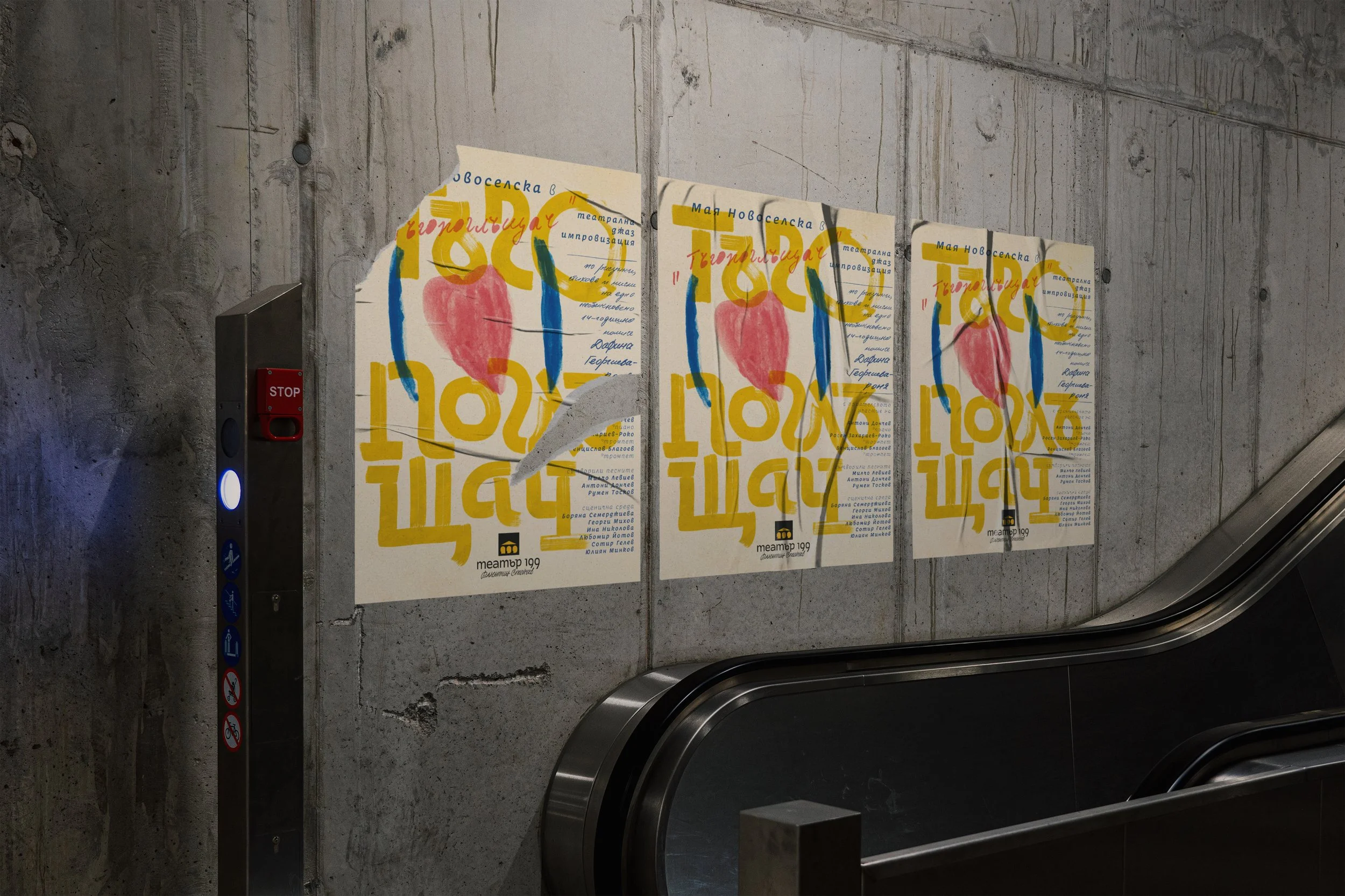
Client: Theater 199
Project: Logo redesign
Year: 2021
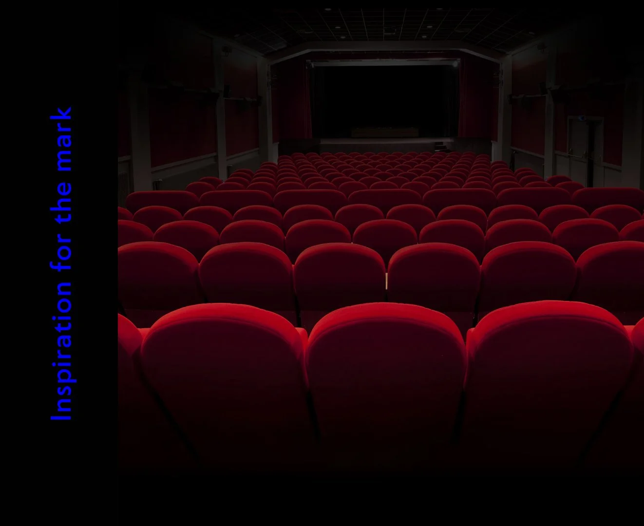
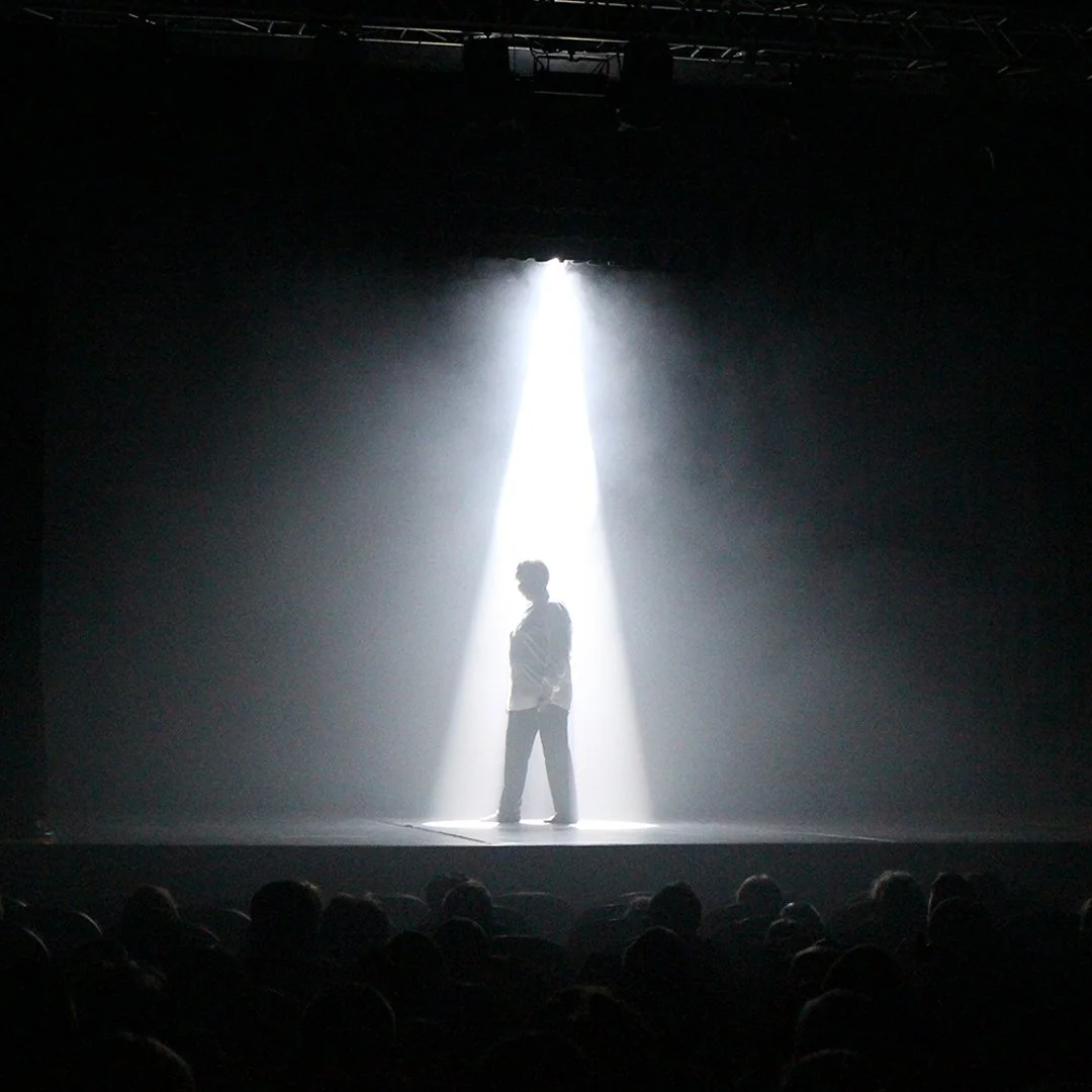
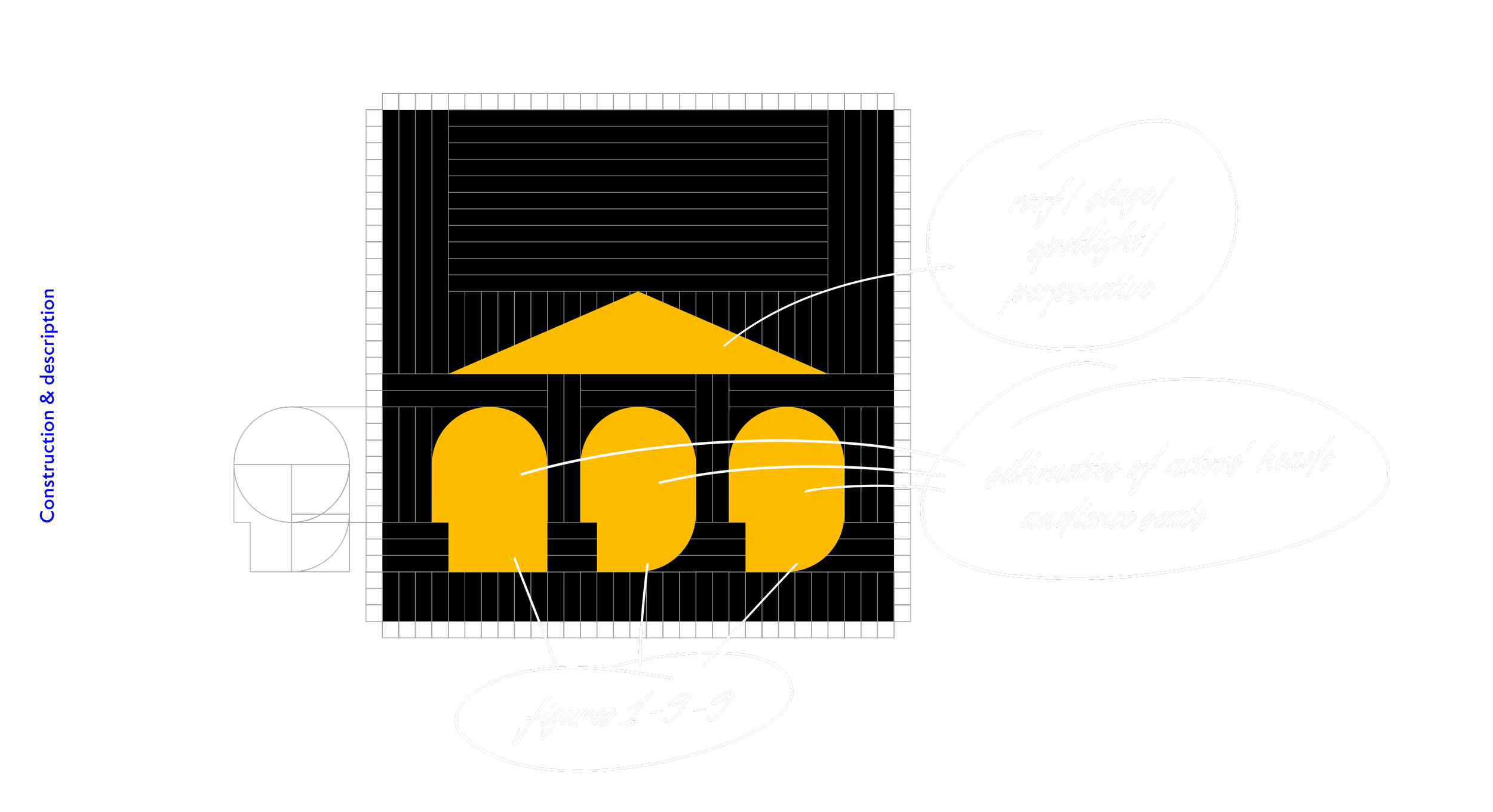
A logo redesign and custom lettering for a lovely theatre in the heart of Sofia, founded in the summer of 1965. Its name comes from the number of seats which were available then (those have decreased since). That is why the hall's first logo depicted a roof and the number 199.
Our objective was to preferably keep the roof element and incorporate it into the new design. That is precisely what we did, additionally involving some more visual metaphors and introducing depth to the idea. The digits 1-9-9 become the front row seats or the heads of the spectators sitting in them, or the actors on the stage lit by on overhead spotlight. The same triangle shifts into an arrow pointing upwards and together with the bottom heavy composition of the elements work as a representation of the underground (literally) nature of the theatre's hall. A black box around the elements serves as a depiction of the dark auditorium when a performance is unfolding.
Apart from the logomark itself, we designed custom lettering for both the title of the theater and its name Valentin Stoychev – in commemoration of its long-term director who managed the establishment from 1991 until his passing in 2007.
Design & concept: Todor Georgiev


The sketches shown below were part of our exploration phase and scrapped along the way.
Client: Synthesis
Projects: Logo and menu design
Menu design & prepress: Jacklina Jekova
Crafting & assembly: Todor Georgiev
Year: 2022
This one was exciting!
Synthesis combines a bar and the collections of distinct photographers displaying their works in the gallery in the very heart of Sofia, both joined with Photosynthesis – a famous shop for photographic equipment and print house. What started as a logo refresh turned to be a menu redesign in two languages which included its production.
First off was the logotype. It reflects the random (in a good way) feel of the bar's interior, the variety of objects, materials and colours inside, the diverse people that are gathered day all year round, and the cosy and imperfect overall setting.

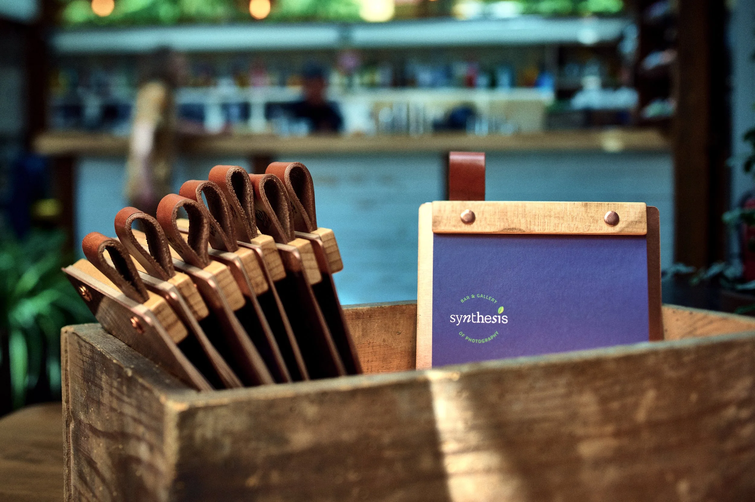
Next up was the menu. After presenting a conceptual idea for the feel, layout and mix of materials, we continued forward with its design. We wanted it to reflect the same feel as the logo so we mixed various typefaces and graphical elements, along with illustrations with and imperfect feel to convey that. After a couple of print tests and proofs, we dialled in what we wanted and the files for both Bulgarian and English were off to the printer.
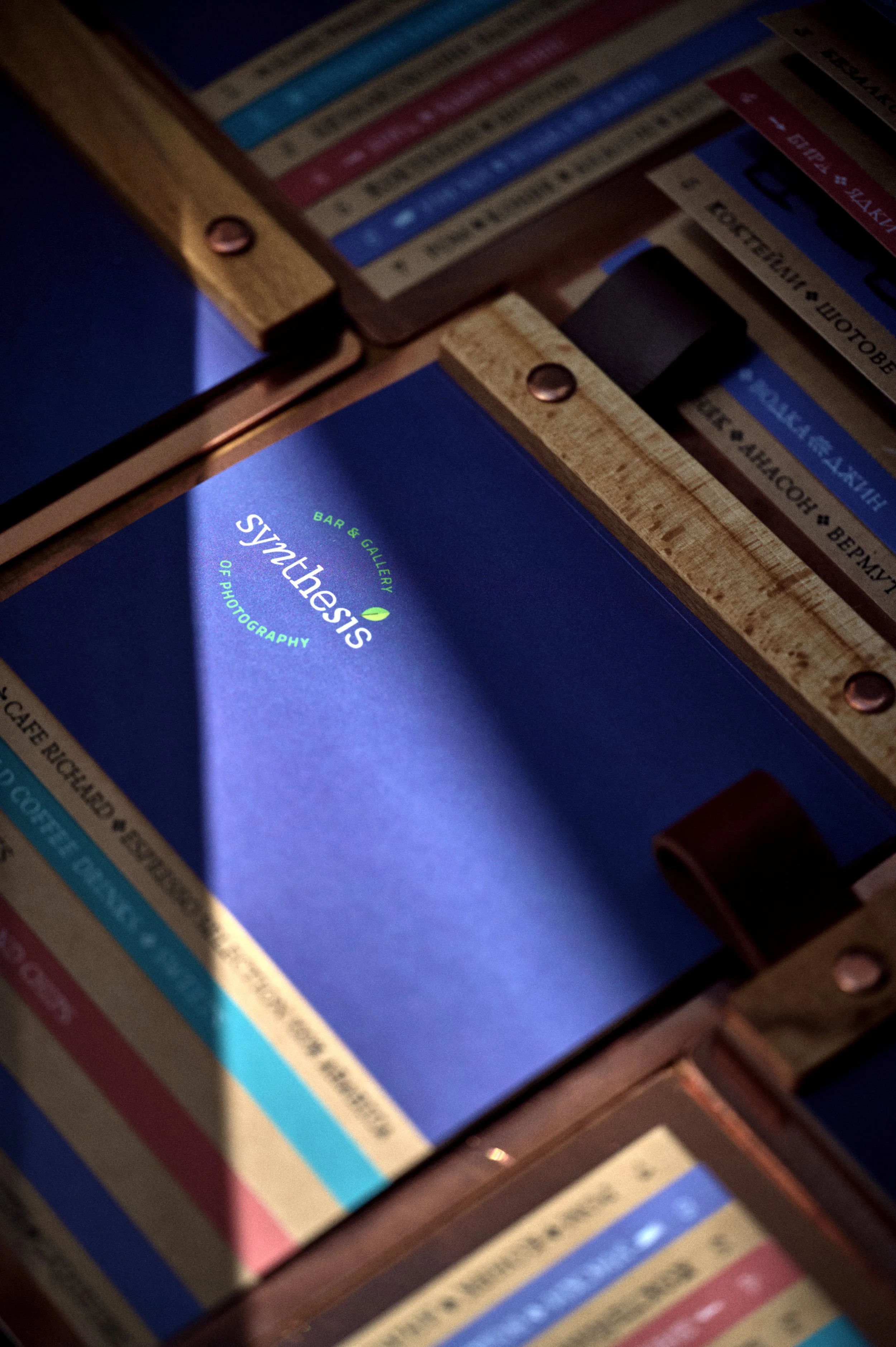

Alongside that, we researched and slowly sourced the best materials available for its production. All this came in an insecure time with prices getting higher by the day and some things were hard to come by. The backs are made from 2 mm thick laser-cut copper plates; hold-down bars are made from beach wood, all cut, milled and finished by hand; all tightened down with copper fasteners manually ground down to size.
To finish them off we chose two tints of bovine leather which we cut into strips to serve as loops and identifiers for the 2 versions of the menu.
All 35 pieces were processed and finished in-house in our workshop.
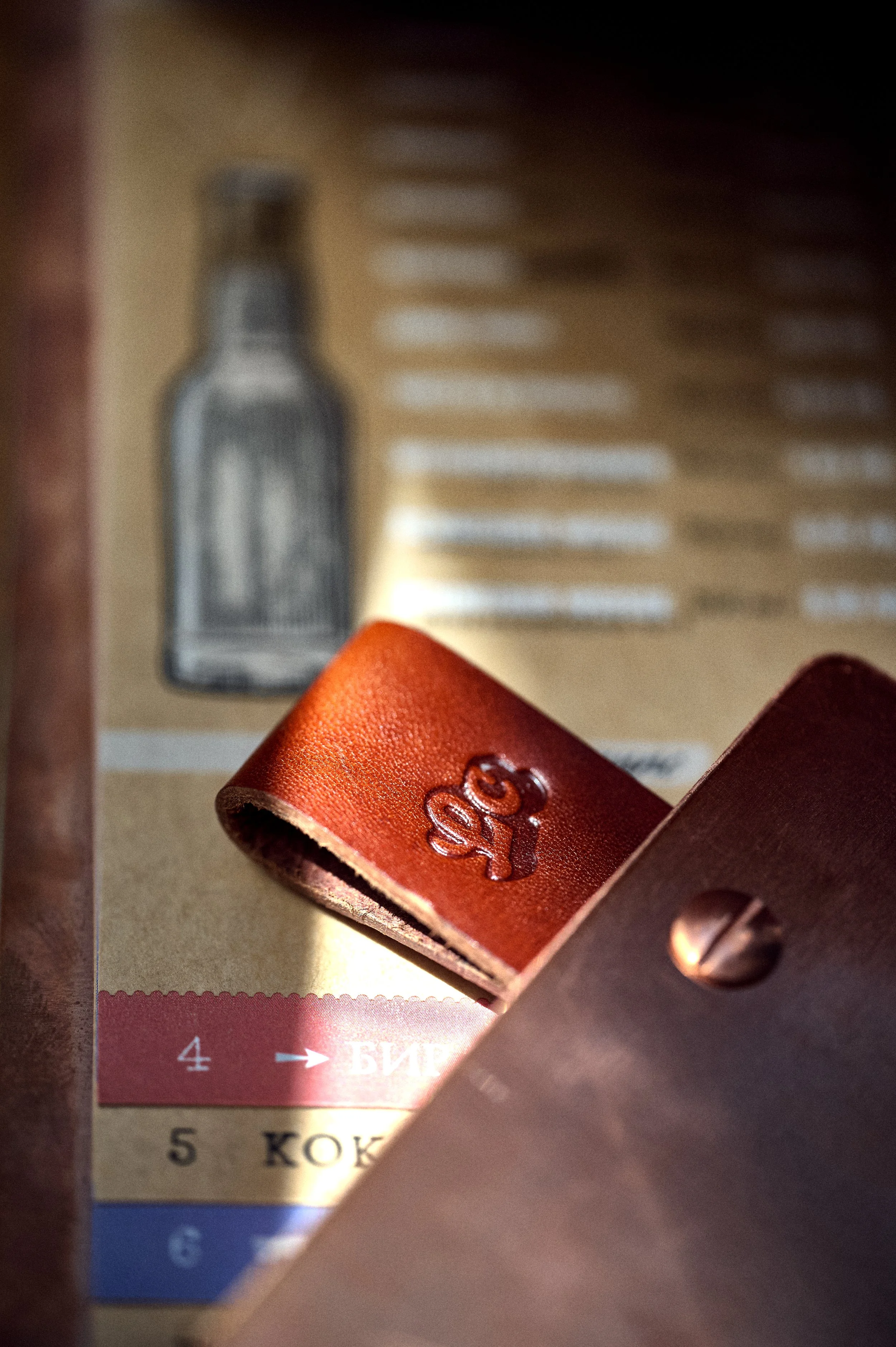
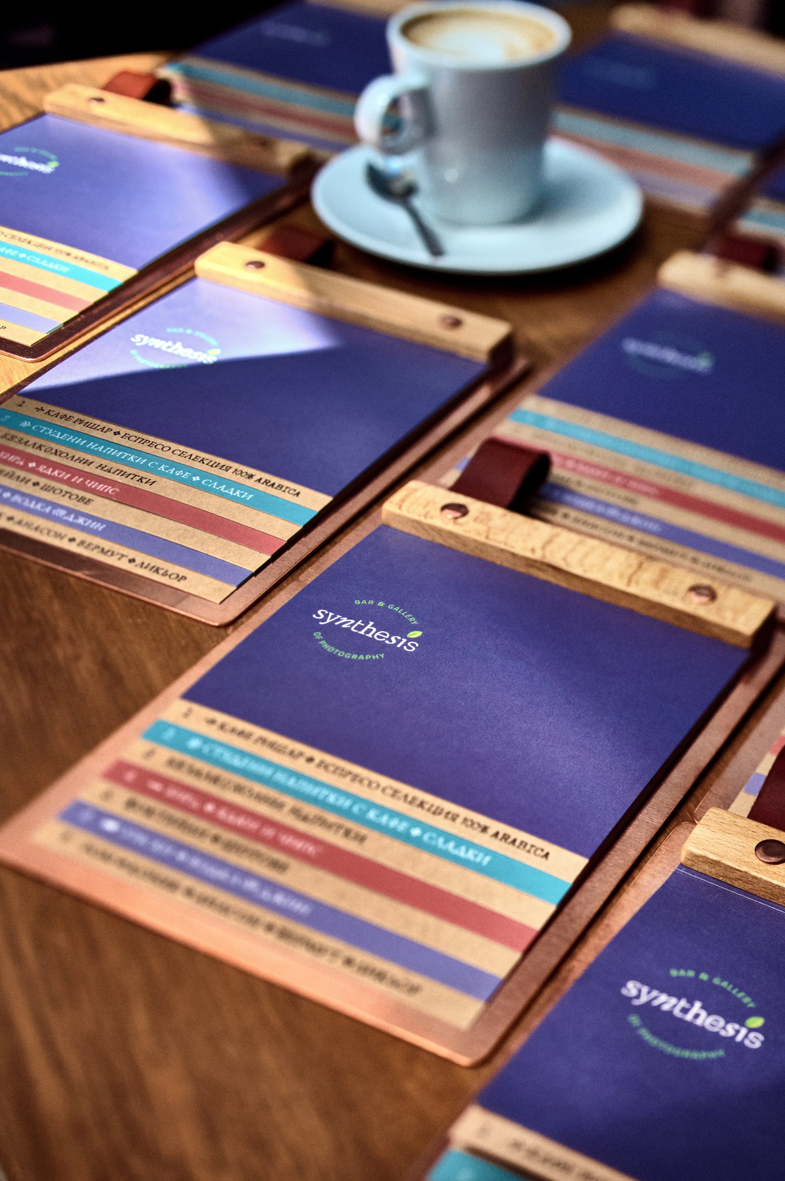
Both we and the client were super happy with how these turned out. A good challenge and test of our skill set. The lovely shots pictured below were taken by the immaculate Simeon Levi who photographed them on-site.
Client: Self-initiated
Calligraphy & type design by: Jacklina Jekova
Presentation by: Jacklina Jekova & Todor Georgiev
Illustration by: Miroslav Zhivkov/dzhingibi
Project: Logo redesign
Year: 2021
Jacky has always wanted to create a casual handwritten font which contains Cyrillic alongside Latin. Now that the time has finally come to design one it even comes with two masters so you can control the slant angle on the go. A variable casual – how cool is that?
Intended to use in large sizes and is perfect for when in need of a classic laid-back headline with a relaxed and warm feeling.
In case this typeface spikes your interest we might even develop a lowercase to match the caps, why not.
The current version supports all basic Latin and Cyrillic uppercase characters, as well as numerals, and the essential set of punctuation and symbols.


Available from:

Or try the DEMO version for FREE
(Cyrillic only)
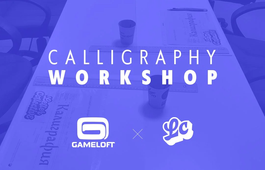
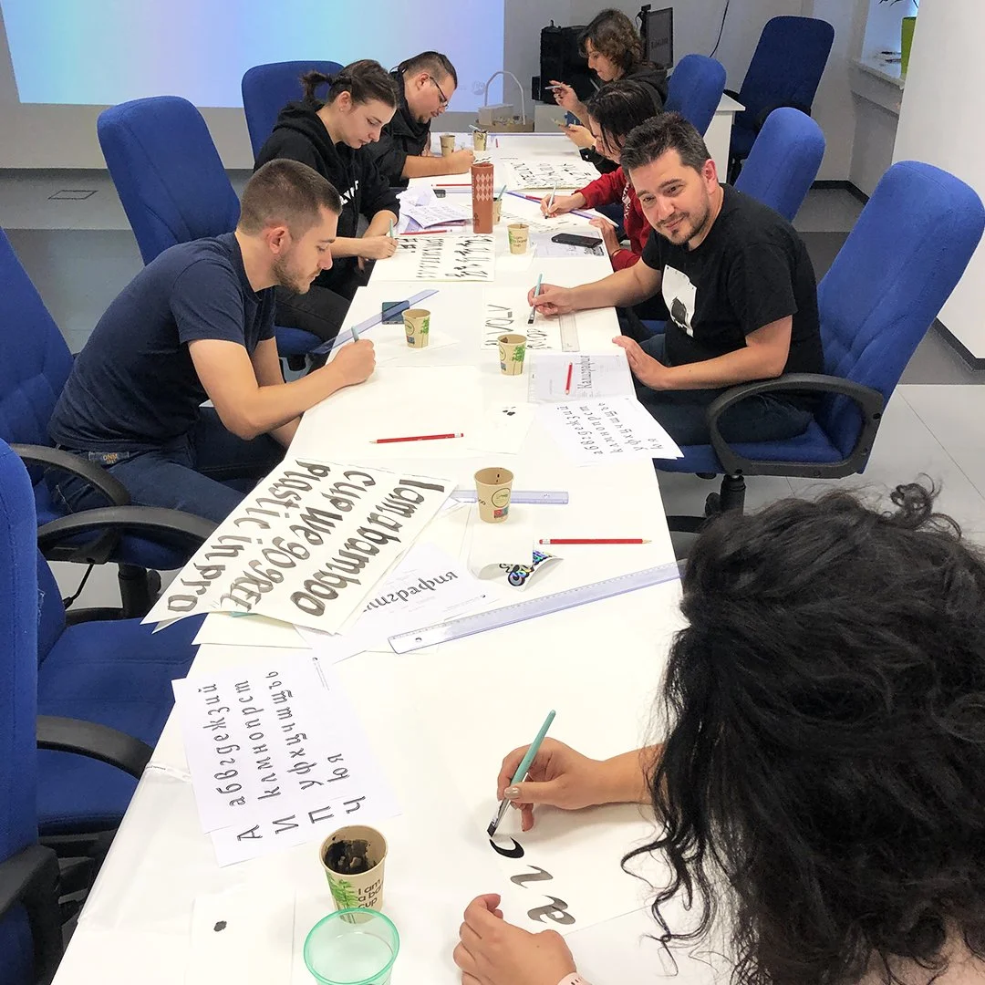
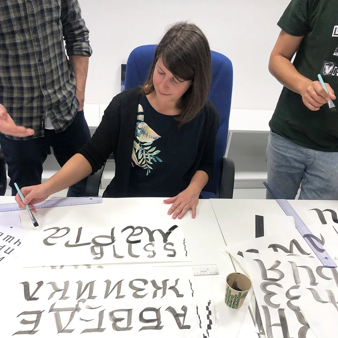
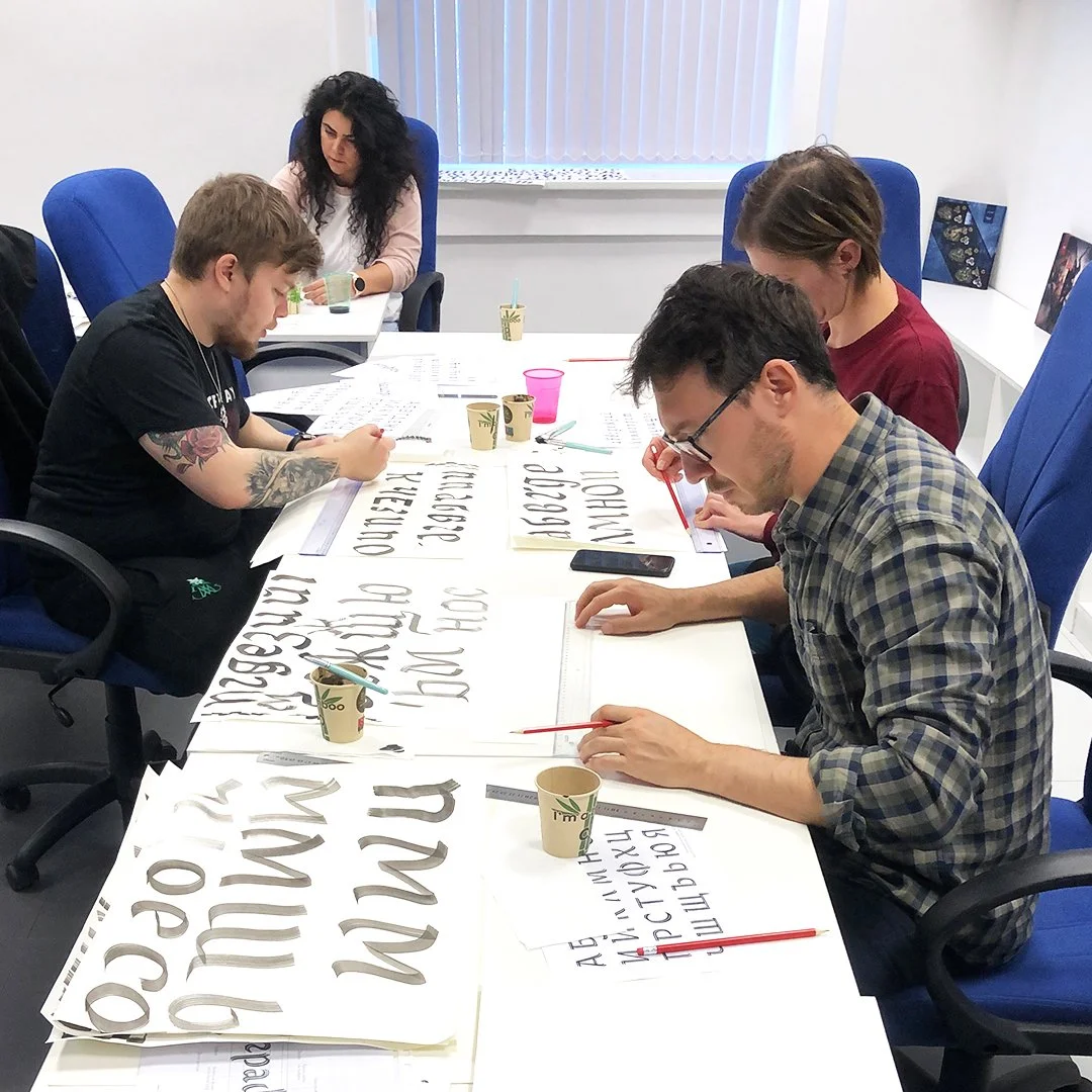
Jackie had the pleasure of being invited to lead a calligraphy workshop with the lovely people from Gameloft Sofia.
We started off with a lecture on basic concepts and methods in calligraphy and typography. We measured the x-height against different tool widths and we tried different writing slants. Later on, everyone did a great job using the flat brush to write classic strokes as well as some experimentations.
A big thanks to all participants for their interest and concentration to write by hand. And for the awesome drawings, too.
Thanks to Marta Radeva for organising the event.

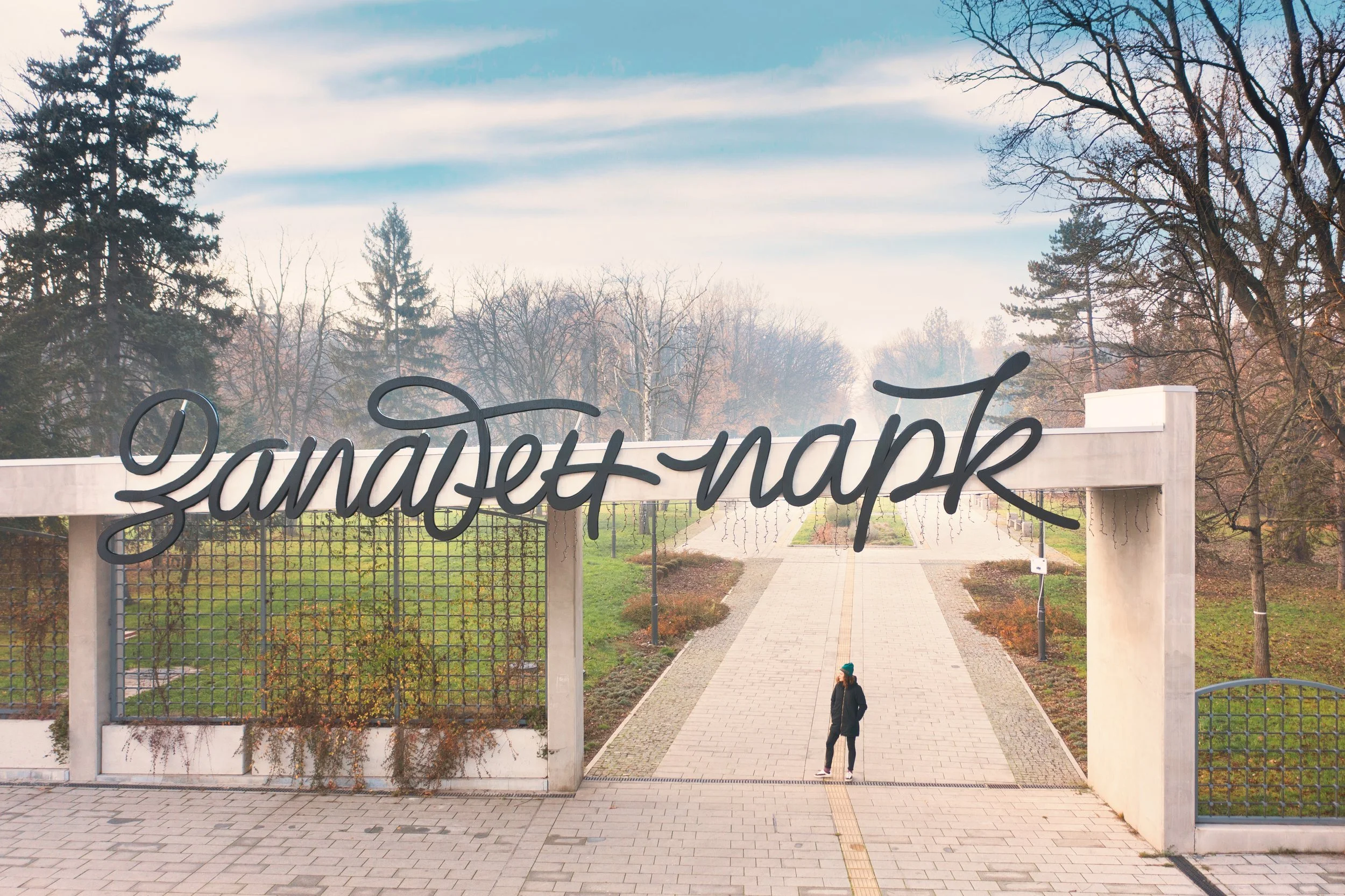
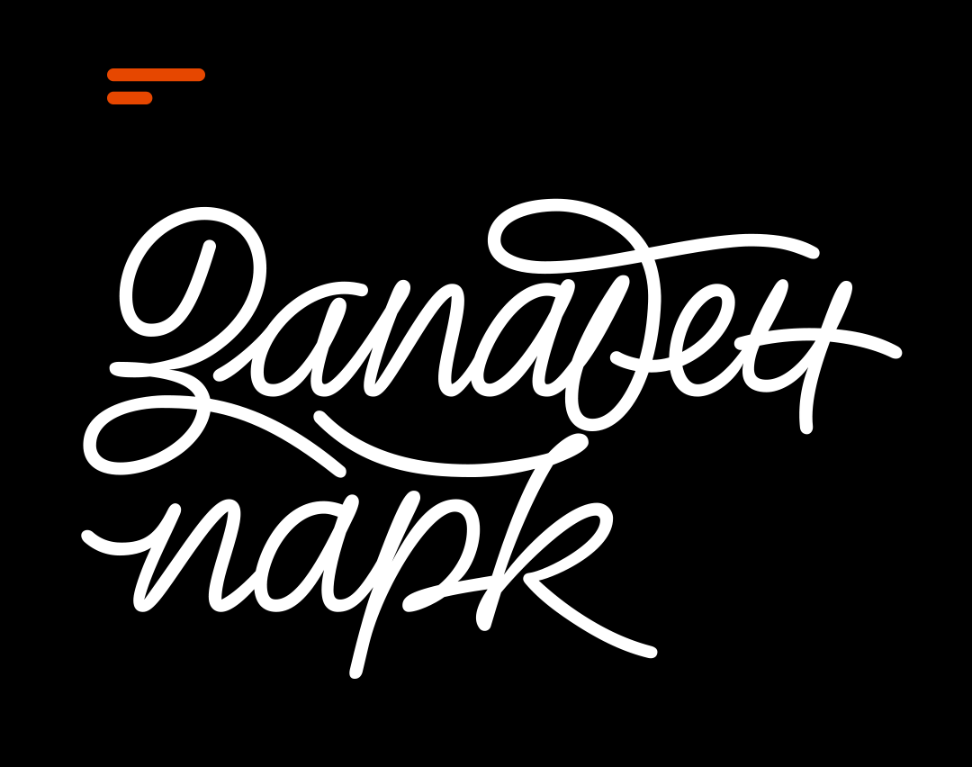
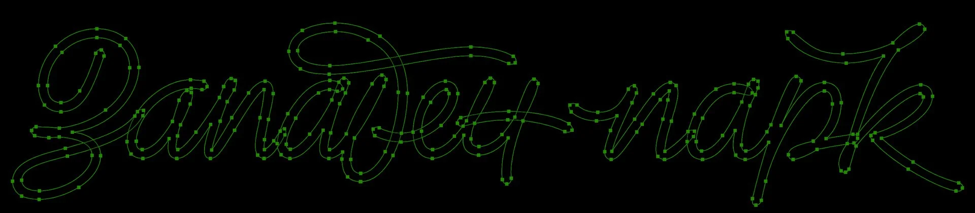
Client: Philip Boyadzhiev/Sofia Municipality
Project: Logotype redesign
Lettering by: Todor Georgiev
Photo & video by: Lazar Dimitrov
Final video editing by: Todor Georgiev
Year: 2021
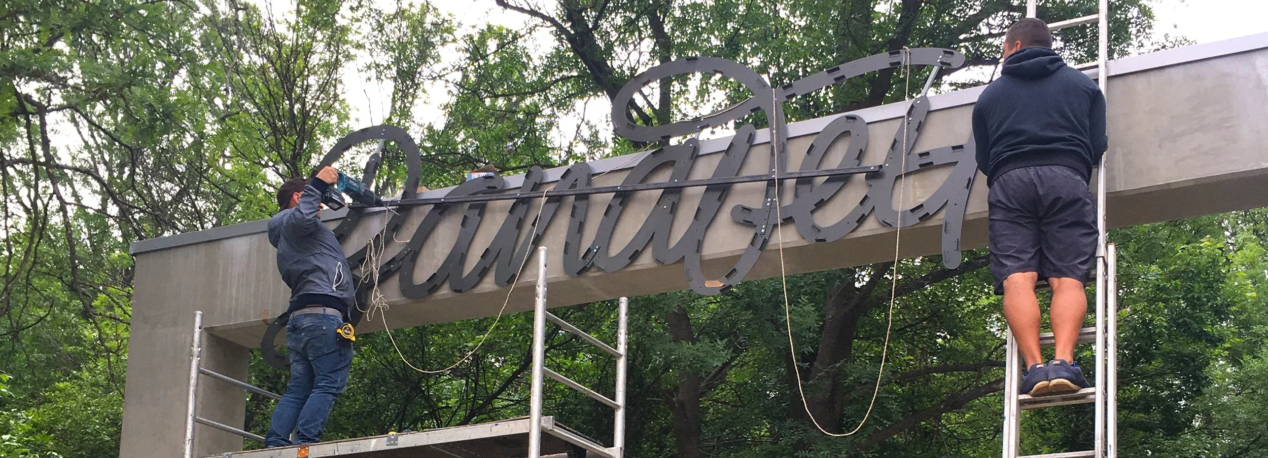
In 2020 we had the pleasure and honour to work on the visual branding of Zapaden park (West park) – the second-largest park in Sofia, Bulgaria. Filip Boyadjiev was currently working on its navigational system and invited us to collaborate on its identity. Our task was to create a custom lettering piece that was to serve as the park's logotype. Filip's creative direction finally led us to a monoline script with lots of connections and handwritten touch.
Upon approval from the lead architect of Sofia Municipality, the massive dimensional signage was installed on the park's freshly reconstructed main northeast entrance. The whole composition measures a whopping 12.5 meters across and a smaller one at about 7.5 meters wide can be seen on the park's southwest gate.
We were lucky to have Lazar Dimitrov take lovely drone shots of the installed works and compile a lengthy video.

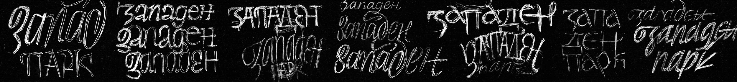
Shown below are several rough proposals dropped in the process.

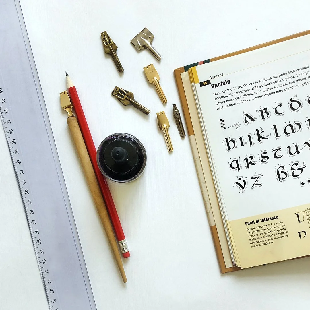
Първи модул:
КЛАСИЧЕСКИ ЛАТИНСКИ РЪКОПИС — РУСТИКА и УНЦИАЛ
Инструмент: плоско перо + туш
Ниво: начинаещо/средно
————————
Първи ден: РУСТИКА
(19.09.2023,вторник)
- 18:00 - 18:15 - запознанство
- 18:15 - 18:45 - лекция
- 18:45 - 20:00 - Латинска азбука РУСТИКА
- 20:00 - 20:30 - дума/изречение
- 20:30 - 21:00 - общо обсъждане + задаване на домашна работа
продължителност: 3 часа
————————
Втори ден: УНЦИАЛ
(26.09.2023,вторник)
- 18:00 - 18:30 - обсъждане на домашните работи
- 18:30 - 19:00 - лекция
- 19:00 - 20:00 - Латинска азбука УНЦИАЛ
- 20:00 - 20:30 - дума/изречение
- 20:30 - 21:00 - общо обсъждане
продължителност: 3 часа
————————
Курсът включва 2 посещения с продължителност по 3 астрономически часа. Подходящ е за напълно начинаещи и за хора с основни знания. Всички материали, необходими за работилницата, ще бъдат осигурени и са включени в цената. Има ограничен брой места, записването е задължително.
Водещ: Жаклина Жекова
Адрес: гр. София, Бизнес парк София, сграда 7
Писане на КИРИЛИЦА
Инструмент: плоска четка + туш
Ниво: начинаещо/средно
КИРИЛИЦА 35° наклон на писане
(21.01.2025, вторник)
- 18:00 - 18:30 - лекция и демонстрация
- 18:30 - 20:00 - Кирилица 35° наклон на писане
- 20:00 - 20:30 - дума/изречение
- 20:30 - 21:00 - общо обсъждане
продължителност: 3 часа
————————
Курсът включва 1 посещение с продължителност от 3 астрономически часа. Подходящ е за напълно начинаещи и за хора с основни знания. Всички материали, необходими за работилницата, ще бъдат осигурени и са включени в цената. Има ограничен брой места и е задължително да се запази място. Опция за плащане и през Revolut
Водещ: Жаклина Жекова
Адрес: гр. София, Бизнес парк София, сграда 7

Трети модул:
ЛАТИНИЦА
Инструмент: плоска четка + туш
Ниво: начинаещо/средно
————————
Първи ден: ЛАТИНИЦА 35° наклон на писане
(20.02.2023, понеделник)
- 18:00 - 18:15 - запознанство
- 18:15 - 18:45 - лекция
- 18:45 - 20:00 - Латиница 35° наклон на писане
- 20:00 - 20:30 - дума/изречение
- 20:30 - 21:00 - общо обсъждане + задаване на домашна работа
продължителност: 3 часа
————————
Втори ден: ЛАТИНИЦА 85° наклон на писане
(27.02.2023, понеделник)
- 18:00 - 18:30 - лекция
- 18:30 - 19:00 - обсъждане на домашни работи
- 19:00 - 20:00 - Кирилица 85° наклон на писане
- 20:00 - 20:30 - дума/изречение
- 20:30 - 21:00 - общо обсъждане
продължителност: 3 часа
————————
Курсът включва 2 посещения с продължителност по 3 астрономически часа. Подходящ е за напълно начинаещи и за хора с основни знания. Всички материали, необходими за работилницата, ще бъдат осигурени и са включени в цената. Има ограничен брой места и е задължително да се запази място.
Водещ: Жаклина Жекова
Адрес: гр. София, ул. Струма 3
———————-
Всички места за работилниците на 16.01 и 23.01 са запълнени. Ако не си успял да се включиш в курса, но имаш интерес, можеш да се запишеш или да закупиш ваучер за следващи работилници.
Аз пиша красиво на Кирилица!
Инструмент: кръгъл флумастер
Подходящо за всякакви възрасти.
————————
Работилницата цели да запознае децата с българската (обла) форма на Кирилица. Ще пишем заедно печатни и ръкописни букви от нашата азбука и ще експериментираме с декорации и украсни форми.
Продължителност: 1 час
————————
Всички материали, необходими за работилницата, ще бъдат осигурени и са включени в цената. Има ограничен брой места и е задължително да запазите място.
Водещ: Жаклина Жекова
Адрес: Бизнес парк София, сграда 7

Четвърти модул: КИЛИРИЦА
Инструмент: тушовка, cola-pen + туш
Ниво: начинаещо/средно
————————
Първи ден: писане на Кирилица с тушовкa
(25.07.2023, вторник)
- 18:00 - 18:15 - запознанство
- 18:15 - 18:45 - лекция
- 18:45 - 20:00 - писане на главни и редовни букви
- 20:00 - 20:30 - дума/изречение
- 20:30 - 21:00 - общо обсъждане
продължителност: 3 часа
————————
Втори ден: писане на Кирилица с cola-pen
(01.08.2023, вторник)
- 18:00 - 18:30 - лекция
- 18:30 - 19:00 - създаване и тестване на cola-pen
- 19:00 - 20:00 - писане на главни и редовни букви
- 20:00 - 20:30 - дума/изречение
- 20:30 - 21:00 - общо обсъждане
продължителност: 3 часа
————————
Курсът включва 2 посещения с продължителност по 3 астрономически часа. Подходящ е за напълно начинаещи и за хора с основни знания. Всички материали, необходими за работилницата, ще бъдат осигурени и са включени в цената. Има ограничен брой места и е задължително да се запази място.
Водещ: Жаклина Жекова
Адрес: Бизнес парк София, сграда 7
ЛАТИНИЦА 35° наклон на писане
Инструмент: плоска четка + туш
Ниво: начинаещо/средно
————————
(05.12.2024, четвъртък)
- 18:00 - 18:30 - лекция и демонстрация
- 18:30 - 20:00 - упражнение на писане на Латиница с 35° наклон на писане
- 20:00 - 20:30 - изписване на дума/изречение
- 20:30 - 21:00 - общо обсъждане на работите
продължителност: 3 часа
————————
Курсът включва 1 посещение с продължителност от 3 астрономически часа. Подходящ е за напълно начинаещи и за хора с основни знания. Всички материали, необходими за работилницата, ще бъдат осигурени и са включени в цената. Има ограничен брой места и е задължително да се запази място.
Водещ: Жаклина Жекова
Адрес: Бизнес парк София, сграда 7
Oпция за плащане и през Revolut: revolut.me/zhaklirvs
ЛАТИНИЦА 85° наклон на писане
Инструмент: плоска четка + туш
Ниво: начинаещо/средно
————————
(22.02.2024, четвъртък)
- 18:00 - 18:30 - лекция
- 18:30 - 20:00 - упражнение на писане на Латиница с 85° наклон на писане
- 20:00 - 20:30 - изписване на дума/изречение
- 20:30 - 21:00 - общо обсъждане на работите
продължителност: 3 часа
————————
Курсът включва 1 посещение с продължителност от 3 астрономически часа. Подходящ е за напълно начинаещи и за хора с основни знания. Всички материали, необходими за работилницата, ще бъдат осигурени и са включени в цената. Има ограничен брой места и е задължително да се запази място.
Водещ: Жаклина Жекова
Адрес: Бизнес парк София, сграда 7
Oпция за плащане и през Revolut: revolut.me/zhaklirvs
Писане на Кирилица
Инструмент: тушовка + туш
Ниво: начинаещо/средно
————————
(21.03.2024, четвъртък)
- 18:00 - 18:30 - лекция
- 18:30 - 20:00 - упражнение на писане на Кирилица
- 20:00 - 20:30 - изписване на дума/изречение
- 20:30 - 21:00 - общо обсъждане на работите
продължителност: 3 часа
————————
Курсът включва 1 посещение с продължителност от 3 астрономически часа. Подходящ е за напълно начинаещи и за хора с основни знания. Всички материали, необходими за работилницата, ще бъдат осигурени и са включени в цената. Има ограничен брой места и е задължително да се запази място.
Водещ: Жаклина Жекова
Адрес: Бизнес парк София, сграда 7
Oпция за плащане и през Revolut: revolut.me/zhaklirvs
Писане на Кирилица
Инструмент: cola-pen + туш
Ниво: начинаещо/средно
————————
(26.04.2024, петък)
- 18:00 - 18:30 - лекция
- 18:30 - 20:00 - изработване на cola pen и упражнения на писане на Кирилица
- 20:00 - 20:30 - изписване на дума/изречение
- 20:30 - 21:00 - общо обсъждане на работите
продължителност: 3 часа
————————
Курсът включва 1 посещение с продължителност от 3 астрономически часа. Подходящ е за напълно начинаещи и за хора с основни знания. Всички материали, необходими за работилницата, ще бъдат осигурени и са включени в цената. Има ограничен брой места и е задължително да се запази място.
Водещ: Жаклина Жекова
Адрес: Бизнес парк София, сграда 7
Oпция за плащане и през Revolut: revolut.me/zhaklirvs
по писане на НЕБРЕЖЕН РЪКОПИС [Кирилица]
Инструмент: плоска четка + туш
Ниво: начинаещо/средно
————————
(20.05.2024, понеделник)
- 18:00 - 18:30 - представяне на “Небрежен ръкопис - Наръчник за изграждане на букви и писане на ръка”
- 18:30 - 20:00 - изписване на азбуката
- 20:00 - 20:45 - изписване на дума/изречение и композиране на текст
- 20:45 - 21:00 - общо обсъждане на работите
продължителност: 3 часа
————————
Курсът включва 1 посещение с продължителност от 3 астрономически часа. Подходящ е за напълно начинаещи и за хора с основни знания. Всички материали, необходими за работилницата, ще бъдат осигурени и включени в цената. Има ограничен брой места и е задължително да се запази място.
Водещ: Жаклина Жекова
Адрес: Бизнес парк София, сграда 7
Oпция за плащане и през Revolut: revolut.me/zhaklirvs